Gustave Moreau – Hercules and the Lernaean Hydra (ANALYZED PAINTING #2)
#729
Welcome back everyone! Thanks a ton for all of the continued support, you keep the site going!
Today we’re going to take a deep look into an exciting masterpiece by Gustave Moreau. He’s a master we’ve covered on the site before, but we’ll get to know him even more as an artist. What is his painting about? What compositional decisions did he make? Did he make any mistakes? Let’s find out now!
Hercules and the Lernaean Hydra The Story
If you’d like to get to know Gustave Moreau a little more as an artist, feel free to check out the previous article and analysis (see #659). It’s a good one!
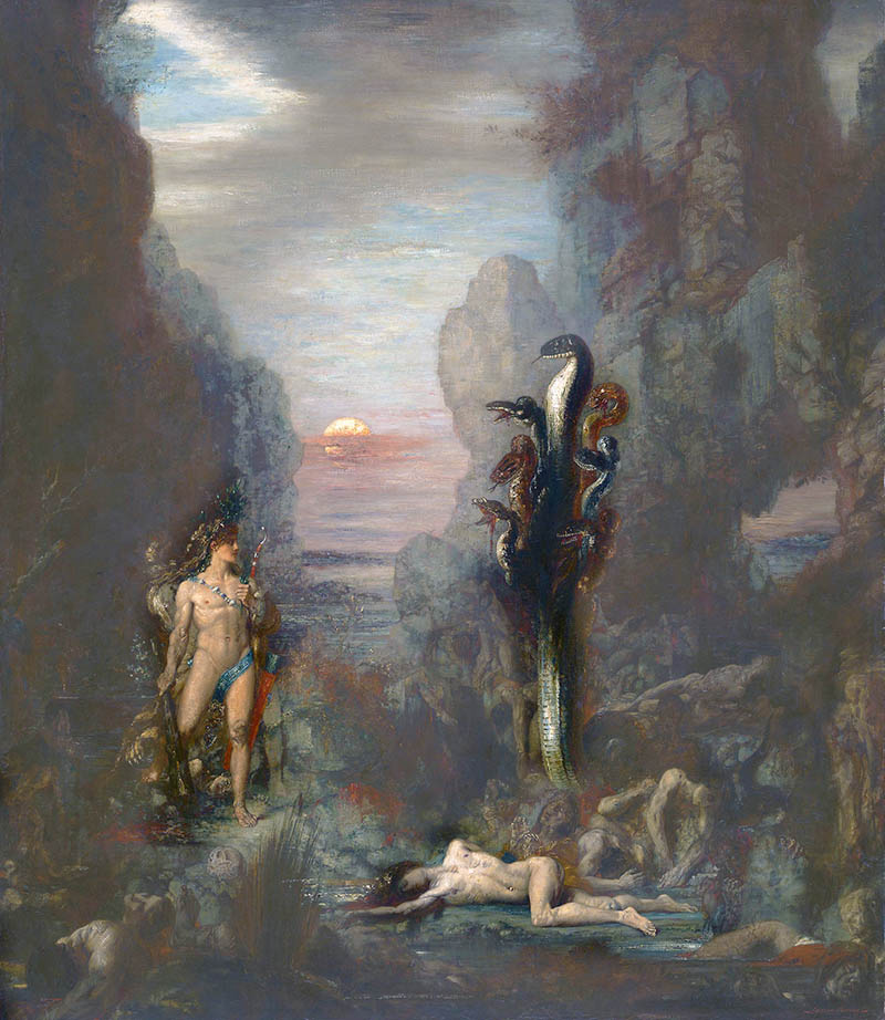
The painting we’ll be analyzing today is called “Hercules and the Lernaean Hydra,” which is seen below. Everyone might have a good idea of who Hercules is, but what is a Hydra? This, my friends, is the 7-headed serpent-looking beast towering above him. Herecules was ordered by King Eurystheus to kill this creature because it was terrorizing the countryside, but there was one problem. Whenever Hercules cut off one of the heads, two more would grow back. This makes for quite the pickle. Eventually Hercules defeated the giant beast by cauterizing the necks with a torch after he chopped the heads off. Smart man! We can see his torch on his left side. What’s more interesting is the details Gustave has presented us. Let’s look a little closer, shall we?
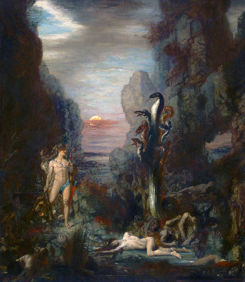
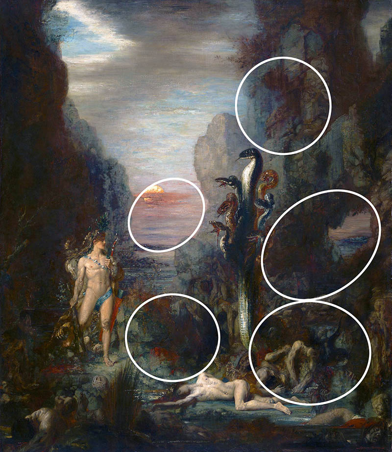
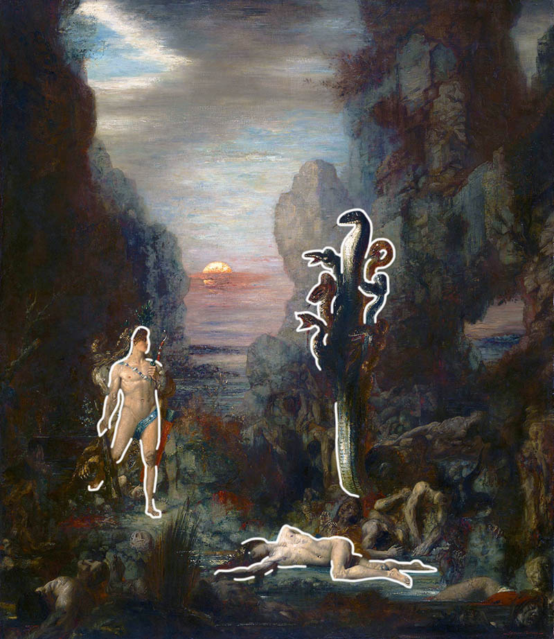
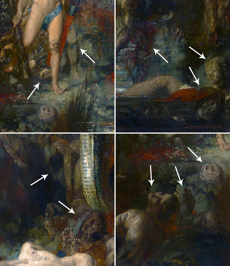
In these details, we can see how meticulous Gustave was when creating the dramatic story. At first glance, the victims of the Hydra would be missed, but when we look close we see why Hercules had to slay this beast once and for all. The arrows point to different characters he developed for the scene. Some are in such low contrast you can hardly make them out. We can even see in the upper-left image that he adjusted the leg of Hercules, but kept the ghosted leg visible.
Gustave did many studies for this painting as well, and we can see how varied they are below.
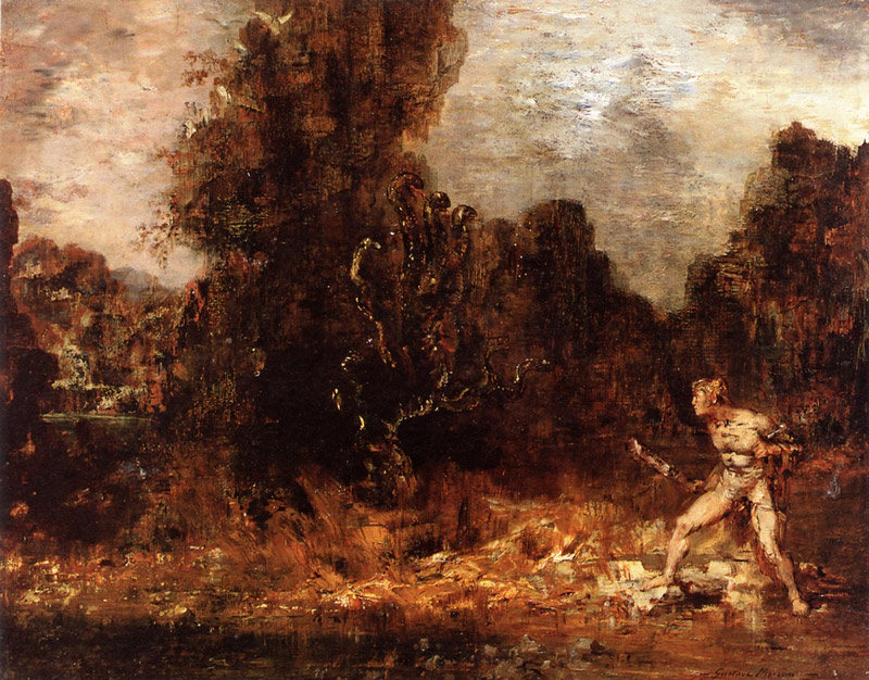
This one is definitely a lot closer to the final masterpiece. It was a wise choice to use a portrait format rather than this landscape format because it allows him to compensate for the tall and skinny Hydra.
Now that you know more about the painting, let’s see how Gustave composed it with design techniques!

Gustave Moreau Analyzed
Dynamic Symmetry
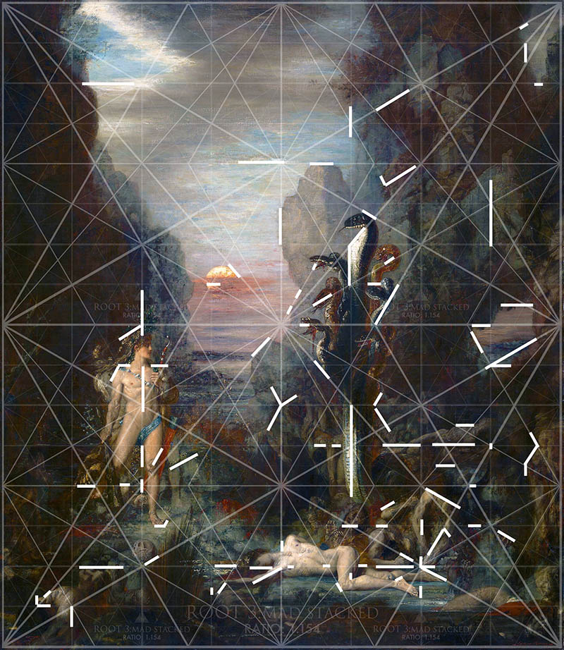
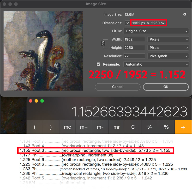
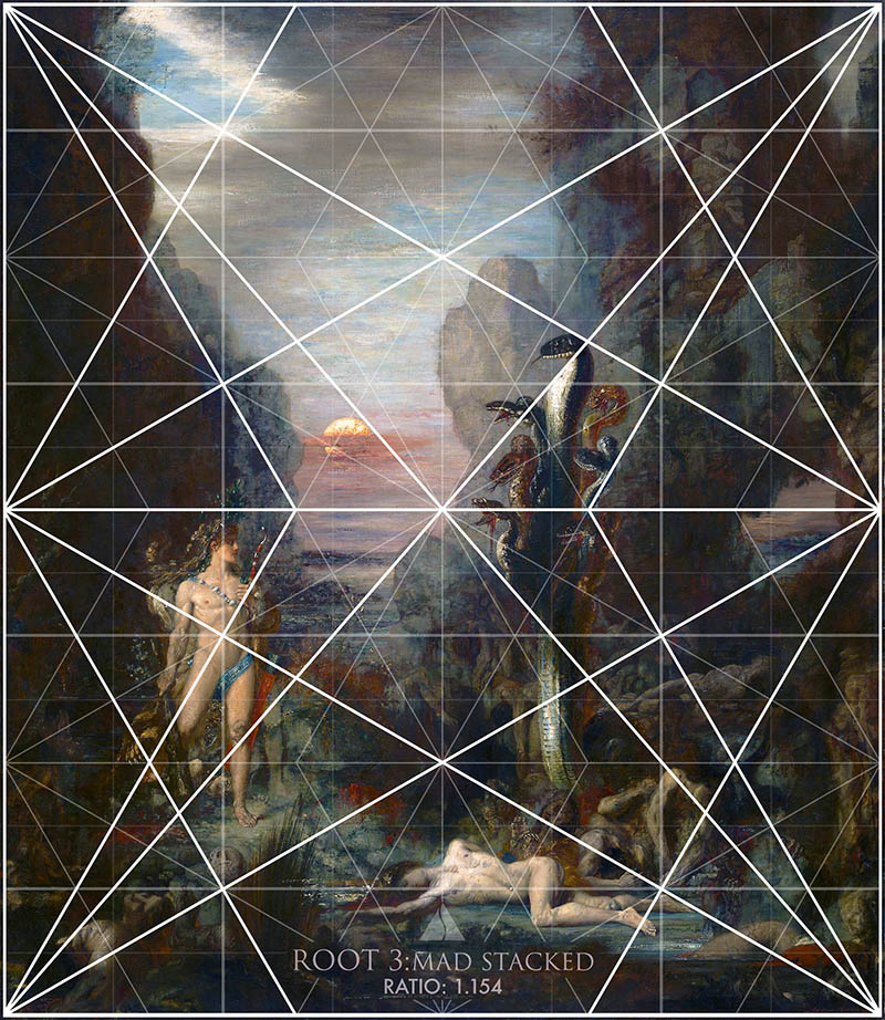
When the image ratio is calculated, we get 1.152. Looking in the ratio guide of the Dynamic Symmetry book gave great direction when finding the grid that Gustave used to organize his composition. There were several grids to choose from, but the root 3 compound rectangle (see Day 155) worked best. Why? Because it locks in and has exact diagonals paralleling the grid. The diagonals are key!
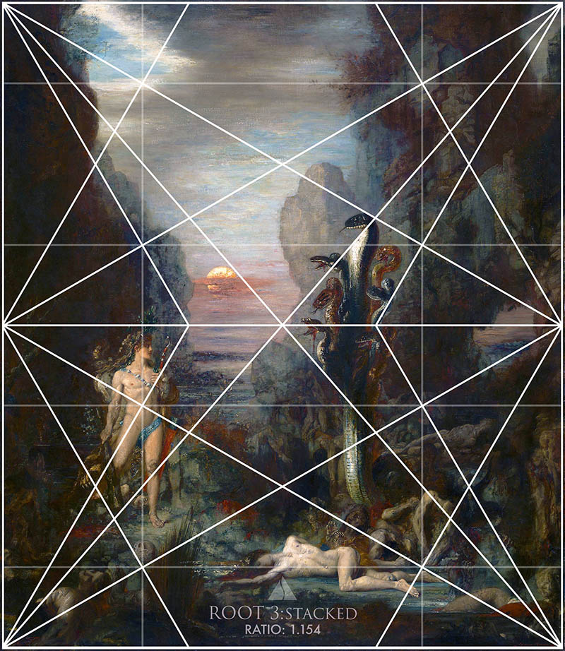
Root 3 – Stacked – Basic Armature
We can find proof that this is the correct grid with just the basic armature overlaid onto the painting. Take a look at Hercules and the leg on our left. He’s locking in and the thigh is paralleling the baroque reciprocal diagonal. We even see the cliffs, clouds, Hydra, and other bodies locking into the grid. The poor guy on the bottom is looking a little stiff, but his foot is locking into the exact diagonal beautifully. His other foot is paralleling the same diagonal. Pretty cool!
Root 3 – Stacked – Major Area Divisions (MAD)
With the MAD in place, we’re able to better see how Gustave went about organizing his canvas. Look at the same guy on the bottom. Now we see the legs, thigh, foot, face, and shoulders are locking in perfect.
Root 3 – Stacked – MAD 32
In this refined grid (see #649) we have 32 smaller grids inside the mother. These refined grids aren’t necessary, but I love them! To the beginner they might seem complex because of all the lines, but they are actually great for beginners. The more lines you have, the less you have to think about paralleling and locking in. They also help us see how the masters composed smaller elements within the scene. We’ll find that even the shadow shapes and cracks in the background cliffs are locking into the grid.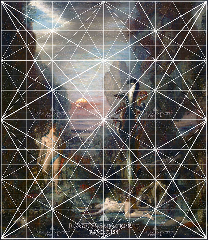
Locked Into the Grid
Here are most of the areas locking into the stacked root 3 grid configuration. Looking pretty good so far, don’t you think?
Using the grid is the first step, but then we have to plan additional design techniques to create unity, movement, strength, etc. This all may seem too difficult to understand and piece together at first, which is why the Drawing Course was created. It’s made specifically to walk artists through every step in a simple way. Now let’s see how Gustave used the same process.
Gamut
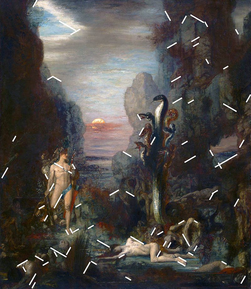
The diagonals of the basic armature can be used to create a gamut (see Day 38), which is a limited number of diagonals. Why do this? To create a hidden rhythm within the composition that hits the viewer on a subconscious level. About 99% of the time they will never, ever, ever be able to identify these repeating diagonals, but they will definitely feel them.
Coincidences
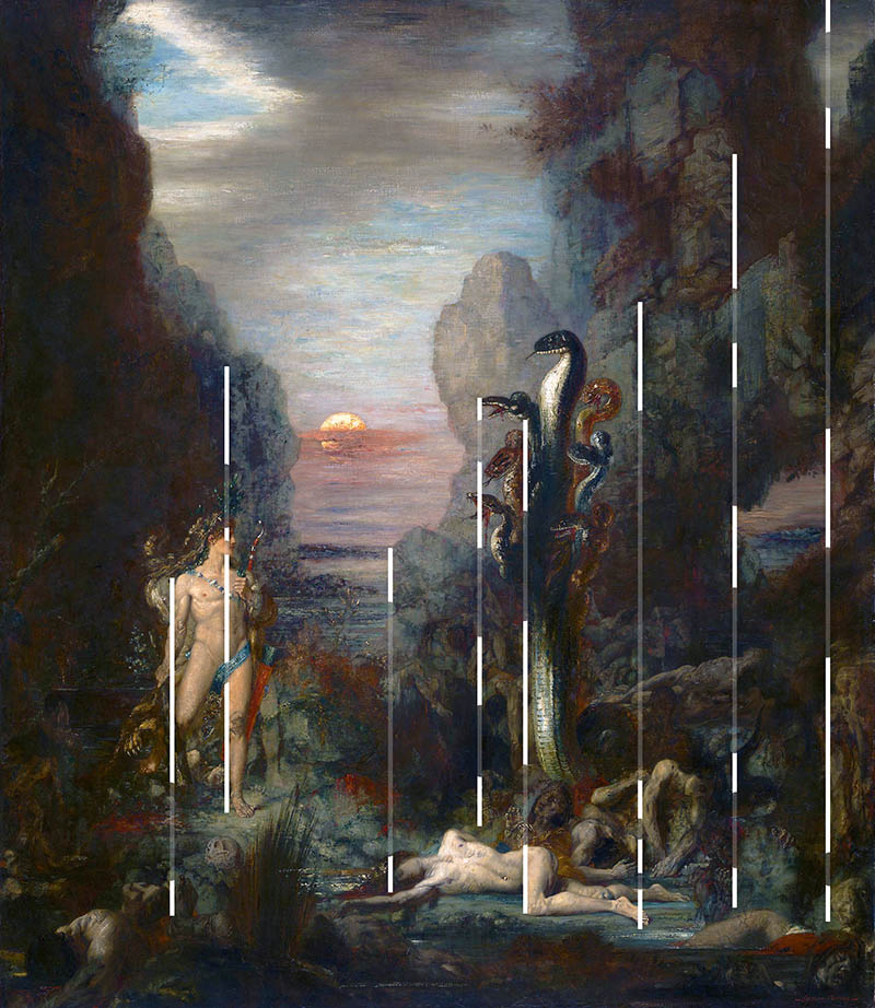
These vertical coincidences (see Day 48) can be found in the foreground and background to help create unity and movement. Look at the one uniting the Hydra with the fallen body below. Hercules is also united with one of the Hydra’s unfortunate victims on the left side.
Horizontal Coincidences
These horizontal coincidences unite Hercules, the Hydra, sun, cliffs…many things. These coincidences can be created with hard or soft edges…the more varied, the better (see #578).
Enclosures
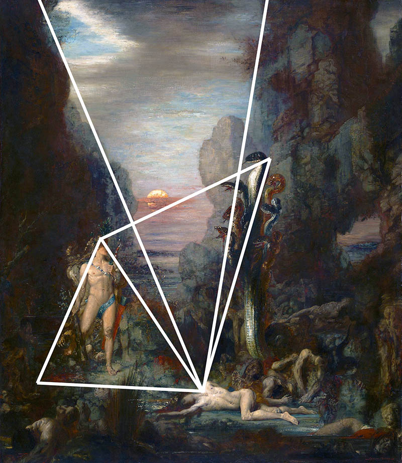
There were several triangular enclosures within the composition. Did you see them before they were pointed out? Did you feel them? They adhere to the Law of Closure (see Day 32 & Day 87) which is a Gestalt Psychology principle that basically states the mind will fill in gaps to simplify visual stimuli. Subtle or obvious changes in contrast can easily create these, as well as other techniques to follow.
Ellipses
There were several small ellipses (see Day 34) hidden within the composition, but nothing big enough to tie all of the characters together. This is fine, and that’s why we have arabesques!
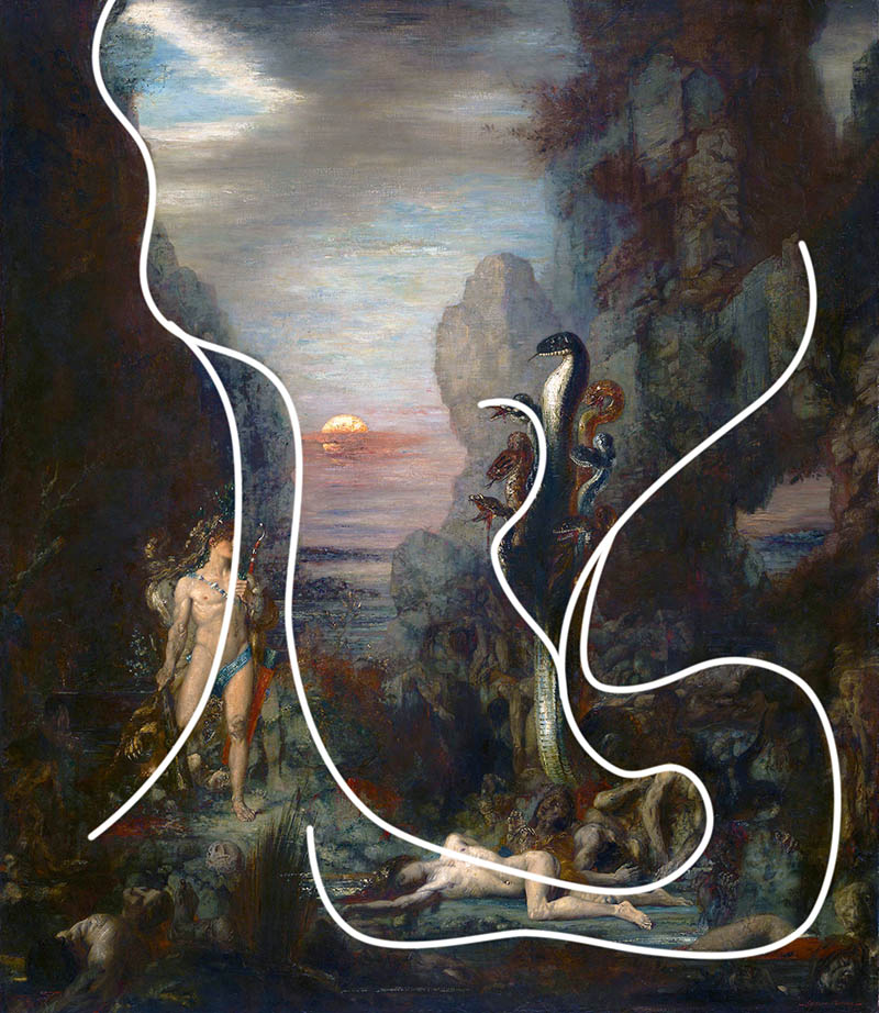
Arabesques
Notice the elegant movement of the arabesques (see Day 17) sweeping around the composition. Beautiful, isn’t it? They unify multiple subjects, and it’s another technique we can use to provoke emotion within the viewer (see Day 353).
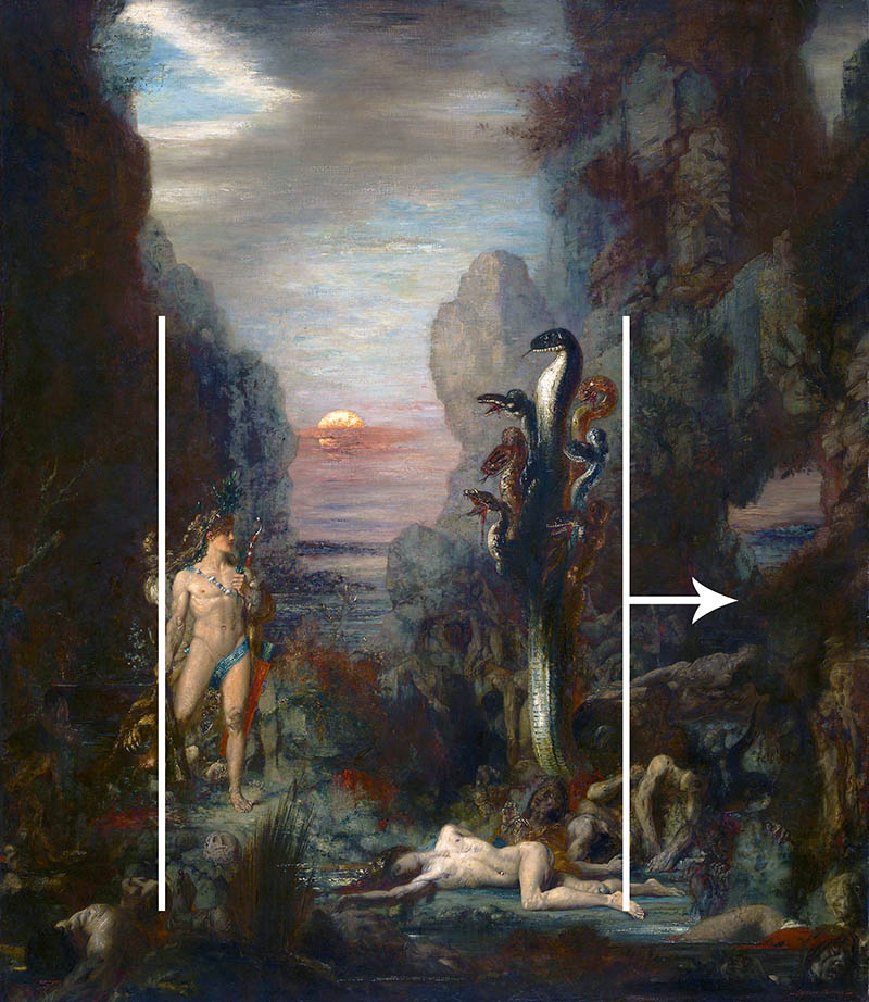
Gazing Direction
When we find the bulk of the composition, we’ll see that the extra negative space on the right makes the gazing direction (see Day 99) go from left to right. This balance works well, and I like how he made a little window in the cliffs on the right. It all helps the image balance from the vertical centerline.
Flipped
Does this flipped (see #638) version work better or worse? As we know, the location of the contrast will also be affected by the way we read left to right. It actually works pretty well here since the Hydra is more in the upper-left area, but the original is still better. This version seems a bit too right-heavy because we have the high contrast of the sky and Hercules.
Breathing Room
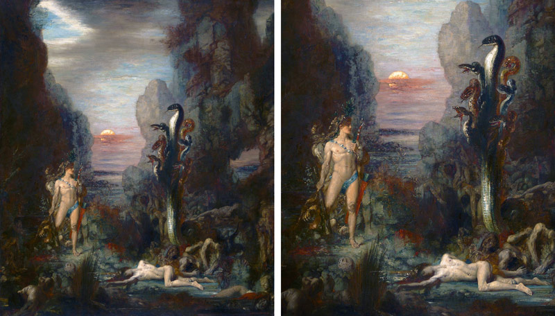
There is excessive negative space on the top, which leaves plenty of breathing room (see Day 102) for the composition. Is it too much breathing room? In other words, can we crop anything off and not miss it? Will we still be telling the same story and bring more attention to the subjects? Let’s crop it and see!
Original vs Cropped
What do you think? In the cropped version on the right we definitely bring more attention to the subjects. Of course we miss out on some of the environment and scattered victims, but it’s a trade off. It’s safe to say that both work well, so it depends on the artist and the story that they choose to tell. Take your hand and cover up the version on the left. The cropped version will grow on you!
Aerial Perspective
There’s tons of aerial perspective (see Day 42) within the composition to create depth. This is done by reducing the contrast in the distant cliffs and sun, but also with lighting techniques in the foreground. If we reduce contrast and use lost edges (see #578) we’re able to effectively create more depth.
Figure-Ground Relationship (FGR)
The main areas of the characters have nice FGR (see Day 21), and both have an aspective view (see Day 78) to help us identify the shapes easier. The mid-section of the Hydra’s FGR and aspective view could be defined even more, but we’re still able to understand what is going on. Plus this image could be a bad reproduction.
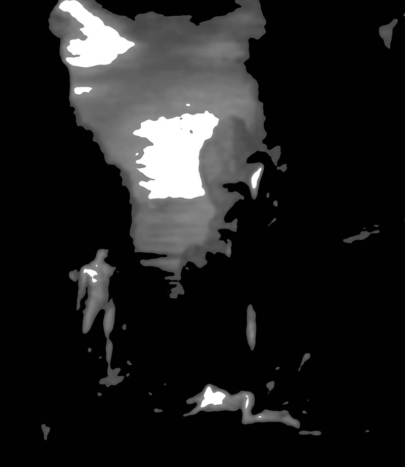
BW Blur
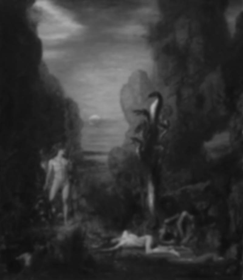
Are you squinting at your art? This simplifies the scene and helps you identify where the contrast is. We can clearly see the main subjects in this simplified version. That’s a good thing! If we couldn’t, our composition would nee some rework because the contrast is not sufficient.
Edge Flicker
Gustave keeps the edges free of distracting high contrast, but there was a little EF (see Day 49) in the upper-left corner. Notice how the clouds and contrast are creating a diagonal into the composition. This is not the footprint of an amateur. Gustave knows exactly what he’s doing by leading the eyes back into the painting!
Greatest Area of Contrast (GAC)
As we might’ve guessed, the GAC (see Day 71) is divided into three subjects…Hercules, the Hydra, and the victim on the bottom. Of course the sky is high contrast, but the mind automatically dismisses this as the main subject and moves to the interesting characters. Kind of like we would a lamp or street light.
Conclusion
Gustave Moreau was an unknown artist to me prior to my visit to Paris in 2019 (see #582). After that, I’ve grown to appreciate his mastery and attention to detail. He also has a “bedazzling” kind of way to create jewelry and light. Check out some of his other paintings and you’ll see what I mean. You gotta look close though!
Hopefully you’ve seen that he simply uses the same powerful composition techniques as other master painters. The same techniques we can use in our own art. Thanks again for all of the support, see you in the next one!

