How to Design a Book Cover and Abstract Letters with Dynamic Symmetry

#542
Hope you are all doing well today, welcome back! Huge thanks for all of the continued support!
Today we are going to be looking at how to use dynamic symmetry to create a unique book cover and abstract letters. It’s something a bit different, which is great because it shows how these design techniques and dynamic symmetry can be used in any visual art, especially graphic design. Aside from the “behind the scenes” examples, I’ve also created a video to show you exactly how I created the abstract lettering, why I designed it this way, and what inspired me. Let’s get into it!
A Master Painter Inspired by
Most of you may have noticed that there’s a lack of authentic, endearing, hand-crafted things out in the world that we can readily enjoy. This was one of the qualities that I wanted to infuse within the new dynamic symmetry book, and it was inspired by Henri Cartier-Bresson’s book called “The Decisive Moment.”
So why is Bresson’s book so special…other than the excellent photos?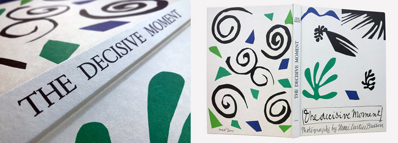
Well, if you’re not familiar with Henri Cartier-Bresson, he was a master photographer who is known for his photojournalism and street photos. He was obsessed with geometry (a.k.a. dynamic symmetry) and referred to its application as an “intellectual pleasure” (see #472).
On top of that, he rubbed elbows with some of the best artists of his time. He captured a lot of them in his photos, including Man Ray, Maurice Tabbard, Salvador Dali, Pierre Bonnard, Pablo Picasso, Alberto Giacometti, and Henri Matisse. This leads us to the creator of his unique book cover, who was Henri Matisse.
What Matisse did to design the book cover was use his unique paper cutouts. In the following images we can see him crafting his art with massive scissors. As you watch the quick video below, you’ll learn that he was diagnosed with cancer and was somewhat immobile. That didn’t stop him though, because he used his paper cutouts to create a new, colorful world around him.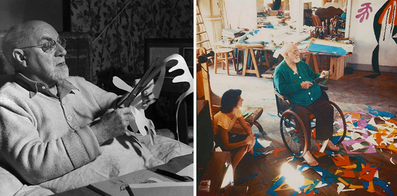
Quick Video
Check out this quick video if you’d like to know a bit more about Matisse’s colorful cutouts and how he inspired others.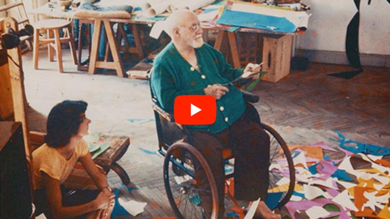

Book Cover and Abstract Letters Designing the
Ok, so now that you know how the book cover was inspired, let’s take a look at the rest of the process. First, I suppose you should know why I didn’t just make things easy on myself and use a standard font like Helvetica to design the book cover.
The thought of using standard/traditional fonts was not very aesthetically fitting for the crafted look I was going for. Most book cover designs we see have a standard font for the title and an image/illustration, but most of them don’t jump out at you. Some are great, but most are pretty ordinary. I wanted something unique…opposite of ordinary. That’s what most of us want in our art…to be original and not like everyone else…right?
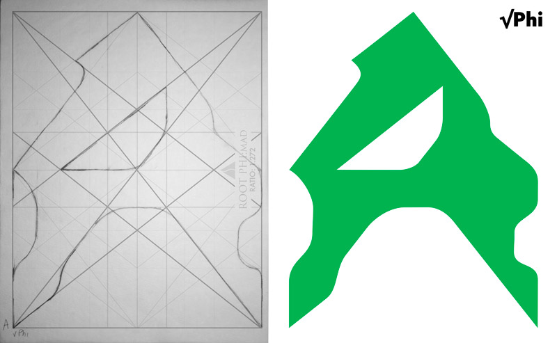
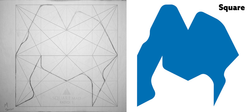
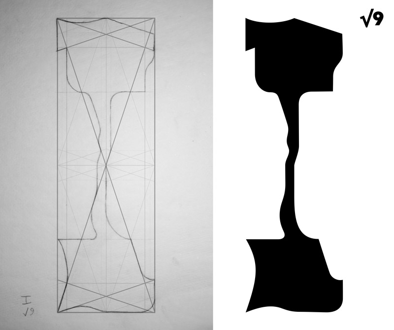
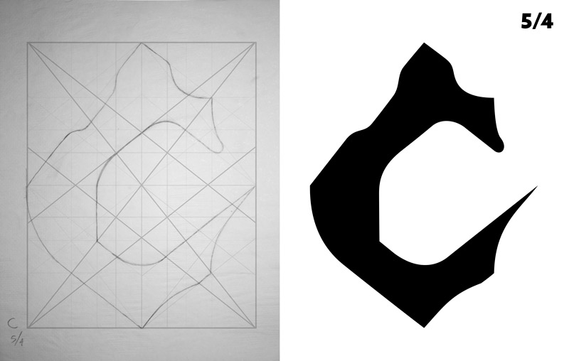
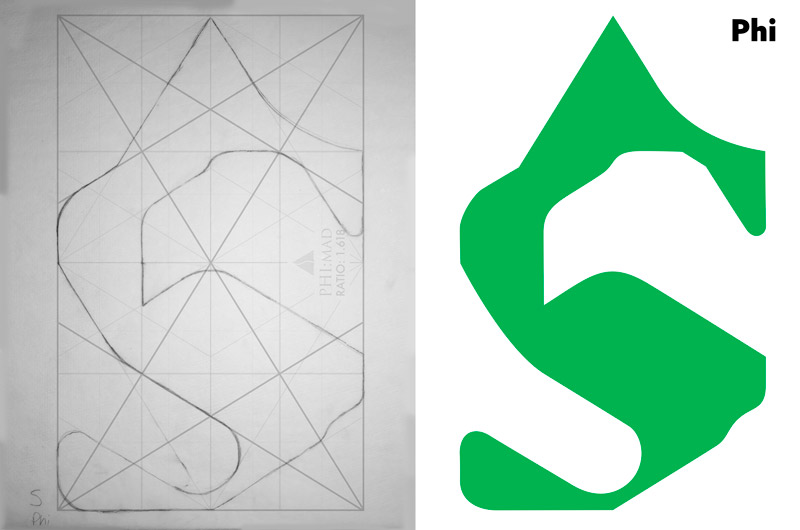
In the video, which is further below, you’ll see how I do a live demonstration on the light pad. I love using this thing by the way! It’s such an easy way to apply dynamic symmetry to your art. With the grid printed onto 11×17 paper (cut to 11×14) and a piece of 11×14 tracing paper, I’m able to work my way around the grid and create a unique letter. Not only that, but we’ll learn in the video how dynamic symmetry promotes unity, movement, rhythm and strength within the letter. All those powerful techniques are infused within the letter with very little effort.
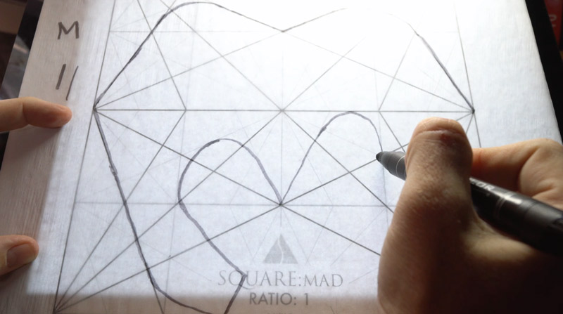
The letters don’t have to be aligned like you’re a robot. There can be wiggles and squiggles in your line, and the alignment to the grid doesn’t have to be perfectly exact either. As long as we’re in the ball park, the effect of its application will still work well. An influential artist/teacher by the name of Harold Speed (see #387) , has a great quote we should keep in mind when using dynamic symmetry.
“There must be enough play between the vital parts (of a piston) to allow of some movement (life); “dither” is, I believe, the Scotch word for it.” ~ Harold Speed
Words of wisdom, right? He explains how a piston won’t fire if it’s fitting perfectly. There has to be a bit of wiggle room for it to work. Allow some dither in your art when you’re applying dynamic symmetry. Get it as close as you can, but don’t stress if it’s just a little off.
Here’s another great quote that he follows shortly after in his book “The Practice & Science of Drawing.” (free PDF download in article #387). Anyone else feel the same way? I know I do. I’ve done academic drawings (Bargue plates) and they look like everyone else’s drawings…cool in a way, but lifeless. They still serve a purpose in training the eye to see individual shapes and subtleties in value.
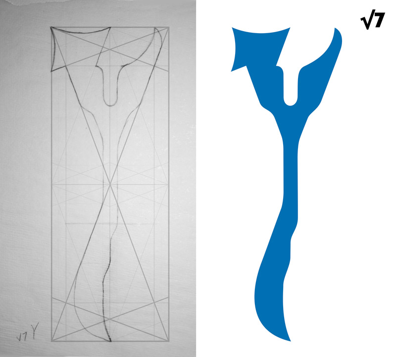
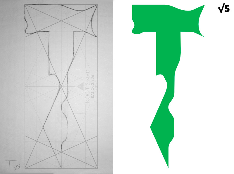
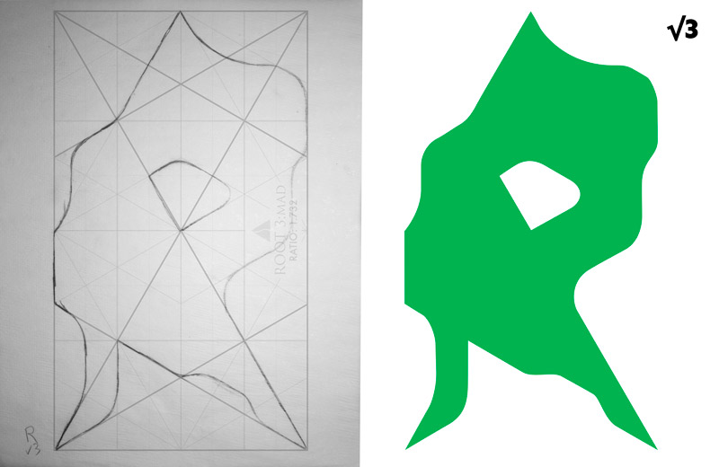
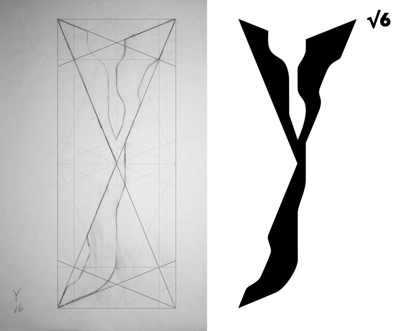
As you select a dynamic symmetry grid, you must always consider the subject and the surrounding environment, props, etc. My subjects are letters…each getting their own grid. Since the “Y” is typically taller and skinnier than a “D,” I’ll select a grid that will hold the subject without having excessive negative space. We can see the same kind of logic being used in this amazing painting by Jules Joseph Lefebvre. His subject is tall and skinny, so he selects the root 6 grid to compose the painting. Not too much negative space and not too little…just right. Although, excessive negative space can serve a purpose when it portrays isolation, loneliness, or a grand scale.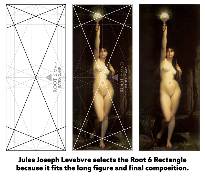
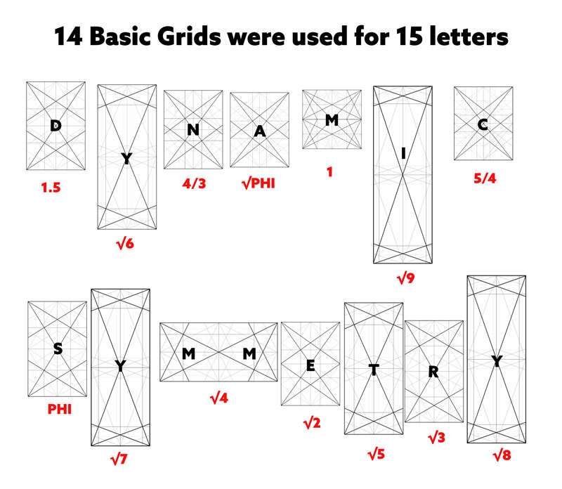
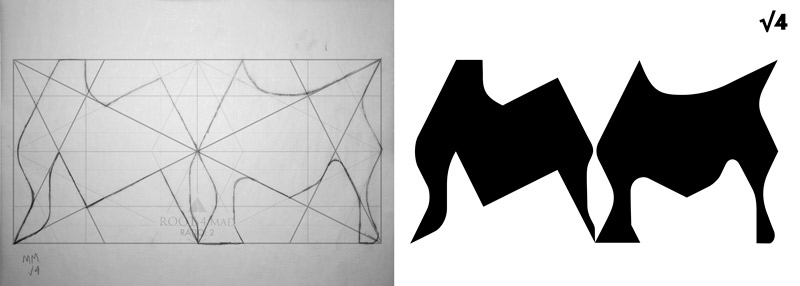
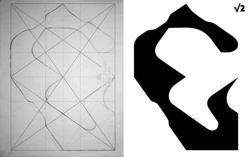
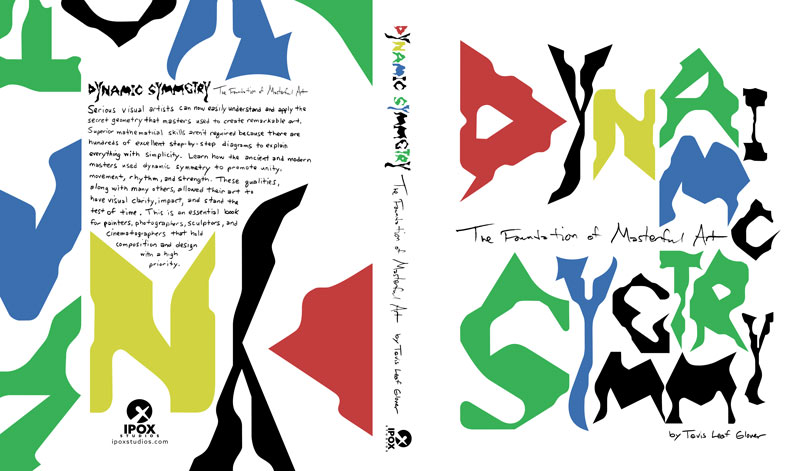
The words “Dynamic Symmetry” have 15 letters and in the book I cover 14 basic grids (square, roots 2-9, 1.5, 5/4, 4/3, root phi, phi), so I designed the “MM” with the root 4 rectangle. Since the root 4 consists of two squares, I used the square to compose the “M” in the word “dynamic.” This way all three “M” designs had a similar shape and feel. You can also see in the diagram below how the letters (subjects) were planned out according to the shape of the grid.
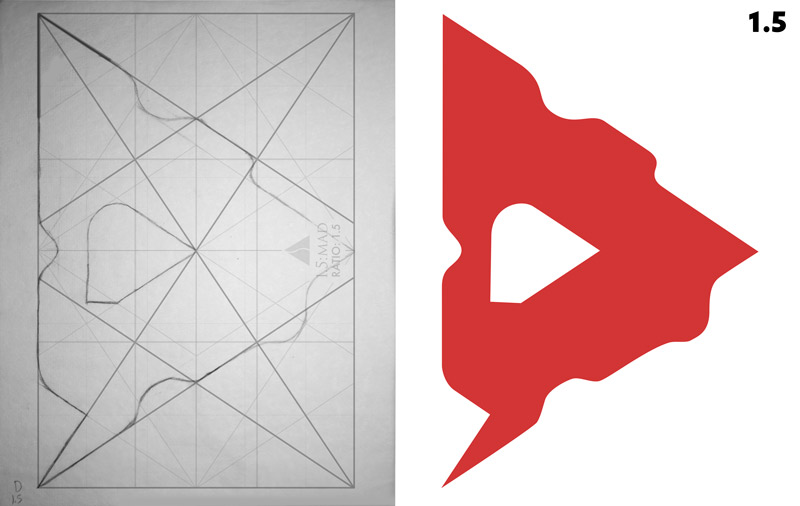
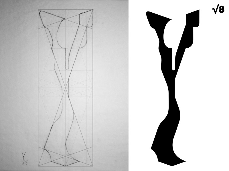
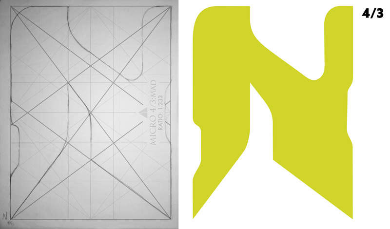
Now that you know the concept, we can run through the letters and see how they were designed within the grids. Make note of how curves and sharp points were created. We don’t have to make everything sharp…the lines can be softened or completely rounded. Also, you’ll see little “notches” taken out of long edges, which curve in while paralleling the grid. This adds a bit more interest on the longer edges.
Another thing to note, is that the overall word should be resizable and readable. This means if you see it on a large poster or small screen (iPhone), it should still be readable.
Here’s a look at the front and back cover. You can see that the back cover has the same design as the front cover, but it’s enlarged and flipped 180 degrees. But wait a sec, what about the hand-written words?
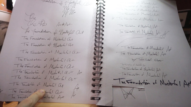
Well, that was also part of the hand-crafted plan. The book Matisse designed for Bresson had hand-writton words on the front, so I wanted to create something similar. I used several different drawing utensils, but liked the feel of my mechanical pencil the best (Graphgear 1000 by Pentel, .05 size). I wrote out the subtitle several times until I got something that looked decent…not too sloppy, and readable.
After I had the subtitle written, I took a photo of it, brought it into Photoshop, and converted it to black and white. Yes, a scanner would be easier than taking a photo, but we use what we have. Right?
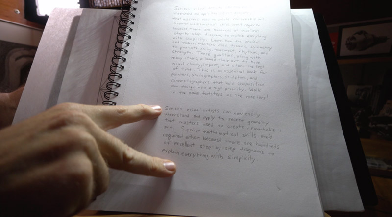
For the summary, I typed it up, then used the same pencil to write it out by hand. I took a photo of the summary and gave it the same treatment in Photoshop.
Arranging the Letters on the Cover
Now that all of the letters are designed, we can see how to arrange them on the cover. We can’t just eyeball them and call it good. We have to use a grid and some other techniques to make it the best we can.
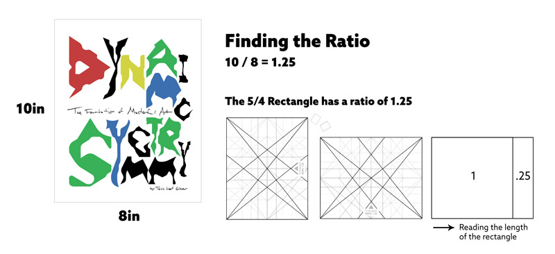
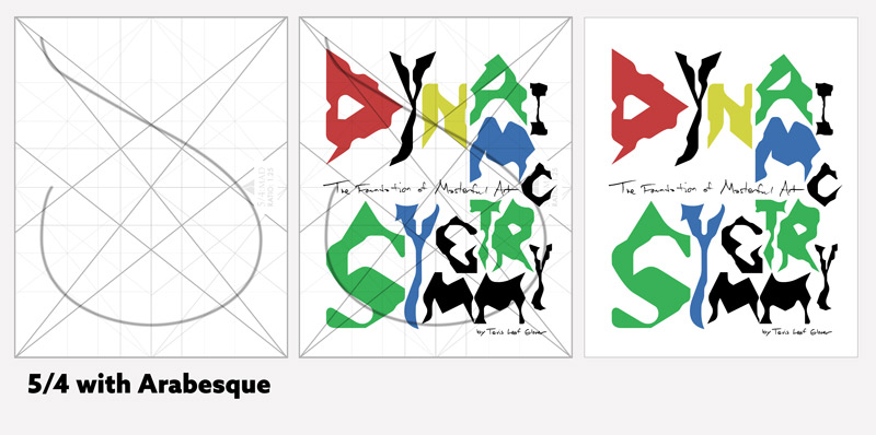
There are several different book sizes available, but the one I selected was the 8×10. So how do we select a grid for this size of book? First we have to find the ratio, which is easy. We just divide the longest edge (10in) by the shortest edge (8in), which gives us a ratio of 1.25 (10 / 8 = 1.25). Fortunately, this is the exact ratio of the 5/4 grid, so that is the one that was used to help organize the composition further.
You can see in the next diagram (example on the right) how we read the ratio from left to right. This means the 1.25 ratio is the same as one square plus a fourth of a square. Pretty easy, right?
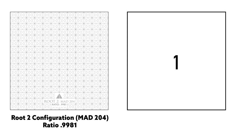
The grids can be configured in many different ways if none of the basic grids fit your subject. Say you’ve got a square canvas, which is usually composed with stacked root 4 rectangles. Typically we select a grid based on the diagonals of the scene/subject and the shape of the subject. But if the diagonals of the root 4 rectangle aren’t working well for the composition, and you find that the root 2 grid fits your subject better, you can reconfigure it to be approximate to the size of the square. Sounds confusing if you’re just learning about dynamic symmetry, but it’s just like stacking the bricks of a building to create a shape.
In the next example you’ll see how 204 root 2 rectangles are combined to give us a ratio of .9981, which is very close to a square. Interesting, right? This is just one example of how flexible dynamic symmetry is!
The grid package was updated to reflect this unique grid configuration as well as ALL of the grids covered in the book.
We know we want to use the 5/4 grid to help organize the book cover, but we also need to try and incorporate some more movement. That’s where the arabesque comes into play. This curvilinear element (the “S” looking line) will help create unity and movement in the design. All we have to do is align the letters to it in a hidden way, while also locking in the letters to the grid.
Just keep nudging, moving, and aligning pieces until the design starts to look nice. We’ll even see how the words are jumbled a bit, but they can still be read. This is similar to seeing the word “spaghetti” or “spahgetti,” which are both read the same without confustion.
The grid also helps place the subtitle and the author name near the bottom. With any intersection point of the grid, an “eye” can be created. With these eyes, we can generate more horizontals, verticals and diagonals to help organize the composition.
Video
Well, you’ve seen what inspired the book cover and how the letters were created. Now it’s time to enjoy the video where I demonstrate everything and talk about some interesting dynamic symmetry related tips.
Conclusion
Whew, that was a lot to do for just some measly ol’ book cover, right? Aside from the extra effort, it’s a great way to sharpen your skills and begin to see how dynamic symmetry can be used to promote unity, movement, rhythm and strength. Use a light pad as a great shortcut! Doodle onto some tracing paper. Have fun with it! Curve the lines or lock them in exactly. Configure different grids to fit your needs.
Thanks for joining in everyone, I’ll see you next time!

