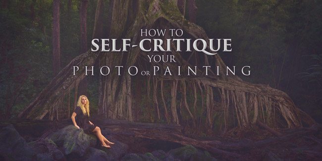
How to Self-Critique Your Photo or Painting
#444
Hey everyone, welcome back to another educational article based on composition and design! As always, huge thanks for the amazing support!
Today we are going to take a look at some highly effective techniques you can use to critique your work when no one else is there to help you out. We’ve covered some of these techniques in the past, but this time everything is consolidated into one article. Being skilled at self- critiquing your art allows you to progress further and surpass any plateaus, all while being brutally honest; something your family, friends, and peers have a hard time with. There are several ways, so join in and learn how to see your art with an unbiased opinion.
We Are All Insecure with Our Art
Being insecure with your art is a natural occurrence. We are always asking people, “how’s this look, what do you think, would you buy this, is it too dark, what should I tweak, do you get it?” The questions never stop, but to be honest, we are the professionals. Why are we asking them? We are the experienced artists, not them. The dilemma we face is that we get too familiar with the piece we are working on. We are too emotionally involved with how it was created…we were there when we took the photo…we were there making each paint stroke. In result, we have a hard time seeing it with new eyes. We’ve been staring at it for so long that we can no longer use our logic to determine what necessary step is next. That’s why for hundreds of years artists have been using techniques to escape the trench of numbness that is developed when working on a piece of art for too long. Let’s learn to use our skillset, our knowledge, to make the next move on our own. No one’s help needed.
Culling Your Work
Here’s a great quote from an older newsletter by Myron Barnstone (from 1982) that talks about culling our own work. I agree with it, and he had such an amazing way with words…even though I’ve expressed my feelings about intuition (see Day 108) vs muscle memory (see Day 45).
“History does us a great service. Minor hacks and mediocre efforts get left by the way; only the finest works tend to survive. The culling, in our own time, is left to us. To be able to separate the important work from the shallow and merely derivative, to know good from bad requires a substantial education. Such an education must be coupled with an almost spiritual power of intuition, a sense of one’s time and a knowing appreciation of an artist’s integrity: No small challenge.”
Culling is when you sort through the crud to find the gold. A miner sifting for gold by the riverbed can tell the difference between pyrite (fool’s gold) and the real stuff. This is because he has the knowledge and experience to do so. If he can’t tell by eye, further tests can be administered to validate his educated guess. The same goes for our art.
Techniques to Find Your Golden Nuggets
I’ll summarize the techniques here, then cover each of them below.
1. Remove all emotional attachment.
2. Understand the limitations of the art genre.
3. Did you apply design techniques (use Design Scoresheet)?
4. Is there a hierarchy?
5. Is the story ambiguous?
6. Shrink the size.
7. Flip and rotate the image.
8. Cover up or edit out part of the image.
9. Desaturate the image to see the tones.
10. Squint and blur your eyes.
11. Surround the image with white, gray, or black.
Did you over-process your image?
Remove All Emotional Attachment
Forget how many paint strokes you made, or how nice the lens was that captured the photo. Forget that the weather was crappy and you did it all by yourself. Forget all of that stuff. Everything you experienced while creating this cannot be a part of our self-critiquing session. The admirer of your work doesn’t have this info. All they have is the two-dimensional representation of your creation, that’s it. Drop all emotional attachment at the door, I mean it! Try your best to pretend you didn’t create the art you are critiquing. Every voice inside your head that insists something positive related to the creative act is a sign of you being emotionally attached to your art. Silence the voice, and reveal an unbiased opinion.
Understand the Limitations of the Art Genre
Not all of these techniques can be used for every genre of art. Some photography, like street photography, makes it impossible to incorporate every design technique due to the method of creativity. This is why we need to understand the limitations of our genre of art (see Day 98). Painters or fine art photographers will certainly have more freedom to employ the design techniques that create a masterpiece, when compared to a wedding photographer. It boils down to time and method. The more time you have, the more planning can go into it. So, understand your genre and critique the design of your image accordingly.
Did You Apply Design Techniques?
The Design Scoresheet is available to download on the Resources Page.
The design scoresheet is the best way to keep track of the techniques you are using and score your art (see #403). Placing your art next to this list and going one by one down it will determine if you have created something remarkable. It will allow you to critique your work based only off of the design techniques you incorporated. As mentioned before, it also depends on the limitations of your art genre.

If you’re not familiar with any of these techniques, be sure to click the links below and study them thoroughly. They are tremendously important for creating and critiquing.
Main Subject (see Day 109), Pleasing Light (see Day 113 & 115, Greatest Area of Contrast (see Day 27), Figure-Ground Relationship (see Day 21), Dynamic Symmetry (see Day 14), Dominant Diagonal (see Day 63), Gamut (see Day 38), Gazing Direction (see Day 99), Breathing Room (see Day 102), Arabesque (see Day 17), Coincidences (see Day ), Edge Flicker (see Day), Color Harmony (see Day ), Aerial Perspective (see Day ), 90 Degree Angle (see Day ), Aspective View (see Day ), Enclosure (see Day ), Add Life (Gesture or Movement), Radiating Lines (see Day ), Ellipses (see Day ), Separated Shapes (see Day ), Overlapping Shapes (Half, Third, Phi), Original (Concept or Interpretation)

Is There a Hierarchy?
When you incorporate a hierarchy (see #442) into your art, you are helping the viewer determine the importance of each subject. A hierarchy that is planned will help deliver your visual message with clarity, and avoid any confusion in the viewer.
An easy way to think of hierarchy is large, medium, or small. When you look at a photo or painting you will notice the largest subject before the smaller one. We can also create a hierarchy out of texture, tone (see GAC), color…tons of different things. When we remember the Law of Similarity, we can even create our hierarchy by creating a difference in a field of similar objects. For example, a singular woman would stand out in a group of 200 men. If we made her with the most contrast, and the only one wearing a furry red top, then we would increase the power of the hierarchy.
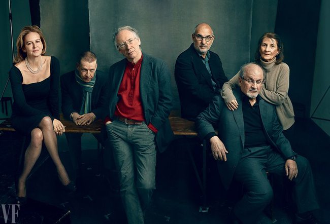
In the photo below, Annie Leibovitz creates a hierarchy with the color red. It doesn’t matter if you know who the people are or not, we are being told that the man in red is the most important. The second most important character would probably be the woman on the left based on the amount of contrast she has with the light skin and dark dress.
Is the Story Ambiguous?
If the person represented in the image is a stranger, then we are better off. We need to pretend we don’t know that he/she is a celebrity; a comedian, doctor, mother, etc. When we view an image we should need no other context to complete the story. Like when you show your photo to a friend and you say, “I was standing on one foot when I took that, and after the shutter clicked the sun went away, so it was the best shot I could’ve hoped for. I used a wide angle lens, that’s why there’s not bokeh. I retouched her skin, and makeup, nice right? And see how I placed her into the background? That’s suppose to mean she is being swallowed by the trees.” Zzzzzz! Snooze-fest, boring! A great image doesn’t need any other context to tell it’s story.
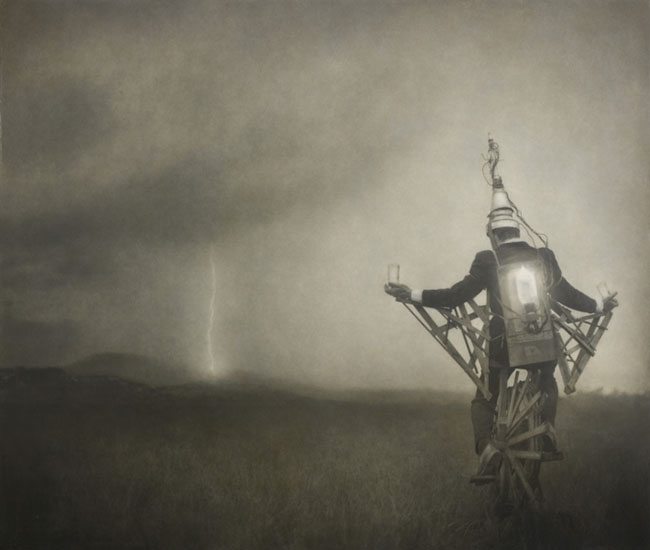
If you tell a story that is ambiguous (see #440), meaning you leave a little to the viewer’s imagination, it increases the longevity of appreciation they have for the piece. Keeping it ambiguous will create an opportunity for the story to change over time as the viewer experiences new things in life. At first they might view the image below by Robert ParkeHarrison as being a sorcerer like Harry Potter, who can conjure powerful bolts of lighting. Ten years down the road, after watching storm chasers on TV, they will probably view the photo differently.
Shrink the size
These next techniques are going to be a piece of cake. They mainly have to deal with certain tweaks we can do on our computer, a phone, or our bodies.
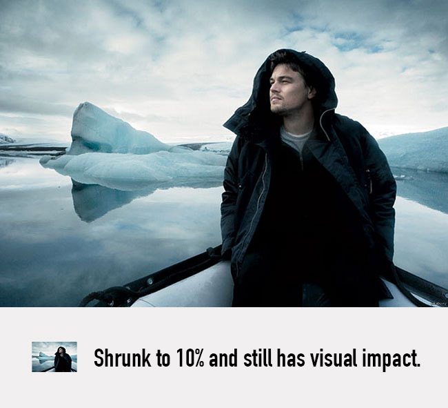
When you shrink the size of your image, you are able to see the visual impact it has, without all of the fine details. That’s why it’s good to have a profile picture that has visual impact, because we always see it at a smaller size (see #405).
It’s easy to shrink your photo, or a picture of your painting in Photoshop or on the computer, but there are other ways to do this. We can use our phone to take an image of it and view it on our phone screen. We can also view it from across the room or across the street. Place your photo or painting in a location to give you some distance from it. Determine if you can still tell what is going on. See how the colors work with each other.
If we can still determine what is going on in the scene at a thumbnail size, then the image has adequate contrast and potentially visual impact. With visual impact the image grabs our attention and we can see the shapes at a glance from a distance. Low contrast images work just fine, but they don’t have visual impact (see #441). We can see this in the photo below by Annie Leibovitz.
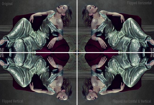
Flip and rotate the image
Another way to see your art from a different perspective is to flip it upside down (see Day 29). Again, we can do this on the computer, the phone, or physically. Try flipping a print of your photo or take your painting, then cover it for a couple of hours. Uncover it without looking, walk away and view it from a distance. Do you see anything you need to adjust?
On the computer we can flip it horizontally or vertically to give us another perspective. Sometimes when we flip it horizontally we can see a change in the direction because of the sinister and baroque diagonals. Does the models gaze improve the flow and balance of the image? If it’s a painting, does the balance look right? The direction of the image usually changes and can sometimes work better.
We can see how flipping and flopping the image changes the movement in another great photo by Annie Leibovitz.
Cover Up or Edit Out Part of the Image
Another great and simple technique to try is to cover up part of the image. This allows us to see the whole image without certain pieces that might distract from our main subject or message.
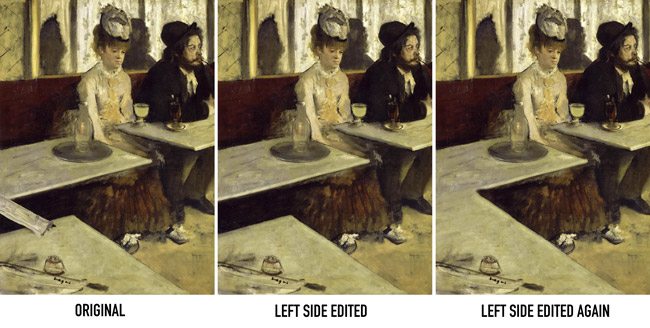
Let’s take a look at Edgar Degas‘ masterpiece below to understand how covering up or editing out can help us determine the importance of a design element. If you are aware of edge flicker (see Day 49) and GAC (see Day 27), you’ll probably notice that the newspaper bridging the table gap on the left is gaining a lot of attention. If you take your finger to cover up this area we have more attention going back to the main subjects.
If we use Photoshop to edit out this area in different ways, as seen below, we can determine if the changes are improvements, or not even needed. Personally, I like the middle version the best, but I would lower the contrast within the gap, and put something more interesting on the lower table…maybe an empty drink, or someone else’s hands holding a pipe or drink (for ambiguity). If you’re going to have high contrast near the edge (which isn’t recommended), make it more intriguing than, what looks like, an ink well and a knife handle (could be an ashtray though). Sure, easy for me to say!
Desaturate the Image to See the Tones
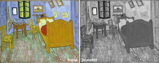
We can take our photo into Photoshop, or use our phone, and desaturate the image to see the tones. Color has a tendency to define our subject, so once it’s taken away we are able to see areas that might need more contrast to be more defined. A grand image should look great in black and white or color. This means that the composition is right on course. Sometimes color or black and white imagery can determine the mood of the piece as well (see Day 178).
We can see how Van Gogh’s masterpiece below looks pretty good in black and white as well as color. The only areas that are lacking enough contrast are the two framed images on the lower-right side of the wall.
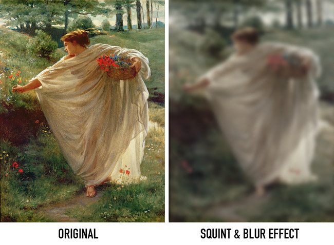
Squint and Blur Your Eyes
Another easy way to see things differently is by squinting. When we squint, we are able to simplify the tones in the image. Make sure that the areas of high contrast are near your subject. You can also use your phone to underexpose the photo to see the lightest areas, then take a picture of it (on an iPhone, touch your screen and swipe down). You can do the same for overexposing, which helps you see the darkest areas of the image (on an iPhone, touch your screen and swipe up).
Blurring your eyes simplifies the shapes and colors to allow you to see the image differently. Don’t forget to close one eye! If you don’t you’ll feel cross eyed. You can use your phone for this as well, just take an out of focus picture (on an iPhone, touch/hold your screen on the background to throw off the focus, then reposition the camera to take the photo).
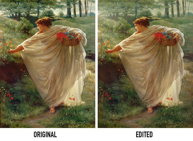
We can squint and blur our vision with the amazing painting below by Edward Poynter and begin to see how the background might be less distracting if subdued by aerial perspective (see Day 42).
When we compare the original to an edited version we can see how the subject gains more attention and we get a more ethereal feeling with aerial perspective.
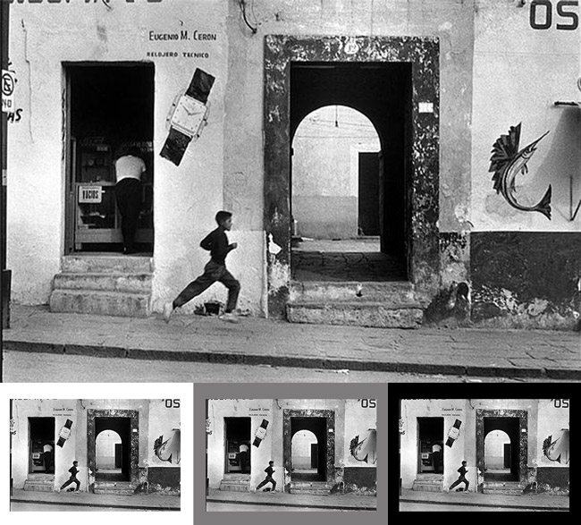
Surround the Image with White, Gray, or Black
You may notice that some colors and values change depending on their neighbors. This is due to simultaneous contrast (see Day 28) and the way complimentary colors (see #370) work. Take your painting and place it on a black, gray, or white wall. Does anything stick out at you? Take your photo into the computer and surround it with the same shades. Notice anything different? This is why some photos are framed with white or black matting. It changes the way we see the image.
When the image is lighter, then placed on a black background we are able to see the edges more clearly and determine if we have Edge Flicker (see Day 49). In the photo below by Henri Cartier-Bresson, we are able to see the dark distractions near the edges when the image is on a white or gray background, but not a black background. This is why, when you edit your photos on the computer, you should always test the image with different colored backgrounds. The same goes for your painting or digital art.
Did You Over-Process Your Image?
Nothing is worse than an over-processed image. Your editing and effects should be subtle, not obvious. If you have a super dark vignette around your image, then you are failing to understand edge flicker, and hiding it with a Photoshop effect. If you overlaid a texture and we can easily see it, then you are creating visual noise that distracts from the subject….unless that’s what you are going for. Did you retouch the skin of the model, but make her look like a glass doll? Keep your processing clean and subtle to avoid looking cheap. This is why most HDR images are horrible, because the effects are too strong…not subtle.
Painters, did you over work your paints? Stop smudging, smoothing, and blending. Lay down the stroke, then walk away like a master. Did you control your color to enhance your composition and bring attention to your subject, or did you splash red everywhere because it felt right? These are all things to consider when critiquing your potential masterpiece. Keep things subtle and simple.
Leonardo da Vinci is known for saying that simplicity is the ultimate sophistication, but this was way before powerful design techniques were watered down with sloppy expressionism and the rule of thirds.
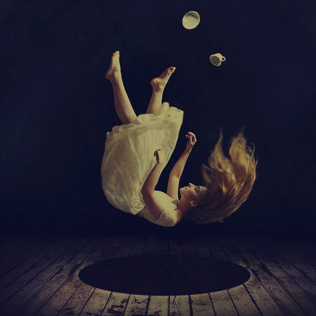
Here we can see a photo by Brooke Shaden that I think is a very cool concept, but she went a little to far with the post-processing effects. See the dark vignette that chokes out the life of the image? The FGR (see Day 21) of the main subject is lacking as well.
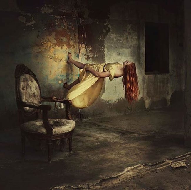
This one is much better in terms of processing and composing…both self portraits by Brooke.
Conclusion
Now, let’s see if that helps you out to self-critique your art with new eyes. Knowledge is the best way to surpass your plateau and reach the master level. Stop waiting for your friends or family to stroke your ego with their candy-coated critiques. Be brutally honest with yourself by using these techniques and watch your self-critiquing abilities push you to the next level.
Thanks for joining in everyone, see you next time!