Mastering Composition to Get More Keepers – P.O.V. Black and White Street Photography
#439
Hey everyone, welcome back! Huge thanks for all of the continued support. A year has gone by since the last video “Mastering Composition to Get More Keepers,” so I’m excited to bring you this black and white follow-up. I’ve packed it full of excellent tips and design techniques, which can be applied to many different types of photography; wedding, travel, lifestyle, sports, fashion, and conceptual. Painters can even use these techniques to capture the perfect reference photo for their new masterpiece.
Mastering Composition to Get More Keepers Video
Here’s the video for everyone! Enjoy, and don’t forget to subscribe and like on YouTube if you would like to see more.
Why Street Photography?
The great thing about street photography is that there are endless subjects and scenarios to keep your skills sharp. You don’t have to rely on a model, or buy tons of lighting equipment.
Gear and Film
Camera: Leica SLR R4
Lens: Summicron 50mm f/2
Film Type: Ilford XP2 400
Typical Settings
Shutter Speed: 1/1000
Aperture: f/11
Focal Distance: 7ft
TRUTH: Street photography is a challenging genre if your goal is to create something remarkable that’s communicated with visual clarity. The rule of thirds won’t get you where you need to be. Learn these design techniques, apply them, and let’s change the future of art!
Lighting
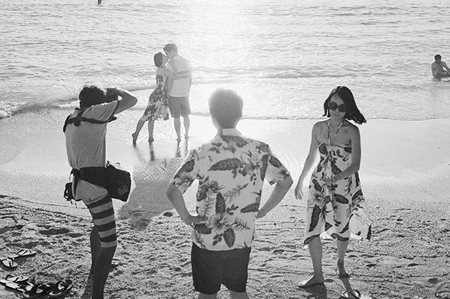
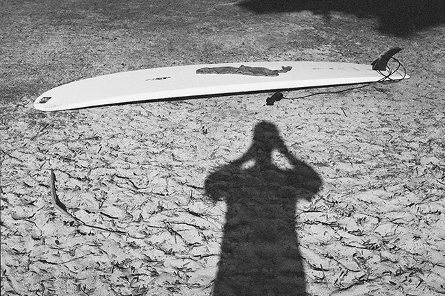
The first thing I do is find the direction of light. To do this I simply look at my shadow. If I see my shadow, it means that my camera is pointed in the direction of light. Proper lighting means that my subjects aren’t silhouettes. When shooting in black and white, I’m very concerned with the shape the subject creates and how it fits within it’s environment. We do this for color photography as well, but it’s extremely important in black and white photography.
Aside from nice lighting, it’s also necessary to remember the role shadows play within our photography. Embrace the shadows! They can define the form and become part of your design.
Learn more about lighting (see Day 209).

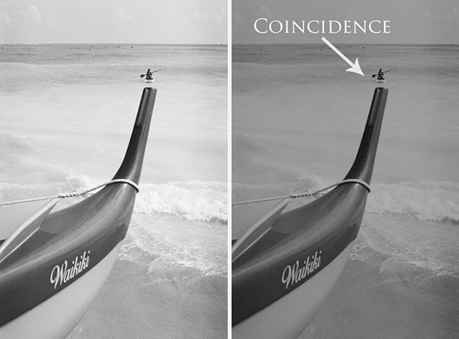
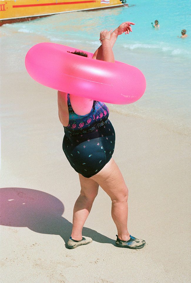
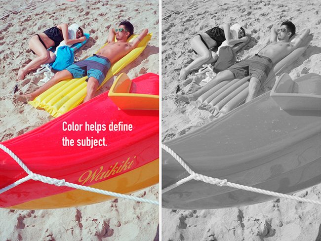
Color helps define the subject, so when we take it away it can potentially kill the composition, story, and design. In the image below we see how the lack of color affects everything. You can’t even read the word “Waikiki” on the boat anymore, and the subjects are not clearly defined.
TRUTH: Most street photographers rarely get one keeper per session. I believe that if you study composition and design techniques, then you will increase your numbers drastically. The “spray and pray” method should never be a part of your arsenal.
Don’t rely on your gut or intuition to create something remarkable. Knowledge and repeated application will develop muscle memory, which allows you to react with a purpose.

Goofy Subjects
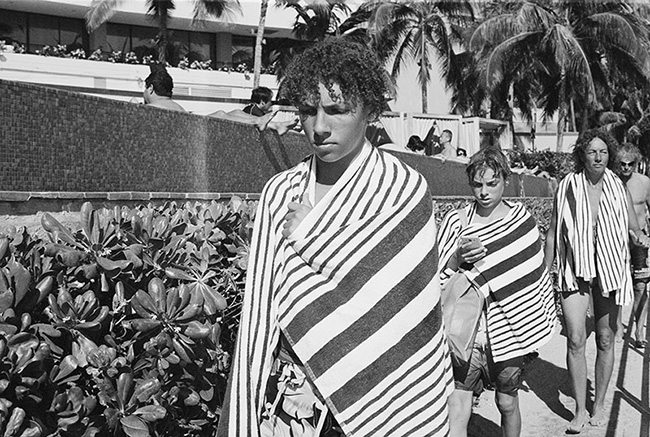
People-watching has always been a fun pastime, so I capture the things that amuse me. A humorous subject or scenario doesn’t complete an image though. We can heighten the candid, snapshot aesthetic found in street photography with the application of composition and design.
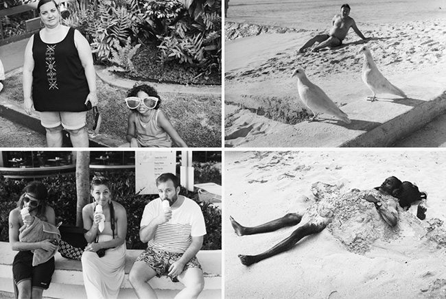
Composition should always be a huge part of any photograph. Without it, the visual clarity is lacking and leaves the viewer either confused, bored, or both. If we have a goofy subject, but a lousy composition, then we’ve just weakened the image. That is, unless it lasts the test of time, but who wants to wait on that? Henri Cartier-Bresson has a great photo of a smiling boy carrying wine bottles; the composition is lacking, but the facial expression and story has lasted the test of time.
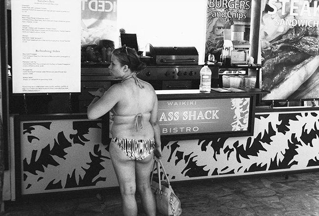
Juxtapositions aren’t covered in the video, but they are also a form of composition. Being able to create a contrast between the subject and the environment requires a certain knowledge, as well as the ability to position the camera properly. In the next image you’ll see a juxtaposition of a sign that reads “Grass Shack,” but with composition in mind we can cleverly reword the sign and juxtapose it with a girl in a bikini.
It’s very hard to achieve a perfect composition in street photography when compared to a great master painting, but if we are able to communicate with visual clarity we are doing very well. Some imperfections are merely adding to the candidness. Commercial photographers might edit out certain areas for a magazine cover or poster, but street photography is widely known as being very true to the environment.
Figure-Ground Relationship
How the subject fits into the background is extremely important, and it’s one of my beefs with the rule of thirds (10 Myths About the Rule of Thirds). If we are plotting our subject on a crosshair without consideration of the background, then the image is destined to fail.
One thing we can do to ensure a nice figure-ground relationship (FGR) (see Day 21) is to draw an imaginary line around the subject. If it collides with background elements that reduce the contrast and dilute the visual clarity, then we should consider making adjustments. Take a photograph of yours that you aren’t too fond of and run a line around it. Check the FGR and see how you did.
We can also squint to reduce the contrast, or blur our eyes to simplify the shapes. We can also think of figure-ground relationship as a pocket of background negative space we need to fit our foreground subject into…like a puzzle piece.
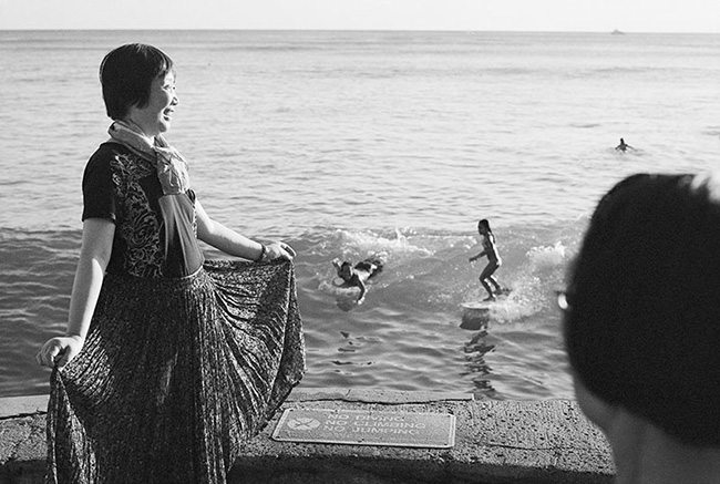
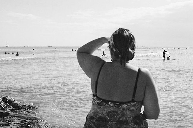
In the example below you can see how the two surfers fit within the pocket between the two women. Foreground and background are both considered to deliver visual clarity.
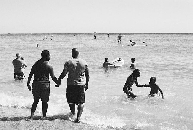
Here’s another example with the foreground subjects displaying a nice FGR and another technique called aspective view (see Day 78). When the subject has an aspective view, it is usually when their limbs are spread to help us easily identify them. You see this a lot when looking at street photos…the man walking with his legs separated…like an ancient Egyptian painting. This is an essential technique for silhouettes since the information is lacking and we need to rely on form to tell our story. Blur your eyes, squint your eyes; with nice FGR and aspective view we can still tell what is going on in the scene.
Gestures & The Decisive Moment
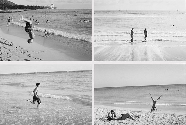
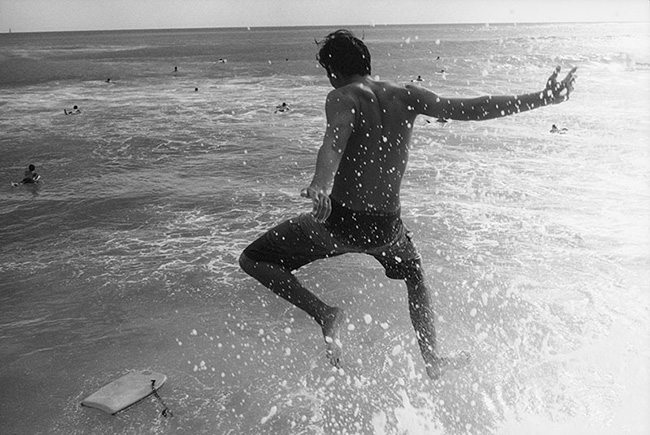
To add life to our photo, we can simply capture gestures. These include simple actions like waving, pointing, eating, throwing, tilting the head, etc. We can also apply our skill and patience like a sniper and incorporate the decisive moment. This is a term coined by Henri Cartier-Bresson and it basically means we wait for the perfect moment to press the shutter. Not before, not after, now!
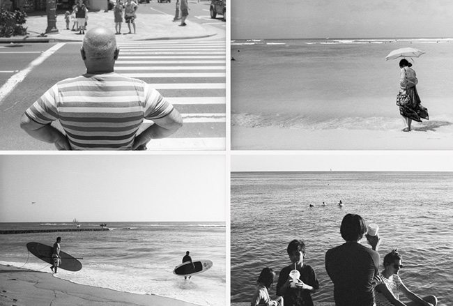
The images below weren’t a result of the “spray and pray” method. These were fleeting moments captured in one shot by anticipating the movement and waiting for the right time to press the shutter button. If we wait to get closer, the moment is gone; if we wait to ensure a straight horizon line, the moment is gone; if we don’t know of aspective view or figure-ground relationship, the visual clarity is gone.
Spontaneity
An unintended crooked horizon line in street photography is a sign of spontaneity. It represents the millisecond in which the photographer captured the image. Straighten the image, and risk losing this context.
Henri Cartier-Bresson, Joel Meyerowitz, Martin Parr, Alex Webb, and Garry Winogrand all have crooked horizon lines present in their photos. Not intentionally created, yet not corrected, allowing them to portray things as they were, keep the spontaneity, and leave the image uncropped. When we straighten images, we crop, and risk cutting off important context. We are street photographers, not fine art photographers. Even Annie Leibovitz has crooked horizon lines in her photos.
What’s more important is to not crop, live with the mistakes, and work harder on composition techniques which don’t require adjustments in post. It’s a discipline that is tough, especially in a world that thrives off of social media and the amount of likes you get on your image.
Separated Shapes
When we take our knowledge of figure-ground relationship and apply it to multiple objects, we get clearly separated shapes. We can add aspective view on top of that and get quit an interesting, clearly communicated image.
Law of Continuity
We can take things a step further and unite our separated shapes with the Law of Continuity in mind. This is a Gestalt psychology principle (see Day 17) that basically means the mind will unite objects on a linear path…much like a dotted line completes an image. We can take multiple objects and unite them in several different ways by using edge-to-edge relationships.
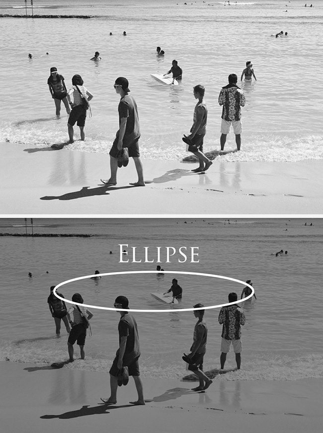
We can see an ellipse being created in the image below. This wasn’t arbitrarily captured. I could see the shape developing before my eyes and waited for the decisive moment. If the surfer in the middle was positioned further up and right, the ellipse would be more complete.
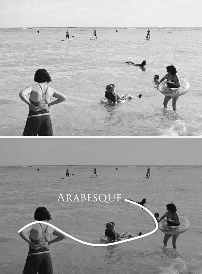
The linear movement seen in this next image was captured in the same way. This wasn’t luck or happenstance. The more you are aware of these techniques, the easier you can sniff them out of the scene and capture them.
A coincidence (see Day 48) adheres to the Law of continuity as well. These are all edge to edge relationships that create unity and movement.
Post Processing
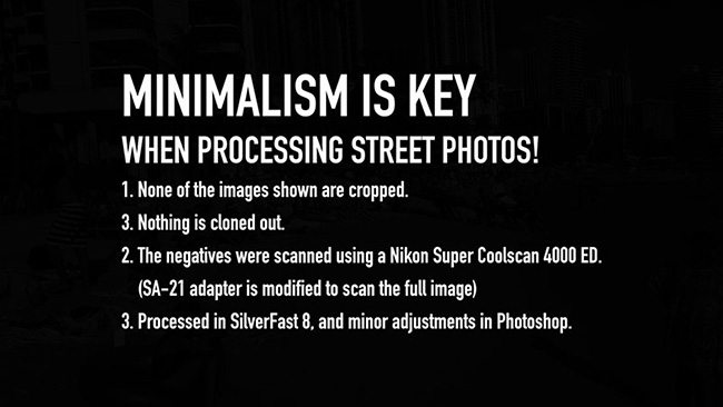
Minimalism is key when processing street photos! We want things naturally within their environment without cloning out objects, or butchering it with a massive crop. Sure, we can use techniques to create scenes of surrealism, but if we are heavily processing the image, then we are entering more of a conceptual realm instead of true street photography. Suffocating vignettes, crippling crops, cloning out, compositing in; all of these things are considered to be unethical in the genre of street photography, photojournalism, and documentary photography. Just look at the mess Steve McCurry got into for cloning out things in his photos.
Note: None of the images displayed in this article are cropped or cloned out. I used a Nikon Super Coolscan 4000 ED to scan the negatives. They were processed in SilverFast 8, and minor adjustments were made in Photoshop.
Pretend to Blend In
In the video, you’ll see me pretend to take a picture of something, then move sideways to capture the actual subject. This is a technique I learned from watching videos of Garry Winogrand (see #402), one of the most prolific street photographers of all time. He would “pretend to blend in,” much like a tourist. If you appear to be taking pictures of everything, then the subject won’t be aware of your true motive.
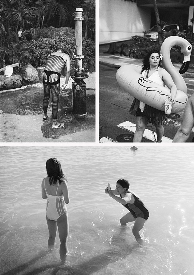
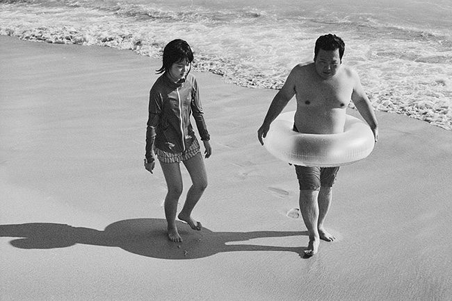
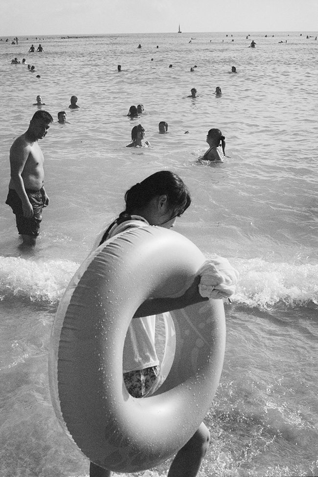
Here’s another shot from the video of tourists with their tube. We’ll soon see how this can be developed into a project.
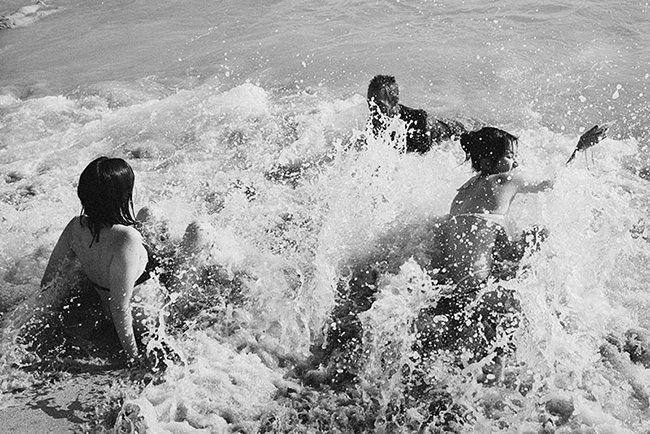
In the video, as I walk further down the beach, I hear girls screaming and splashing in the water. This automatically clued me in on a potential photo opportunity (something I learned from shooting weddings and events). I anticipate what will happen next, move in closer, wait for the wave to hit, then press the shutter.
Bresson’s Geometry
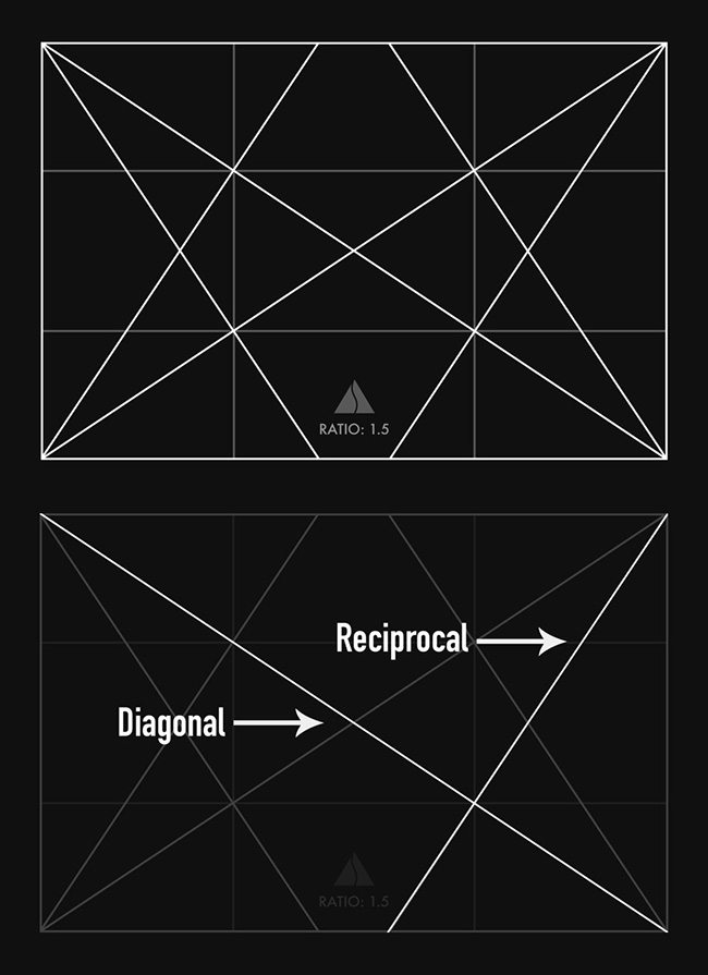
Henri Cartier-Bresson was obsessed with “geometry”, which is also known as dynamic symmetry. He typically used two lines of the 1.5 basic armature (grid); a major diagonal and a reciprocal (see Day 41). The major diagonal is easy to find because it runs from corner to corner. The reciprocal will intersect the diagonal at 90 degrees. Easy!
Analyze some of Bresson’s photos and you’ll see that he used dynamic symmetry extensively. You can even see a diagram of it on Page 17 of the insert for his book “The Decisive Moment.”
In the diagram below, you’ll see the 1.5 rectangle with it’s armature (two diagonals and 4 reciprocals). To get familiar with the grid you can print it onto transparency film and tape it to your camera’s LCD. If you are shooting film, you won’t have an LCD to use, but a great way to start training yourself to see the lines is by analyzing photos in post by overlaying a grid. This repetition in seeing the lines will build muscle memory, and you’ll be able to incorporate them into your film photos as you shoot…just like Bresson.
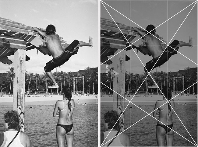
Anticipate the movement and wait for the diagonals. To get it perfect would be great, but close enough works just fine. Several diagonal movements are locked into the 1.5 armature below.
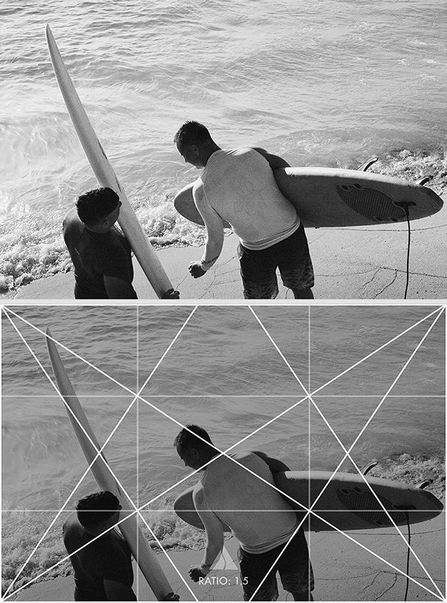
Here’s another photo where I anticipated the movement and locked in the reciprocal.
Dynamic symmetry (a.k.a. geometry) serves a purpose; it adds structure. To foolishly think, “if you add enough lines to an image, something is bound to line up,” is to deny yourself the opportunity to incorporate rhythm, unity, and movement within your design.
Projects
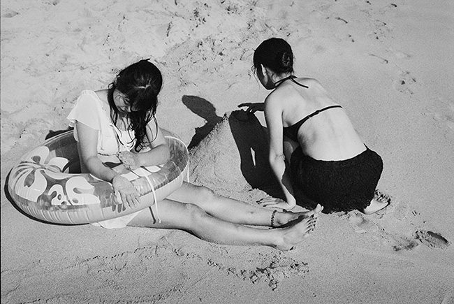
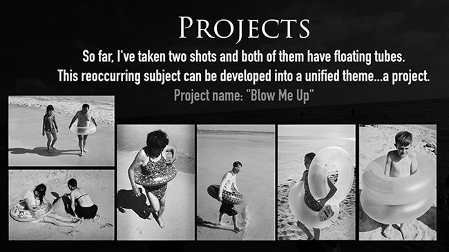
So far within the video, I’ve taken two shots that have floating tubes. This reoccurring subject can be developed into a unified theme…a project. The project name can be anything we want, but for this project I decided to name it “Blow Me Up.”
Consistency will strengthen the project. Having all tubes, and black and white photos creates unity. I could broaden the project to include other flotation devices that are blown up like flamingos, unicorns, or rafts. On the flip side, I could make it more unified if I decided to only include dark-haired women under the age of 30 inside tubes. If I added a color photo to the project, the unity would suffer, but we could always create a color version of the project.
Here’s another photo for the project that was captured in the video. It displays separated shapes and figure-ground relationship.
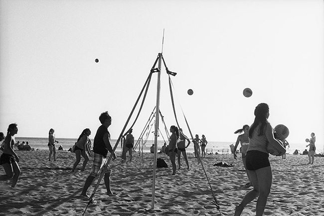
As I walk further down the beach I see a group of kids playing with a beach ball. Sometimes to capture a ball with great FGR we need to freeze it above the horizon line as seen below.
I continue to walk down the beach and see an opportunity to capture a fleeting moment inside a woman’s arm. I was too late, but you can see a similar image below. This too, could be developed into a more difficult project.
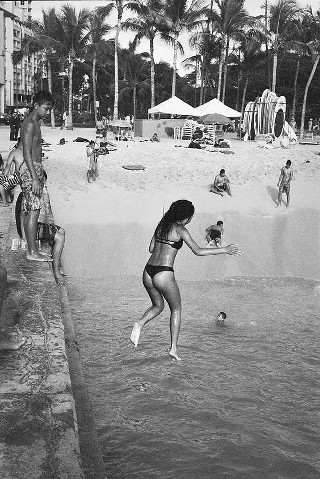
In the video, as I work my way towards a wall, I see tons of action. Kids surfing, flipping, and jumping into the waves.
This girl seemed to be the only one repeatedly jumping, so when she came back I had my camera ready. I was anticipating something more elaborate, a back flip or cannonball, but her friend pushed her off before that. We have a clear FGR and aspective view.
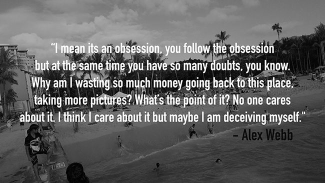
Here’s a great quote from Alex Webb, another master photographer, that we can all relate to. “I mean it’s an obsession, you follow the obsession but at the same time you have so many doubts, you know. Why am I wasting so much money going back to this place, taking more pictures? What’s the point of it? No one cares about it. I think I care about it but maybe I am deceiving myself.”
Conclusion
Mastering composition is the best way to produce more remarkable work per photo session. Not to say that all of the photos displayed here are remarkable, but they are working in that direction. With composition and design you’ll transform knowledge and repeated application into muscle memory, allowing you to capture fleeting moments at their climax. The more you shoot, the more you’ll start to develop your artistic style (see Day 122). This will lead you into projects and give a focus to your work. It’s always your job to communicate your visual message with clarity, otherwise you risk confusing or boring your audience.
That’s it for today, I hope that inspires you to grab your camera and get outside! Once again, huge thanks for all of the support, I truly appreciate everything. Take care!

