Nick Knight’s “War” Photo Breakdown

#738
Hey everyone, thanks for joining in!
Today we’ll be dissecting a photo series called “War” by Nick Knight. How did he create it? Did he use any design techniques or dynamic symmetry? Is it more than just shock and awe? Let’s find out now!
Nick Knight Who is
Nicholas David Gordon Knight (born 1958) is a talented and visionary photographer that lives with his wife in London. He’s a professor at the University of the Arts London and has worked for many fashion magazines. To say his photos are strictly fashion would be highly misleading. One look at the two images below and you’ll know that his photos are extremely different compared to other fashion photographers like Annie Leibovitz (see #704).
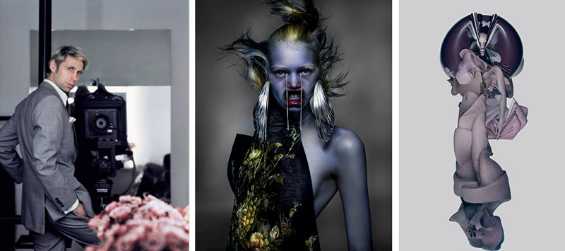
If you’d like to see some of his other photos analyzed, please check out the video below. It’s packed full of info! For now, let’s dig deeper into his “War” series and see what we can learn.
"War" Photo Analyzed
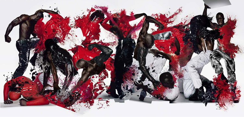
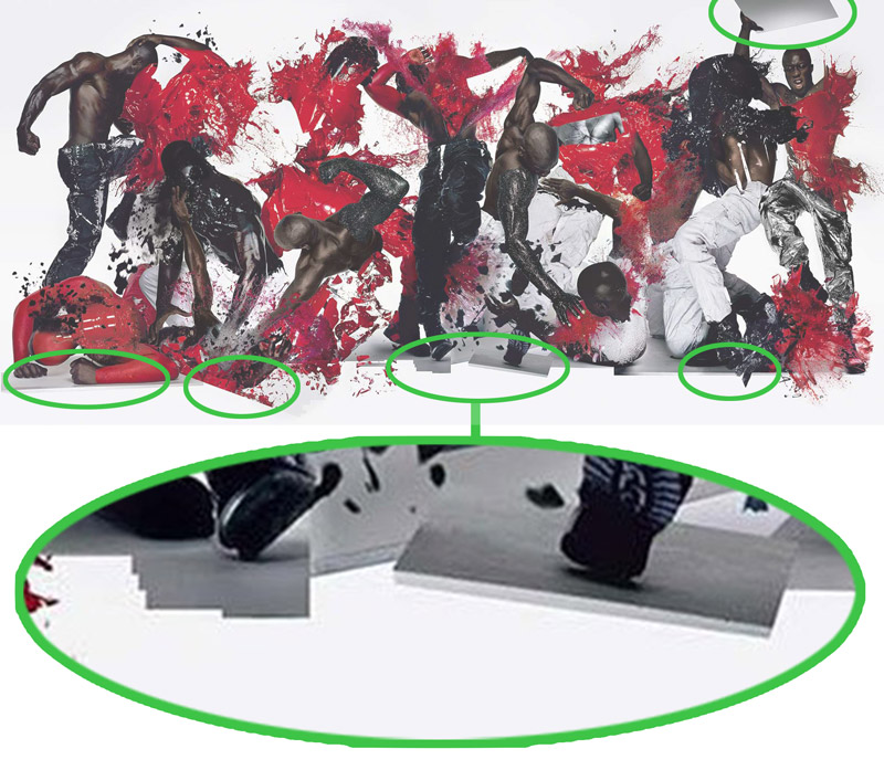
Here we have the main image from the “War” photo series. Amazing right? When we’re breaking it down let’s start with the obvious stuff, then we’ll get into the nitty gritty.
The first thing that stands out is the red splattering paint. We’ve seen over and over how this color has the ability to grab our attention (see Day 183). Was Nick splashing paint all over the models, then using a fast shutter speed to freeze everything in time? Not exactly.
When we see some of the detailed images further below, we can tell that the red splatters were captured separately, then added to the model. That means this is a composite photo with tons of Photoshop. We can tell the editor was very skilled because it’s hard to see transition lines from splatter effect to model.
Speaking of models, it looks like the same model was used for about 99% of the photos. There is one other male model that looks heavier, but that’s it. So this means he had the same model doing different “street fight” poses. There’s tons of movement (see Day 15) and life from the dynamic poses and splattering paint, but Nick has also added an exploding black object. Some of it looks like he might’ve colored the red paint black, but there’s also particles of black materiel exploding which we’ll see in some of the detail images to follow.
The image is quite shocking, but we’ll soon learn that it’s more than that.
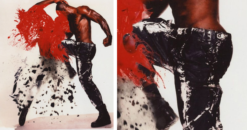
Can you see the exploding black pieces in this image? It definitely adds a lot to the image!
As we dig deeper, it looks like his pants are made of black plastic trash bags. The pants are too thin and loose to be latex, but it has the shine of plastic. Whatever it is, it adds a nice texture to the image (see #698).
Do you see anything else here? It’s the same exact pose and photo as the one placed on the far left of the main image. So Nick flipped it, then composed it with the group. Did he use dynamic symmetry? I mean, this pose does have some nice diagonals going. I guess we’ll find out soon!
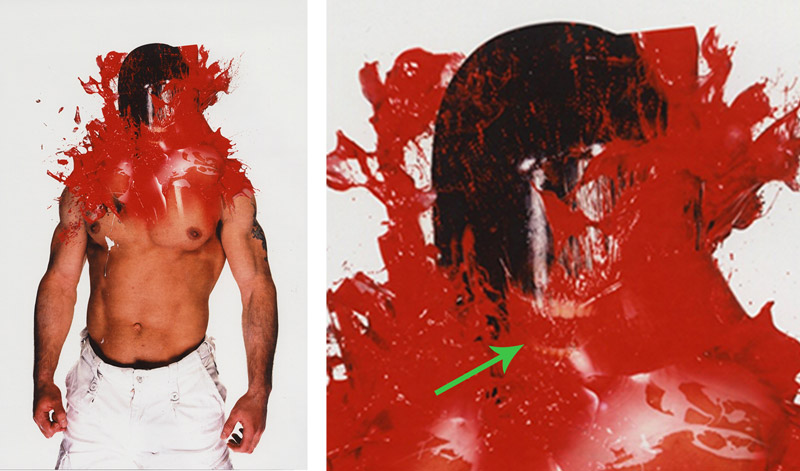
Another thing I noticed when analyzing these photos is the hidden teeth in this one. They aren’t very prominent, and they’re slightly lower than they would be in real life. They are positioned in a way that would make his chin rest on his collar bone. This could be a mistake, or an artistic chose to make this guy look even weirder. Either way, the fact that they’re low in contrast makes it work regardless.
Another thing that was noticed, and would drive any perfectionist insane, is the avant-garde Photoshop cutouts at the bottom of each pose. He’s making no efforts to hide the composite marks in this location. Perhaps that’s to help with the shadows, but also to make it more edgy. Some of the stair-stepping edits are horrendous, but as a whole it works.
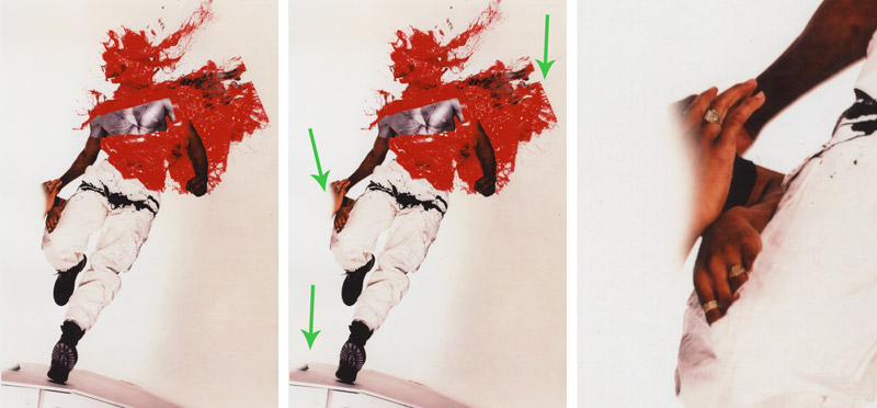
This edit was uhhh…interesting. Kinda reminds me of a Steve McCurry photoshop mistake (see #499), but given the rough cutouts seen on the right side (and previously) we can only assume this was intentional. Look closely in the detail on the right and you’ll see a woman’s hand helping the man with his balance as he poses. We can even see rings on her fingers. This is one thing I’d personally remove because it doesn’t fit the story. This guy is going into battle with himself, but he’s being held up by his woman? Doesn’t make sense when considering the final group composite.
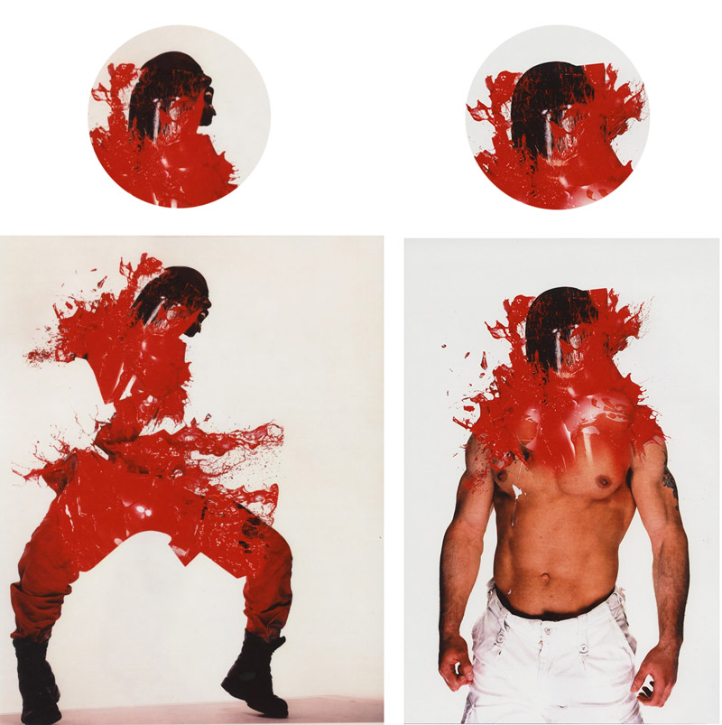
Here we have two different images, but the same exact composite image being used. Normally we’d want to avoid this cloning look, but perhaps Nick is maybe showing a transformation within the same character? Again, I’d personally clone stamp the highlights to be slightly different.
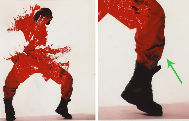
The model was probably placed on a light background, photographed, cut out, then placed on a pure light background with no shadow variations. We can tell by looking at the shadows on the model. If the background were actually this light he wouldn’t have this shadowed area on his lower leg. The bright light from the background would actually wrap around. They used multiple lights to light each pose, but shadows were still able to creep in.
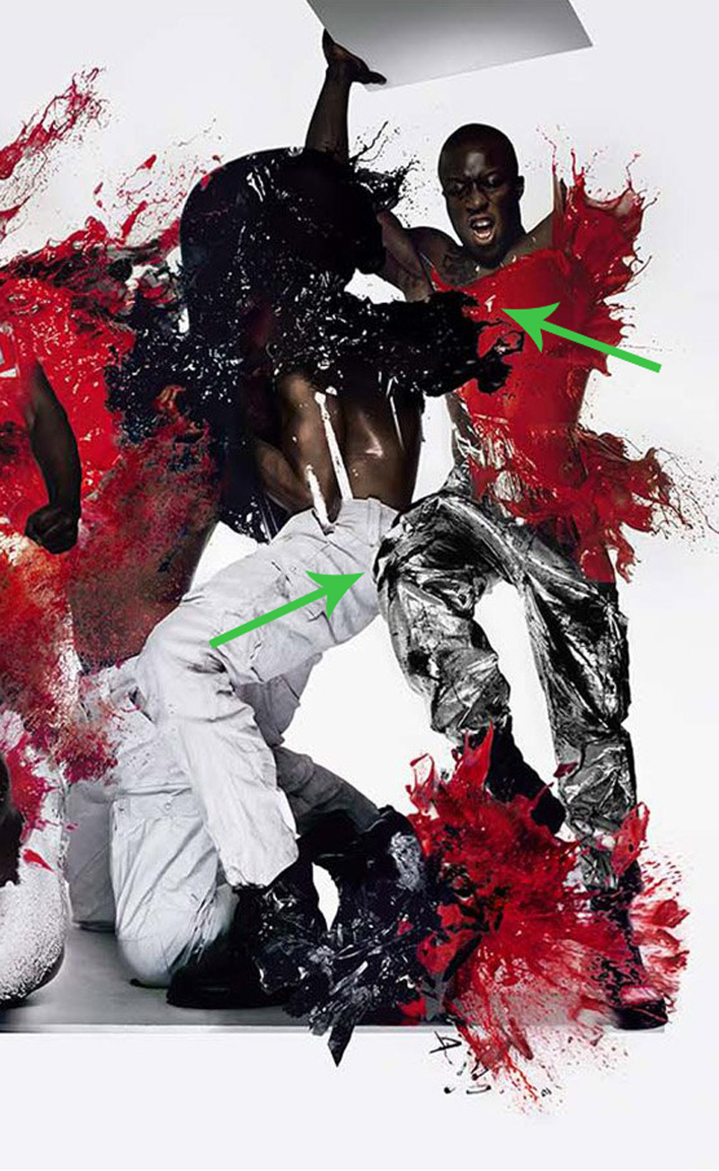
When we look at the overall photo composite, we can tell that they took each photo composite and organized them in a specific way. Even though it is a great job of compositing, they didn’t go for lighting accuracy by creating cast shadows from one model to the next. They are simply overlapping rather than being staged in the same scene with the same lighting. We can really see it in the model on the far right. Let’s take a closer look.

He’s behind the black paint to his left, but still looks just as illuminated. Then his lower body is in front of the same character, which makes the perspective off just a little. There would also be some shadows on the white pants, but they have the same value as the foil plastic leg gets closer to it.
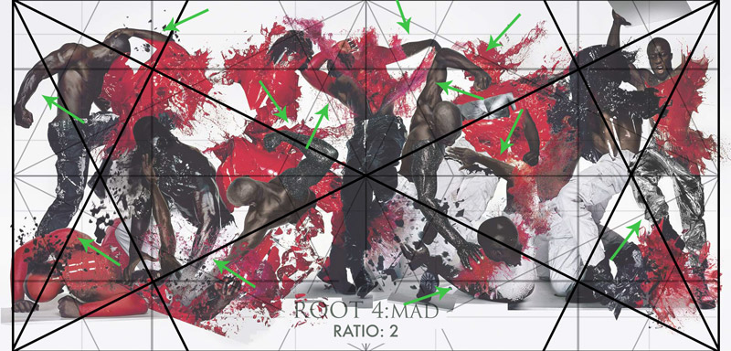
Here’s something very interesting that I was happy to discover. It appears that he used dynamic symmetry grids to help him organize the poses. With the root 4 overlaid, are you able to see how the poses lock in and parallel the grid?
Arrows were added to show which limbs are paralleling the grid. Find the arrow, look at the diagonal of the limb, then see how it parallels the diagonal of the grid. Amazing!
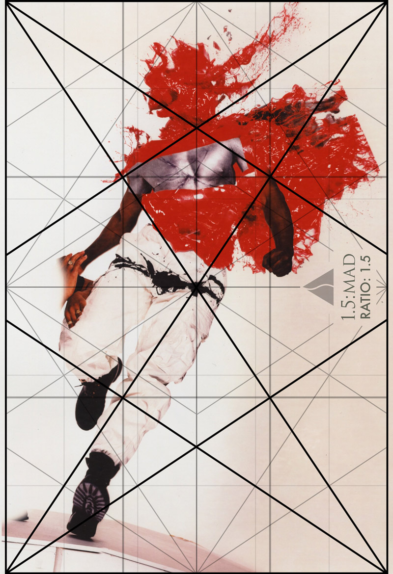
Here’s another photo with the 1.5 grid overlaid onto it. See how the diagonal of the leg locks in, and the left forearm parallels it? He’s also got specific splatters and other areas locking in and paralleling. Nicely done!
Conclusion
By now we can see that Nick Knight put a ton of work into his photo series and produced great results. This took a lot of planning and it definitely paid off! The photos were more than shock and awe (see Day 111), don’t you think? Did he make any mistakes? Perhaps, but we never know with this specific image because it’s so beautifully chaotic. He used a vast amount of knowledge in photoshop, lighting, posing with dynamic symmetry in mind, color and more. Well done Nick!
Thanks for joining in to show support, you’re much appreciated. See you next time!

