Peter Lindbergh – Top 6 Techniques (ANALYZED PHOTOS)
#754
Welcome back everyone, thanks for showing your amazing support!
Today we’ll be digging into Peter Lindbergh’s photos to discover what his top 6 techniques are, and how we might be able to use them in our own photos. Who is he and what secret ingredients does he use to make his photos successful? Let’s find out!
**NSFW** (contains some nudity)
Peter Lindbergh? Who Was
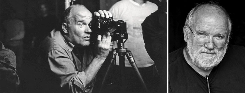
Peter Lindbergh (1944-2019) was a German fashion photographer who dabbled in film directing. He studied arts in Berlin and exhibited a lot of his art before graduating. His career started to take off in 1971 when he worked for Stern magazine. He ended up photographing dozens of female models and musicians including Cindy Crawford, Naomi Campbell, and Tina Turner. Most of us have heard of Cindy Crawford, but she was a nobody when she started working with Peter. Little did they know, this was the beginning of the supermodel era. How exciting!
Here’s a photo of Peter with his camera.
Before 1971, in his college years, Peter was a painter. He was deeply inspired by Vincent Van Gogh (see #697) and hitchhiked to Arles to inspire his scholastic paintings.
“I preferred actively seeking out van Gogh’s inspirations, my idol, rather than painting the mandatory portraits and landscapes taught in art schools.” ~Peter Lindbergh
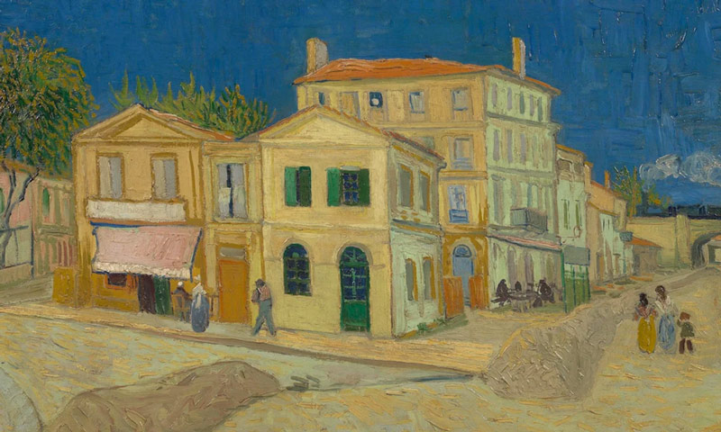
I wasn’t able to find any of his paintings unfortunately, but here’s one of Van Gogh’s Arles paintings. I always love it when photography circles back to the great master painters!
Now that you know more about Peter, let’s dig deeper and discover what his top 6 techniques are!
Top 6 Techniques Analyzed Photos
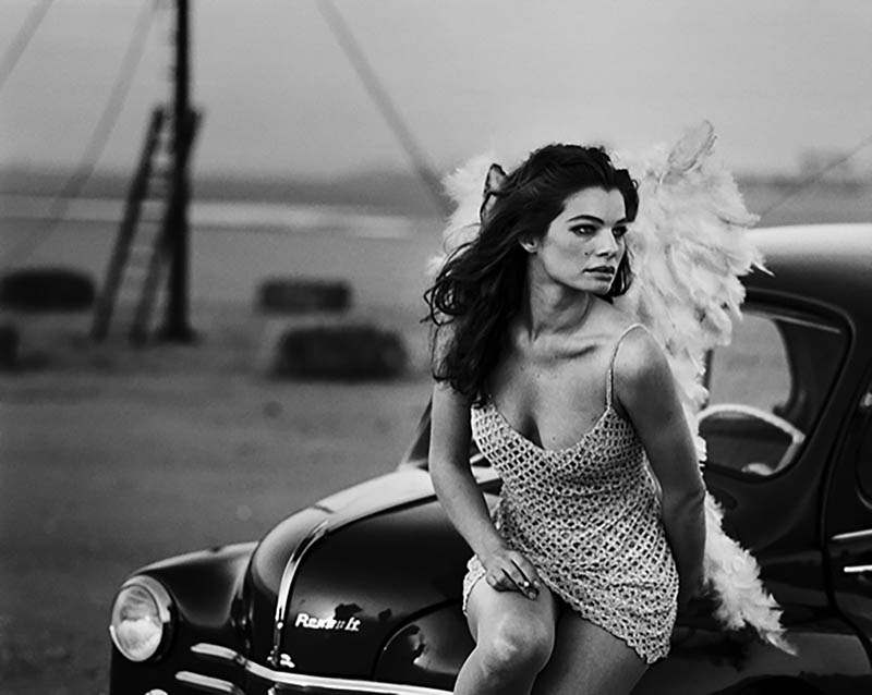
One of the most obvious things we’ll see is that Peter prefers black and white photos. He’s got some great color photos, but we’ll see those a little later. His black and white shots look as if they were shot on a film camera, but he was known to shoot with a digital camera. It became no secret that he used Photoshop to add noise/grain to make them look “much more human.”
1. Black and White Fashion
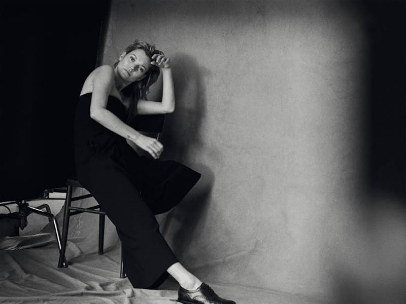
The first technique, or ingredient, within his artistic style (see Day 122) is black and white fashion. Most fashion designers have bold colors and textures, but for his black and white photos he has to work with different materials. Most of the wardrobe he shoots is black, white or both, which translate well within the final image.
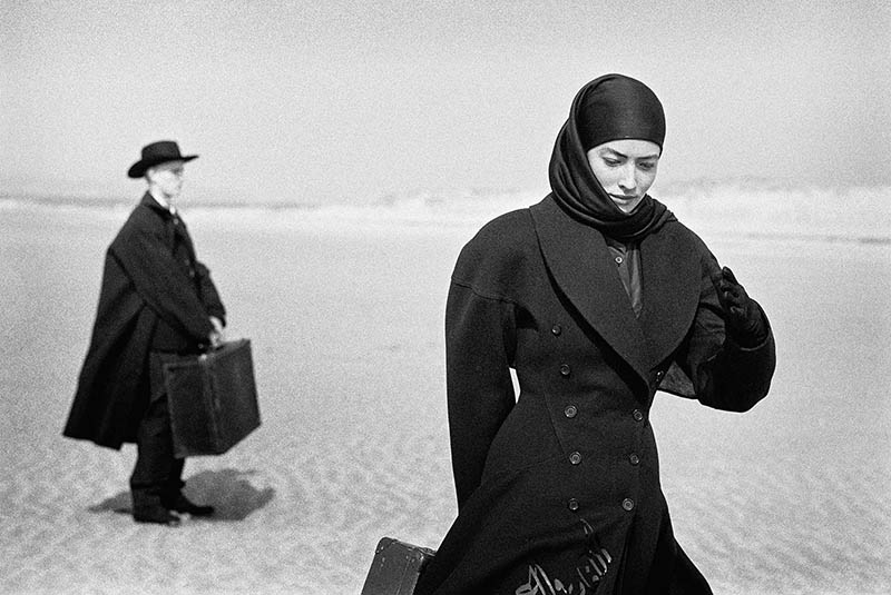
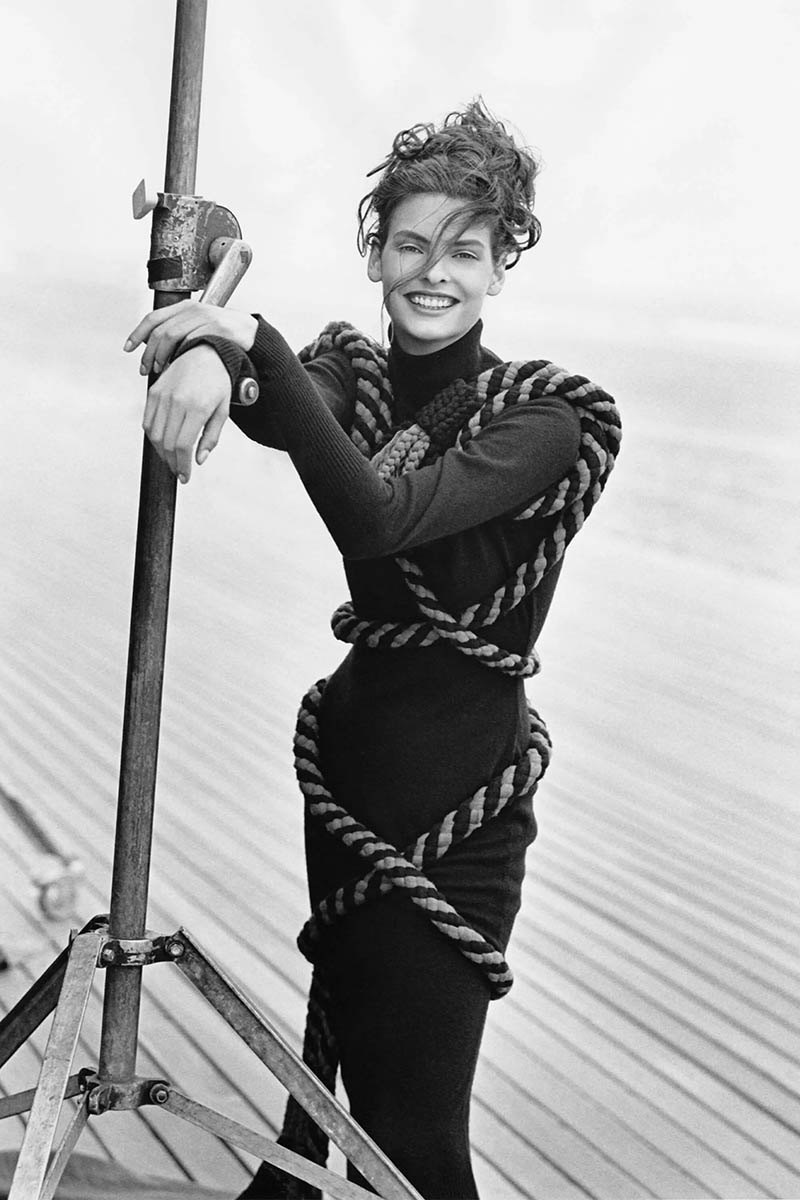
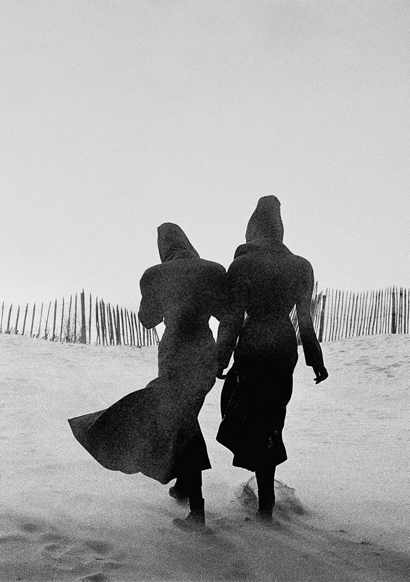
Here we can see the outfits are black and on a light background. We can even see the noisy Photoshop grain going across them to create aerial perspective (see Day 42). This photoshop trick adds a lot of depth to the image…almost like the sand is blowing across them. The dark clothes also help with visual clarity, which we’ll cover soon. The pattern of the fence is pretty nice too (see Day 189)!
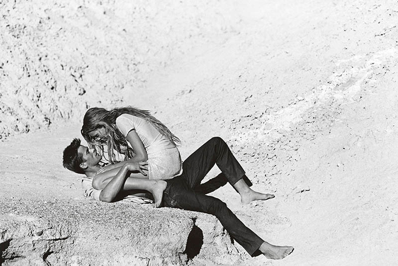
Here we see that Peter used white and black clothing on the models, which isn’t anything fancy in regards to fashion, but it definitely makes for a striking black and white photo. He’s also added his Photoshop grain to most of the image except for the black pants and hair. Look closely and you’ll see that anything black looks much more “clean.” In the above image he edited it so the grain was partially over the figures.
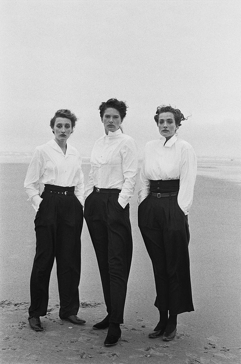
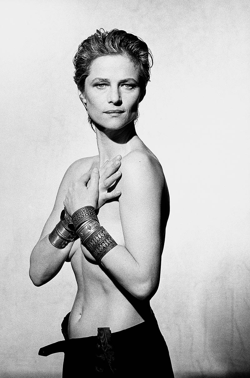
There’s hardly any grain in this one, but we can easily see his use of white clothing.
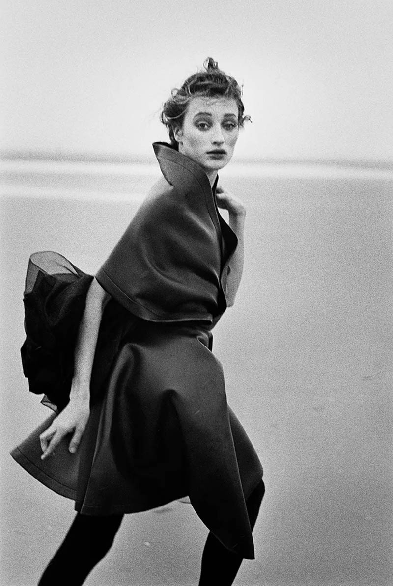
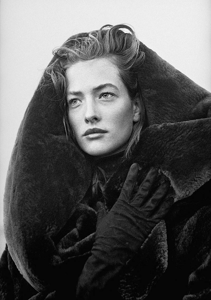
This one with a thick black fabric looks pretty striking! Look at how much grain he adds to her face, and it looks great. He uses grain quite a bit and could be considered another ingredient within his artistic style.
2. Masculine Motives
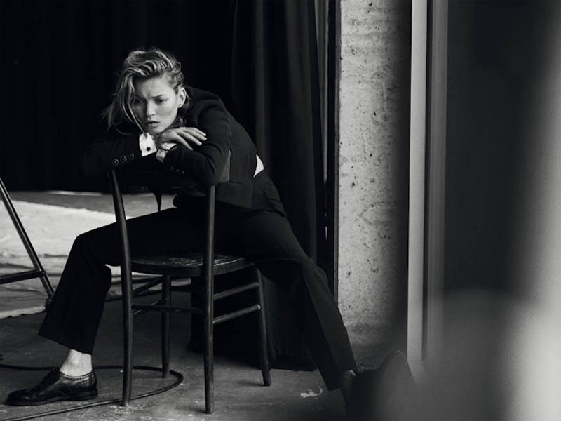
The second technique I noticed while digging deep into Peter’s photos is the masculine motive. Sure he’s got some photos of models presenting themselves as very feminine, but a lot of the ones found on Google showed masculine poses, environments, haircuts, and wardrobe. It was only later when I found the following quote and it all started to make sense.
“If photographers are responsible for creating or reflecting an image of women in
society…then, I must say, there is only one way for the future, and this is to define
women as strong and independent. This should be the responsibility of photographers” ~ Peter Lindbergh
Perhaps this is why I didn’t initially like his photos…his subject matter. I personally prefer to present the female form with femininity, but that’s just my artistic style (see Gallery). Maybe my preference stems from being raised with 3 feminine sisters. Either way, I can’t critique his subject matter or style, it’s more appropriate to critique his compositions…which work really well (see #625).
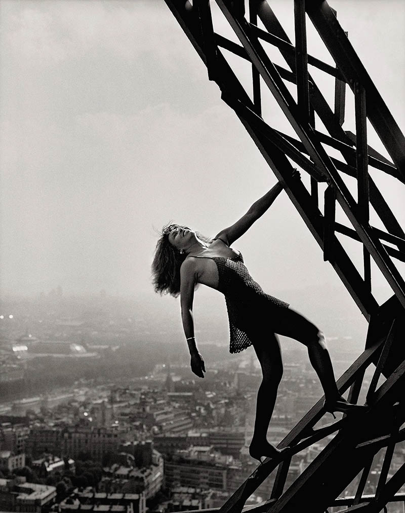
Here’s one of Tina Turner which is a great shot, but the environment is more masculine…don’t you think? I imagine this would be a great setting for George Clooney or Mark Wahlberg, not Tina in high heels.
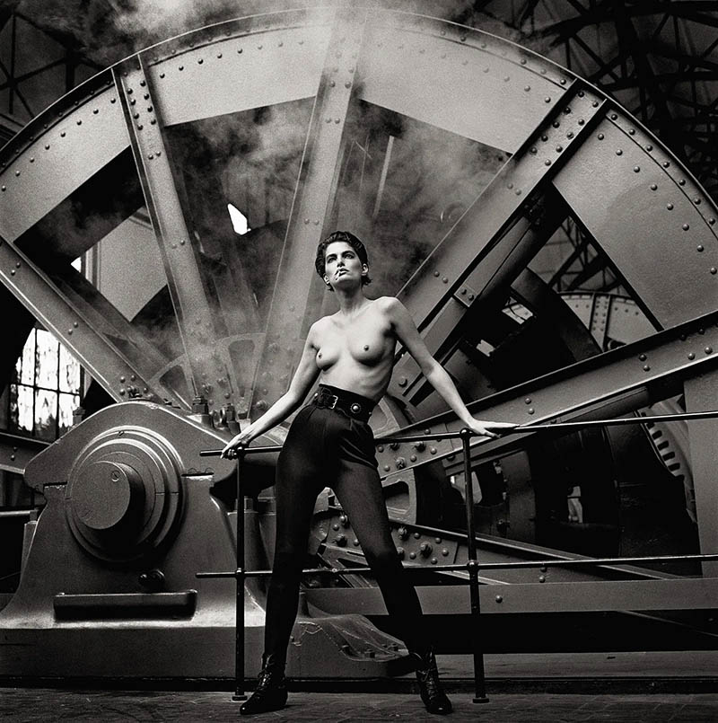
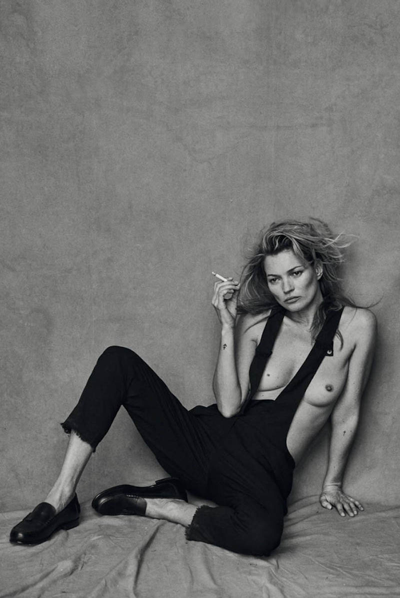
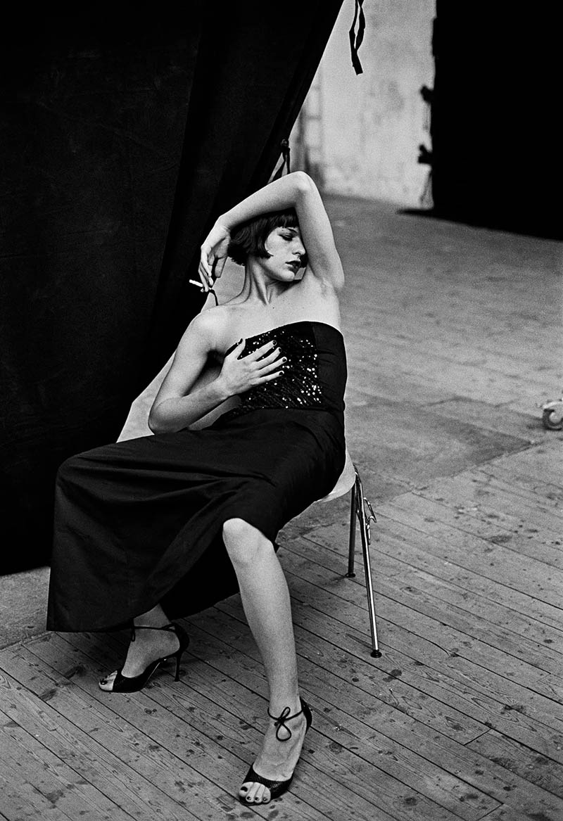
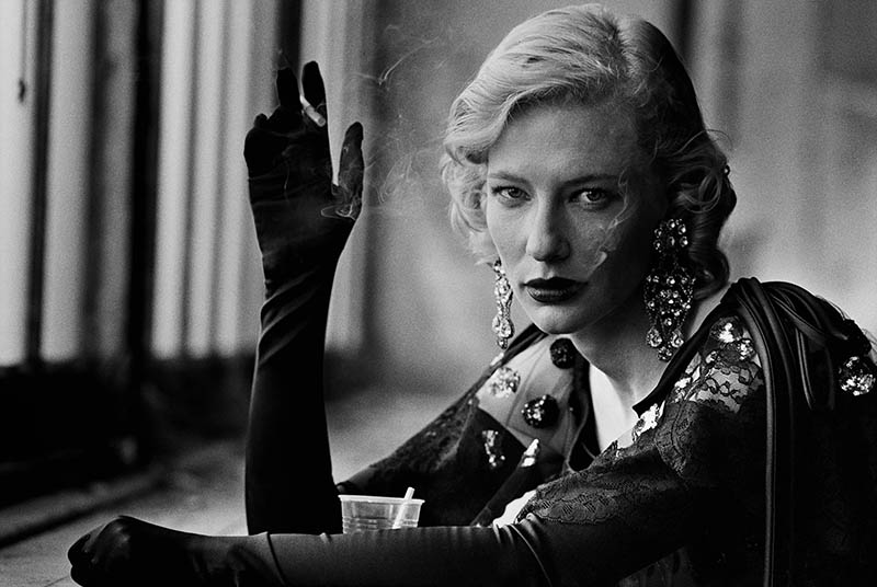
This one definitely screams manly. The environment, wardrobe (or lack of), and cigarette all complete his masculine aesthetic.
The psychology behind this image is interesting. Certainly most of these models are very feminine in real life (I’m assuming), but if we’re reading the body language and wardrobe within the image it reads very masculine. In that case, I’m personally not as attracted to them as I could be. The interesting part is how Peter can present these models in a way that increases or decreases their attractiveness depending on each viewer’s own tastes. Do you find them more or less attractive?
Either way, it’s an excellent shot!
He’s using the cigarette to represent masculinity, which is weird because my mom use to smoke two decades ago and I never saw her in a masculine way. The wardrobe and pose definitely push this further towards Peter’s goals though. If you want to convey something in an image, it’s best to stack up stereotypes. It’s almost as if he imagined a cool manly pic with Brad Pitt, then did a body swap. Very cool!
3. Figure-Ground Relationship (FGR)
As we’ve seen in most of the previous images, Peter is really good at creating nice figure-ground relationship (see Day 21), which helps his compositions have visual clarity. Here we see the two dark subjects on a light background, and he’s also creating a counterpart (see Day 57) to help with the left-to-right balance.
Most fashion photographers like Annie Leibovitz work with a blank back drop to help with FGR (see #466), but since Peter is outside in a lot of these he has to use the sky, ground, or other pockets of negative space (see Day 83) to create that separation of foreground and background.
I love the dark outline going around her body in this one. The angle of lighting helps with this!
4. Groups
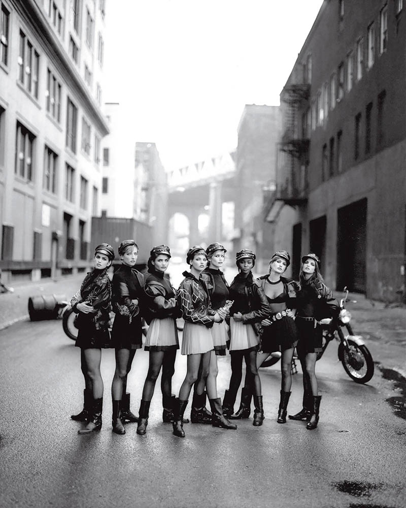
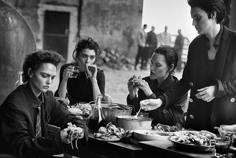
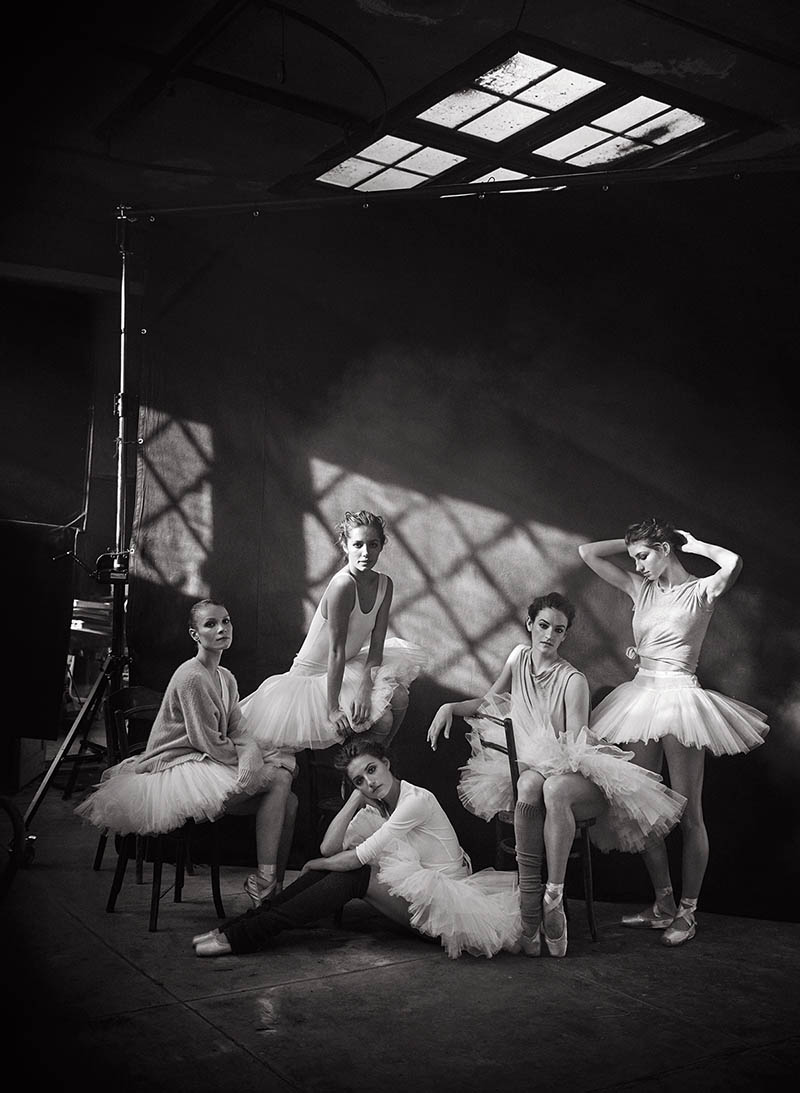
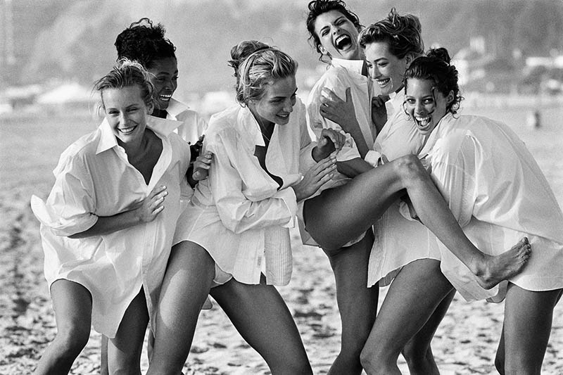
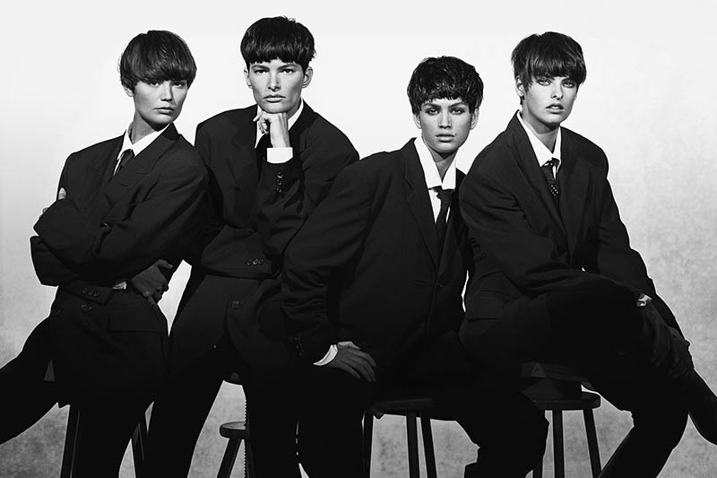
Another technique you might’ve noticed is that Peter likes to shoot group photos. After all, his claim to fame seems to be the group photos of supermodels. They made each other famous! In this one, we can see he isn’t using the masculine aesthetic or much grain, but he has the nice blank background for FGR.
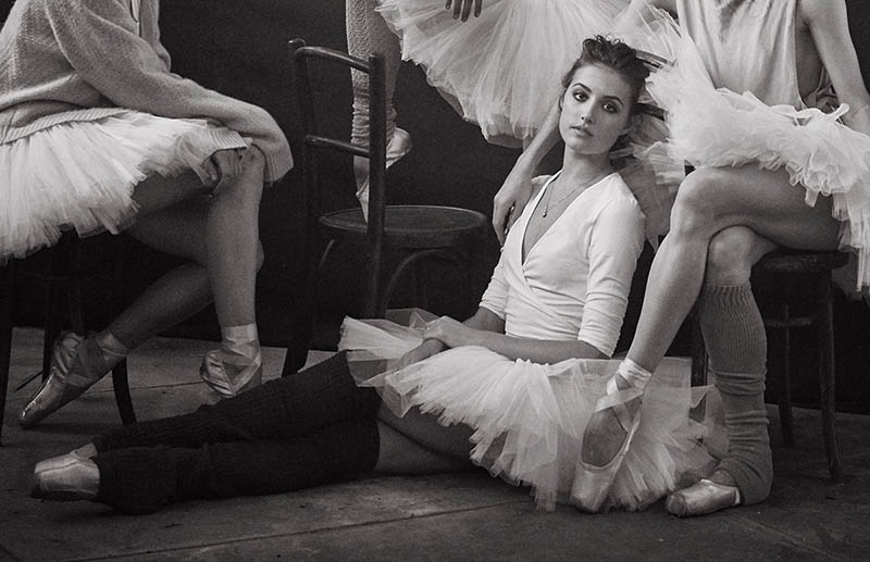
I like the crop on this one to emphasize the dancer sitting.
5. Aspective View
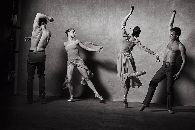
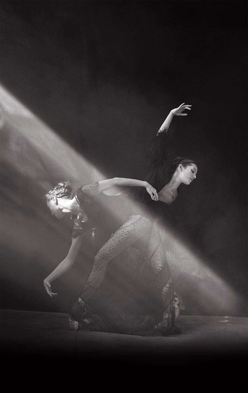
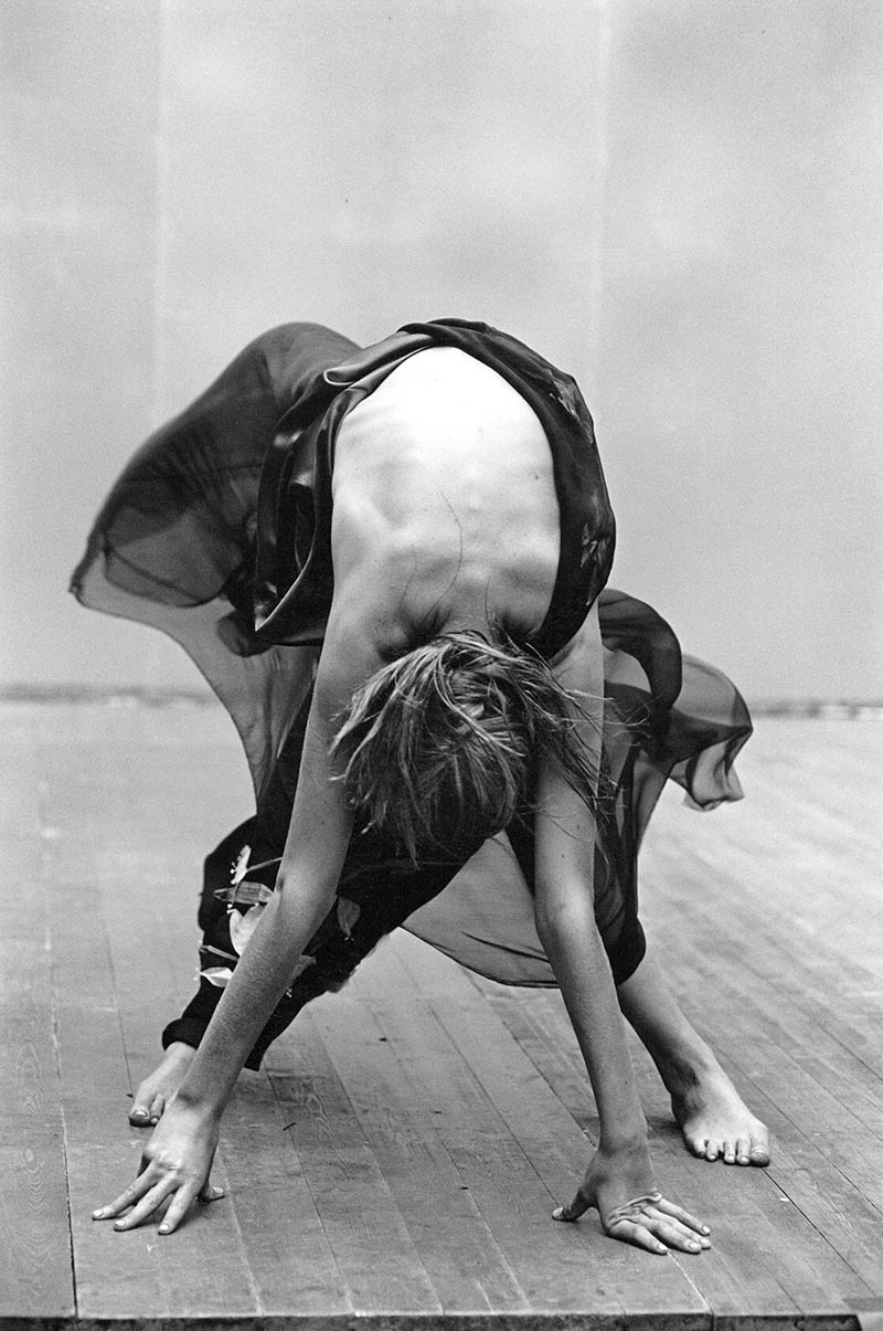
Using an aspective view (see Day 78) is an excellent way to promote visual clarity…especially in silhouettes. When the limbs are spread it’s easier for us to identify the shape.
This one has a nice dominant diagonal created from the light to help promote visual impact (see #441). We’re also see aerial perspective for depth and atmosphere.
6. Awkward Poses
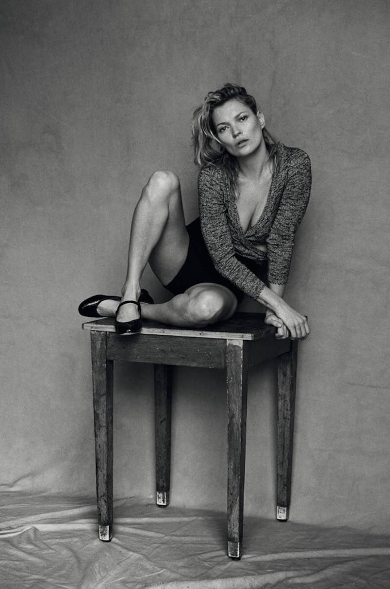
The final technique that we’ll typically see within Peter’s photos is an awkward pose. Capturing poses like this keeps things spicy rather than looking like a generic, “hand on hip” prom photo.
This pose could’ve been so normal, but he has her twist her body and push her left hand back. Interesting!
If you look closely in this one, you’ll see her legs are crossed. Ouch!
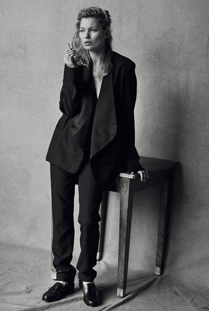
This one adopts his masculine aesthetic with the cigarette and pose, but it’s unflattering the way it looks like she’s checking her deodorant. Not to mention the whole backside of her hand is showing. Typically hands are posed to show the side which makes them look smaller. This hand looks huge!
Color to Black and White
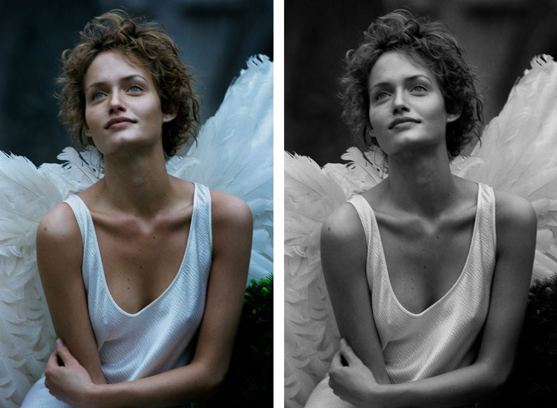
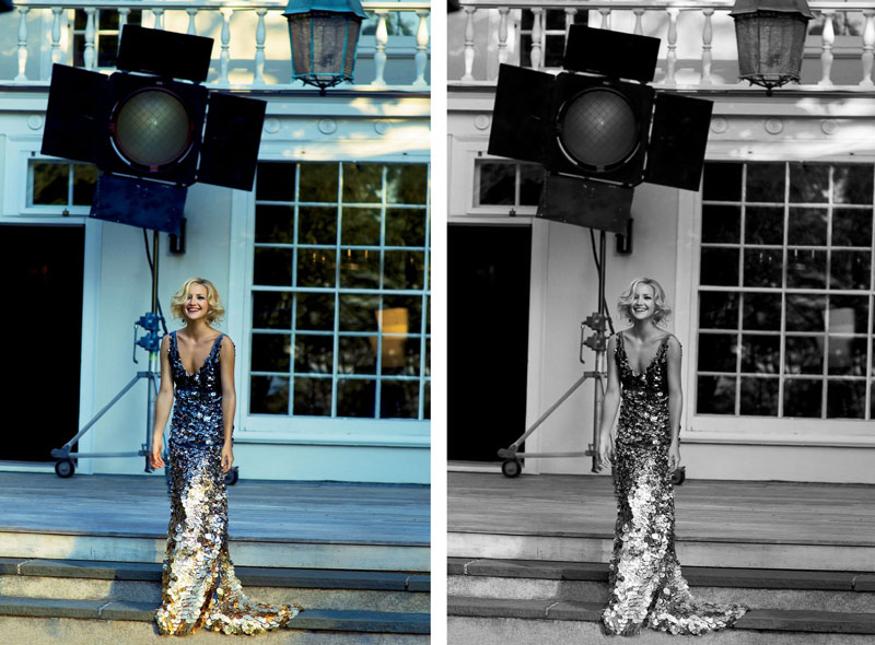
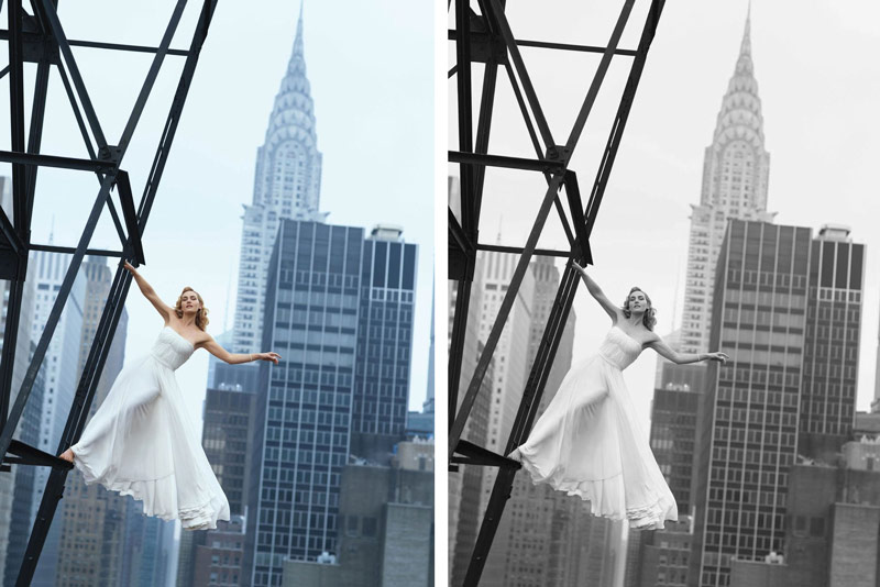
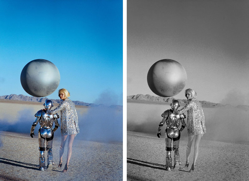
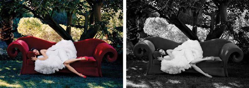
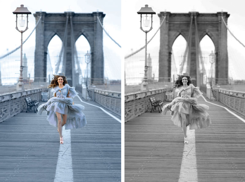
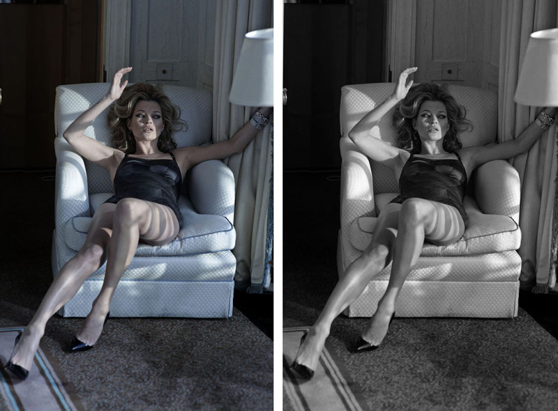
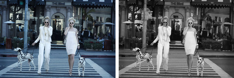
Since most of Peter’s photos were black and white, I wanted to dig around the internet to look for any color ones. I was able to find a few, but was curious to see if his techniques still applied to them. When converted to black and white, we can see that they’re still great images with many of the same techniques from above.
The biggest thing that changes when converting from color to black and white is the emotion of the image (see Day 178). Color is cheerful and helps define the shape. Black and white is more timeless.
“Using black-and-white photography was really important to creating the supermodel.
Every time I tried to shoot them in colour, because their beauty was close to perfection,
it ended up looking like a bad cosmetics advert. With black and white, you can really see
who they are. It toned down the commercial interpretation that colour gives. What’s so
striking about black and white is how it really helps a sense of reality to come through.” ~ Peter Lindbergh
Notice how he finds the small pocket of negative space in the background to get nice FGR.
In this bw conversion, the white dress is a little lost on the white background. Some dodging and burning could easily fix that.
The red couch is hard not to love, but the black and white is definitely more timeless. Especially if some of his signature grain was edited in. If Peter wanted to reduce some distractions he could subdue the highlights in the background. As it is, the background seems more important (with more contrast) than the model on the couch…especially with the dark diagonal of the tree going through it. Squint your eyes and you’ll see!
What do you think of these other conversions? Do you prefer the black and white or color? Why? Knowing the answer to these simple questions could help you in your next shoot.
Conclusion
Each artists will eventually develop their own recipe, their own artistic style. It can always be tweaked along the way too. Peter used some pretty powerful composition techniques like FGR and aspective view, then combined them with several other techniques that fit his tastes and goals. If you don’t know your artistic style, spend an hour to try and identify it. Consistency is the key to creating a brand for your art, which allows people to identify your work.
That’s it for this one, I really appreciate the support! It keeps the site going. See you next time!

