Rule of Thirds – The Number One Reason NOT to Use It
#692
Thanks for joining in everyone, we’ve got a valuable article for you today!
We are going to learn the absolute basics of composition and ask some hard questions. Why do we use the rule of thirds? Why do we use dynamic symmetry? We need to be able to answer these questions quickly to understand why we use the compositional tools we choose. Let’s boil things down until they are crystal clear!
Rule of Thirds The Number One Technique
You may or may not have noticed the goal of this site repeated in videos and articles. “Sharing the secrets of composition to change the future of art” is a lofty goal, but perhaps if things are simplified so beginners can teach it, we might have a chance. That’s why this video and article were created.
For longer than any artist can remember, the rule of thirds has been the leader of composition techniques. Is anyone curious as to why? Is it because we hear it repeated over and over again in videos, books, magazines, and schools? Hmmm, that could be part of it.
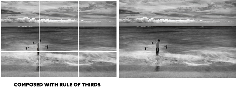
I know it had an effect on me when I was first learning graphic design and photography. We can see in the photo below that I perfectly composed it to the rule of thirds. Whew! I really nailed the composition!
Years later after learning design techniques, I could’ve done so much more with this photo opportunity. Ho hum.
A great reason the rule of thirds is at the top of the compositional charts is that it’s super easy to teach. Telling a beginner artist “place it on a third” is about as easy as it gets! Teaching great composition in a simple way is much more difficult. So, if you got paid the same to teach something easy or difficult, wouldn’t the easy route be a no-brainer? You betcha! Unfortunately, just because something is easy for beginners to teach and learn doesn’t mean it will benefit their art.
So let’s keep digging and know exactly how to answer some serious questions in regards to the future of our art.
ROT or Dynamic Symmetry? Why? Answering Tough Questions
So why is the rule of thirds (ROT) so bad to use and teach, and how do we communicate this revelation to others? How do we say it in one sentence?
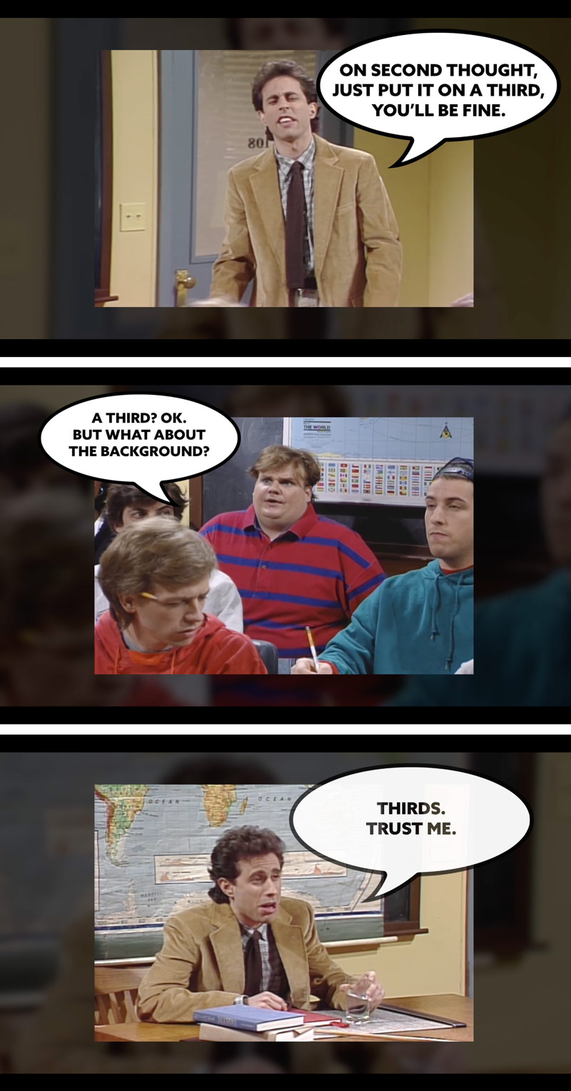
All we have to say is, “the rule of thirds is unfortunately misleading because it prioritizes specific thirds placements rather than how the foreground and background interact with each other.“
This whole time, when they were telling us to use ROT to get the subject out of the center, they were wrong. The problem isn’t the center, it’s plotting on a third and not paying attention to the background. Figure-ground relationship (FGR) (see Day 21) is when the foreground and background interact with each other nicely; they fit together like a puzzle piece.
We can also tell other artists that, “If we don’t see the image as a whole, we risk confusing the viewer when visual clarity is essential.” Figure-ground relationship (FGR) is tremendously important to create visual clarity and easy to teach, but they would rather teach the rule of thirds. Sad, but true.
We run into all kinds of problems when we don’t pay attention to FGR. One of them is the iconic tree-growing-out-of-the-head photo.

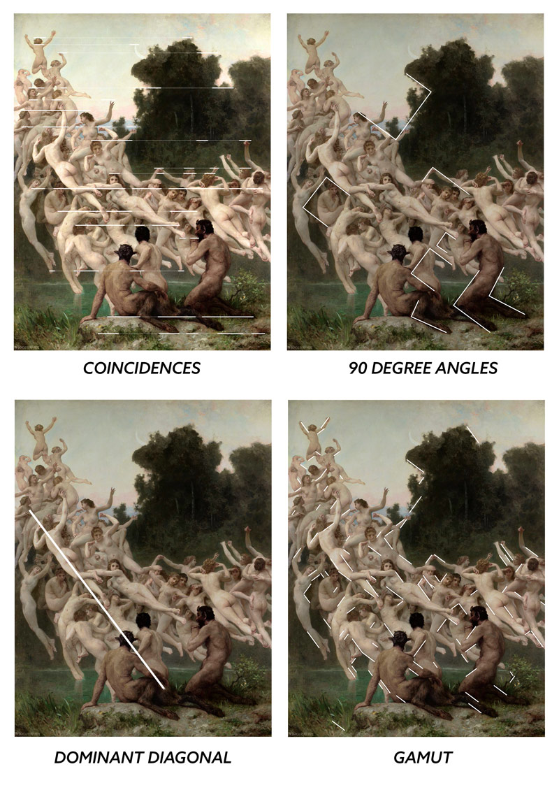
Some beginners have even gone as far as to generically place rule of thirds grids over master paintings. When they find that some things line up to a third their quick analysis further embeds their confirmation bias; “masters used the rule of thirds too.”
When you learn more about design techniques, you’ll know that master painters didn’t think like this…and neither should we.
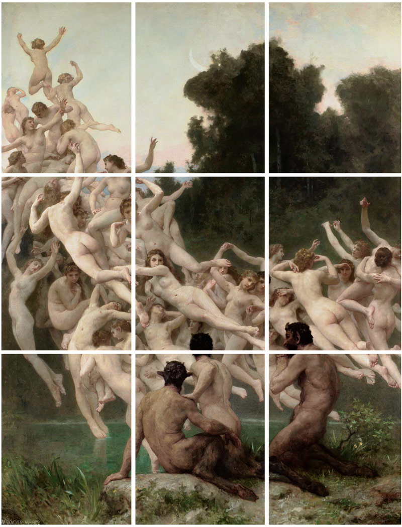
Masters like William-Adolphe Bouguereau (see Day 65) see the composition as a whole rather than trying to plot the subject on a specific thirds point. You can place the subject where you like, then design around it to create movement, unity, rhythm, strength, and visual clarity.
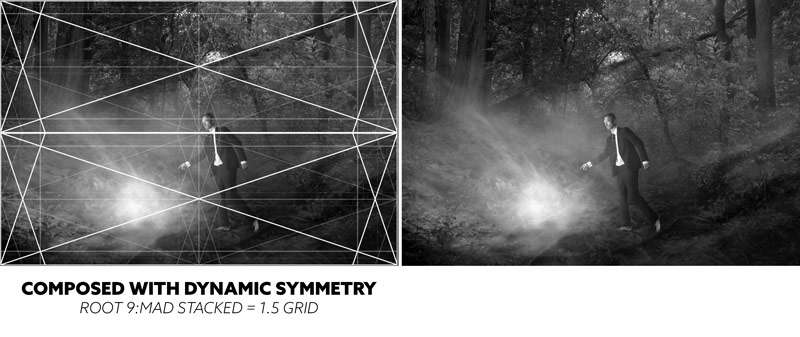
As you saw, I used the rule of thirds in the beginning of my artistic journey (see #415), but I kept digging deeper. I learned about phi, discovered Myron Barnstone (see Day 369), analyzed 100’s of photos and paintings, dug, dug some more, then shared it with all of you.
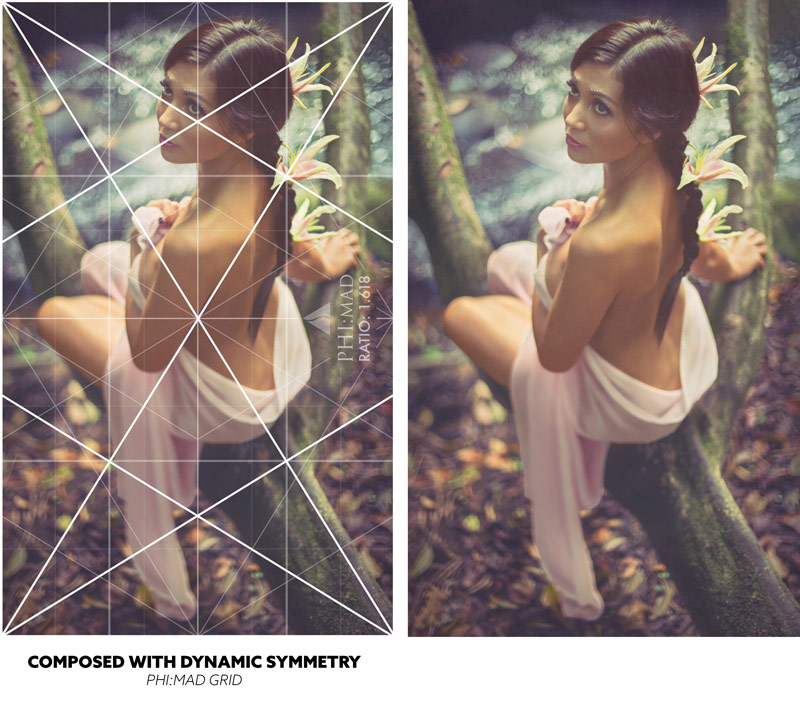
Here are some photos where dynamic symmetry was used…many years later after discarding the rule of thirds forever.

If an artist is using the rule of thirds, ask them why. Does it really make the image more pleasing? Does it really move the eyes around the image. How does it create a more balanced composition? Why is thirds placement a priority in art?
Ok, all this nay-say about the rule of thirds. Why should we use dynamic symmetry? How do we say that in one sentence?
All we have to say is that, “It promotes other design techniques like edge-to-edge relationships, 90 degree angles, dominant diagonals, and repeating diagonals.”
We can see in the simple diagram below how the techniques are directly related to the grid (coincidences, 90 degree angles, dominant diagonals, gamut).
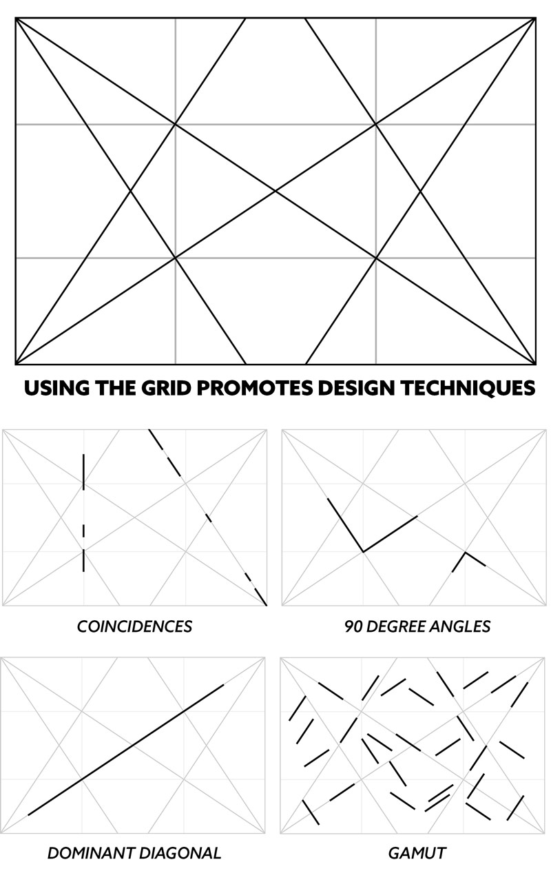
These are four powerful design techniques, and the great thing is that you don’t have to know anything about dynamic symmetry or the techniques to benefit from them. Sure more knowledge is always better, but If you’re using the grid by locking in and paralleling objects, then you’ll automatically be promoting the techniques. No math, no constructing, just use the grid while also paying attention to figure-ground relationship. Easy!
Video and Recap
Be sure to check out the video below, and you’ll also find some free phi grid downloads so you can try out the grids (free grids HERE). There are some for your computer, cameras, and more!
RECAP: Why don’t we use the rule of thirds?
“The rule of thirds is unfortunately misleading because it prioritizes specific thirds placements rather than how the foreground and background interact with each other.”
RECAP: Why do we use dynamic symmetry?
“It promotes other design techniques like edge-to-edge relationships, 90 degree angles, dominant diagonals, and repeating diagonals.”
Conclusion
By now you know the absolute basics of composition. Just pay attention to figure-ground relationship (FGR) and use the grid. That’s it! You’ll be promoting powerful design techniques by aligning things to the grid, and you’ll be creating visual clarity with nice FGR.
Don’t forget to go over the recap above so you can answer the questions easily. Teach it to others too! More artists need to escape the grasp of the rule of thirds so we can change the future of art.
Thanks for joining in, you’re all appreciated! See you in the one!

