Top 20 Discoveries from Canon of Design

#458
Thanks for joining in today everyone! I appreciate all of your continued support.The Canon of Design was launched on September 28th, 2013, so it’s been almost four years of digging deep into the secrets of composition and design used by master painters. How awesome is that?!
Today, I’ve compiled 20 of the most remarkable articles (added to list of Resources) that were great discoveries, and a direct result of grinding into these techniques. The specifics weren’t learned anywhere else, and will likely not be seen anywhere else on the internet. Most of them were created exclusively for The Master Pass members, but everyone will get a glimpse of them today. Let’s get into it!
These aren’t in any particular order of importance, and I will include a brief summary of each article. All of them are definitely worthy of your attention. If you’re a Master Pass member, be sure to dig deep into all of these linked articles…it will only result in making you a more proficient artist.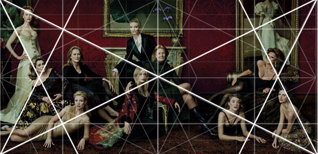
1. Annie Leibovitz Uses Dynamic Symmetry
Several Annie Leibovitz photos have been analyzed (see ALL) and it’s been discovered that she (and her team) definitely incorporate dynamic symmetry into their poses and scene. They also use several other design techniques like arabesques, coincidences, enclosures, etc.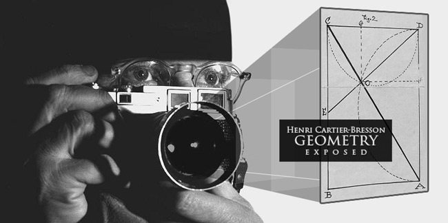
2. Proof of Bresson Using Dynamic Symmetry
My mentor, Myron Barnstone (see Day 120), first mentioned that Henri-Cartier Bresson (see Day 41) was using dynamic symmetry within his photos. This is what got me so interested in what he was teaching and made me move to the East Coast to study with him. Dynamic symmetry was the “geometry” Bresson always referenced. But, it was only when I was watching a book flip-through of Bresson’s book “The Decisive Moment” and reading a book preview by Eric Kim of the same book, that I first saw the 1.5 armature overlaid onto his photo.
No one described what the drawn lines were in the book, but I knew immediately what it was. It was proof that Bresson used dynamic symmetry (see #410). Of course he did, Barnstone wouldn’t lead me astray, but I always like to dig deep and find the proof for myself. Something that I recommend any artist to do; think for yourself and question the status quo.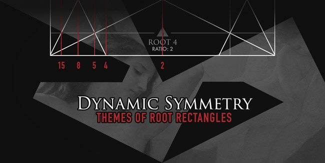
3. Numeric Dynamic Themes
Themed root rectangles have been mentioned on the internet before, and they were briefly covered in Jay Hambidge’s book “The Elements of Dynamic Symmetry” (see Day 14), but the term “numeric dynamic themes” (see #438) was discovered by digging deep into the subject. We can get NDT’s by dropping lines through the eyes of the basic armature. Doing this gives us an equally divided amount of smaller root rectangles inside the mother rectangle, which can be used to further refine any of our designs.
There can be several different themes, and compound root rectangles (see Day 115) can be used, but only the NDT’s will give us equal divisions.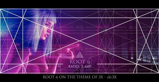
4. Root 6 Can be Used for Cinematography
When It was brought to my attention that someone was analyzing Blade Runner to an arbitrary grid system (see #446) it made me dig deeper into the root rectangles. Barnstone always said that nothing past the root 5 was really serviceable, so I never looked past the root 5 for design alternatives. This makes sense for drawing and painting, but it turns out, that the Root 6 and Root 9 are perfect ratios for cinematographers (see #448). Which leads us to the next discovery…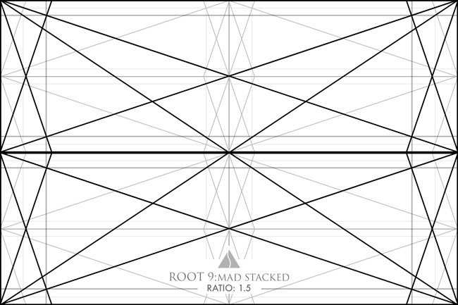
5. Root 9 Stacked Equals a 1.5 Rectangle
Earlier, as I created dynamic symmetry grids for artists, I discovered that the Micro 4/3 ratio is the same ratio as two 1.5 rectangles side by side. Why is this significant?
As we know, the square is the building block of every root rectangle, but as I learned in art school, the M43 was not part of the dynamic symmetry system. Also, the 1.5 was thought to not be part of the dynamic symmetry system…even though it’s a square and a half and serviceable by artists. Well, as it turns out, these assumptions were understandably incorrect! The root 9 (see Grids for Cinematographers) is the piece of the puzzle that answers the riddle.
When we stack two root 9 rectangles on top of each other, we get the 1.5 rectangle. The ratio of a root 9 is three…meaning three squares side by side. When they are stacked, we get six small squares, which can actually become 1.5 squares (four stacked root 9’s for the M43 ratio). Interesting right? Remember, the square is the key to creating all dynamic symmetry rectangles. The 1.5 rectangle can be created by swinging a line down like the root rectangles, and is covered in the Dynamic Symmetry book.
6. Magnetic momentum
In the Law of Symmetry video, I go into detail of what magnetic momentum is, and how we can take advantage of it in our art (see Day 64). This was discovered when viewing a painting by Jeremy Lipking. He had a sinister diagonal in the body of the model, and the greatest area of contrast (see Day 27) was in the upper left corner. Because of the way we typically read from top to bottom, left to right, there was extra movement created within the composition.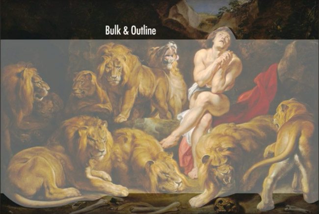
7. Measuring balance with the bulk
Proper balance is a huge part of excellent composition, so knowing how to find the bulk of an image is a necessity. The techniques “breathing room” and “gazing direction” were demonstrated in the Law of Symmetry video (also see Day 57, Day 99, Day 102, Day 104), and they both help us determine proper balance. Once we find the bulk, we can then see where it resides within the frame and how the breathing room and gazing direction come into play.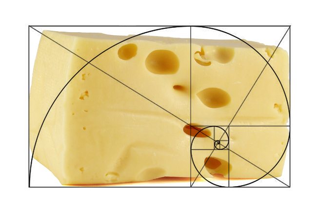
8. Improper Use of the Golden Ratio
Artists all over the internet have been slapping the golden ratio spiral onto their art like it’s a slice of cheese without really understanding it’s use and application (see Day 60, Day 62). It’s not the artists fault. This stuff isn’t taught clearly anywhere else and is easily misinterpreted.
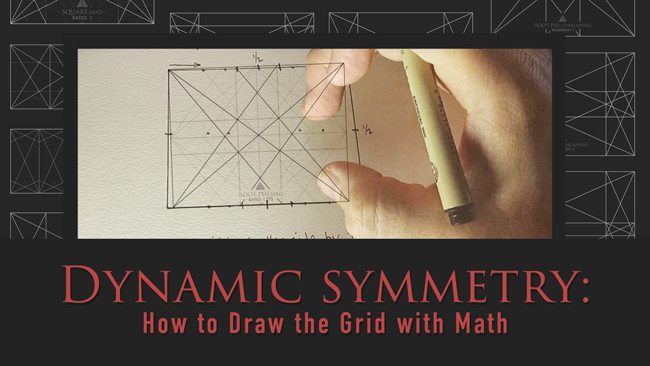
9. How to Draw the Grid with Math
Drawing the armature of a rectangle can be difficult if you don’t have a T-square or triangle to find the 90 degree angle, but I found a way to construct it by using simple math (see #432). You can also build the basic armature as well as the major area divisions (MAD).
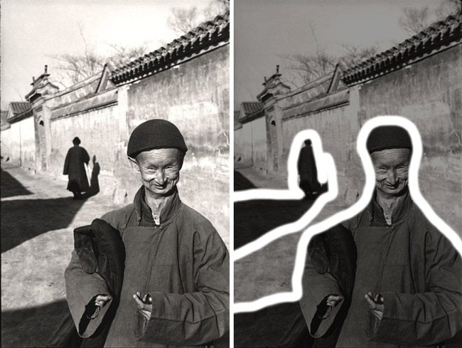
10. FGR is More Important than Placement of Subject
Dynamic symmetry is an important tool to incorporate into your art, but placing your subject within the grid should work hand in hand with figure-ground relationship (see #454). If we aren’t paying attention to the way the subject fits into the background, then we are risking the disturbance of visual clarity.
11. Separated shapes: Bresson Inspired by Matisse
Using separated shapes in street photography is an excellent technique to provide visual clarity to the overall image. It is like advanced figure-ground relationship, and was used by Bresson, Webb (see Day 276), and other master street photographers. The original source of inspiration was from master painters like Matisse (see #374).
12. Finding Arabesques in Nature
Artists have been inspired by nature forever, and we can find arabesques everywhere; in branches, rivers, clouds, etc. One day, as I was walking along a trail, I was awe struck at a particular moment by the beauty of nature. It compelled me to take out my camera and capture the scene. This happens all the time, to all of us.
When these moments hit us, we think we are just seeing a nice scene, but we now know that we are seeing design elements being presented to us by nature. It’s what makes us stop in our tracks and drop our jaws in admiration. Hidden beauty created by naturally occurring design , but discoverable to the trained eye (see Day 18).
13. Artistic Style Development
Artists usually fall into a particular style after trying many different paths, but there is a way to develop your artistic style faster (see Day 122). If we keep the subject, intent, and finishing approach consistent, we will be on our way to solidifying our artistic style.
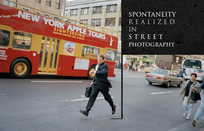
14. Spontaneity Realized in Street Photography
Not every street photo can be composed with a straight horizon line (see #412). Just take a look at Garry Winogrand’s photos and you’ll see what I mean (see #402). This crooked horizon line tells us that the photo was taken in a fraction of a second. It adds spontaneity to the photo, an interesting context that is lost if the image is straightened.
15. Visual Tension with the Law of proximity and Mr Robot
Using the Law of Proximity will allow you to create visual tension when needed (see Day 59, #411). Take a look at the visual tension created in the painting of Adam reaching for God in the Sistine Chapel. We can see the same visual tension in Mr Robot, with the actors face in close proximity to the edge of the frame.
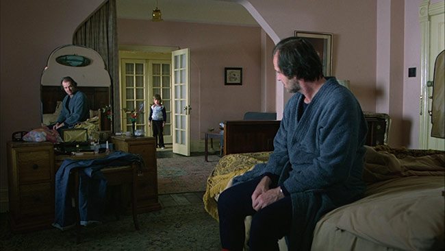
16. Window of Depth and Mirror Mystery
Incorporating a mirror into your art can create mystery and a sense of depth (see Day 238, Day 249). We can also create depth in a composition by leaving a small area of negative space which represents the sky or open air. The eyes will be allowed to travel through the painting or photo to the distant negative space, then return.
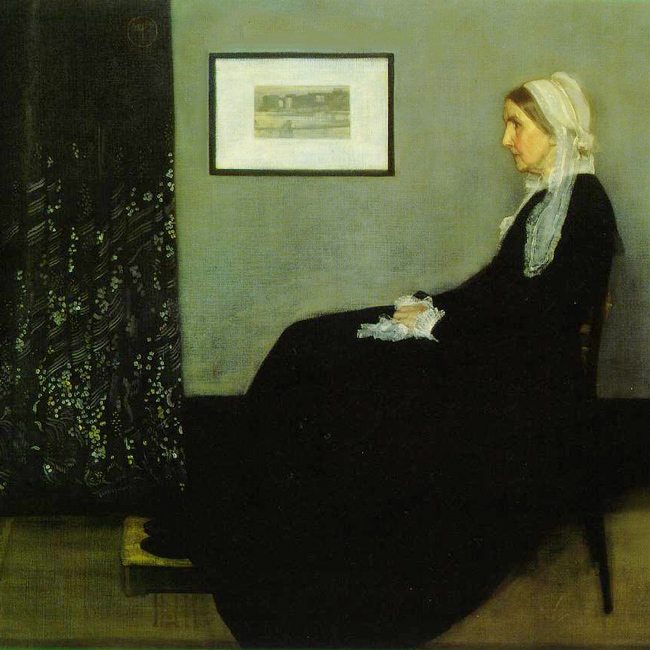
17. Measuring color balance
Color theory is difficult to understand for many artists, but if we remember to capture or create them in a hierarchy (see #442), we are able to have more control over them (see #370, #371, #400). We can incorporate variations of the four basic colors (red, blue, yellow, green), in combination with a hierarchy, to get a very pleasing color palette.
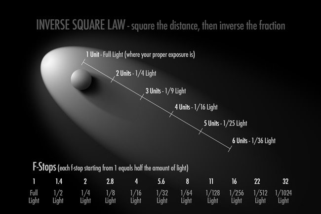
18. Visually Measuring Light with Inverse Square Law
Light can get very scientific and difficult to understand, especially when it comes to the inverse square law (see Day 209, Day 210). It’s taught all over the internet, but it’s not broken down for us visual creatures. I’ll explain it in an easy to understand way, and we can even see how it’s applied properly in master paintings (also see COD book).
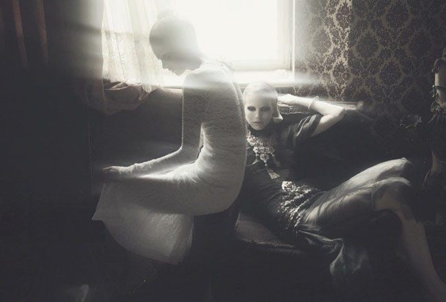
19. Edge Flicker
High contrast near the edges of your frame is definitely a bad thing if you are wanting to control the eyes of your viewer (see Day 49, Day 50). You need them to keep their attention within the frame, not get distracted by high contrast objects near the edge.
20. Best Emotion Provoking Technique
Many design techniques can be used in your composition, but only a few of them will provoke emotion within your viewer (see Day 353). Aerial perspective (see Day 42) is proven to be the best emotion provoking technique to incorporate into your art. Learning to use all of the techniques will render your viewer helpless to your power.
Bonus: 10 Myth’s About the Rule of Thirds
Yes, as a bonus I’m including the 10 myth’s I found for the rule of thirds (see #396). The Canon of Design would not be the same if it weren’t going against the status quo of composition (ROT) and introducing artists to more powerful techniques used by the masters.
Thanks again for joining in today everyone, see you next time!

