Annie Leibovitz – ANALYZED PHOTO #1
2/365
How does Annie Leibovitz use composition in her photography? Well, we are going to be looking at that today! This will be the first analyzed image of the 365 project. None of these design and composition techniques were covered yet, but I just want to introduce you to everything, and then we’ll chip away at it later in the 365. You’ll slowly understand how they use these techniques to create a professional, well organized photo.
Why did I pick Annie Leibovitz? Well, she’s pretty much known by everyone, which makes her a great subject to analyze. I also admire most of her work. Now, when I say Annie Leibovitz, I can’t leave out her team. I know she couldn’t shoot all of those amazing setups and perfect the composition by herself. And who knows, she may just show up, press the shutter button and “BANG”, it’s an Annie Leibovitz image. Someone has to take ALL of the credit right?
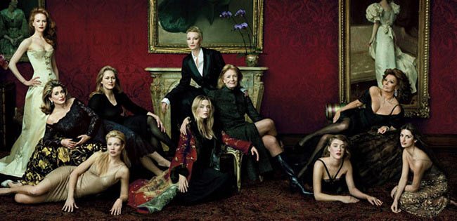
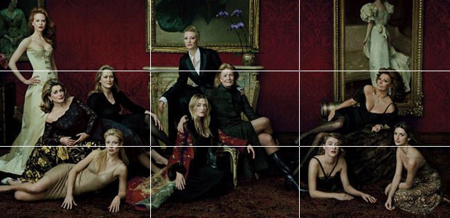
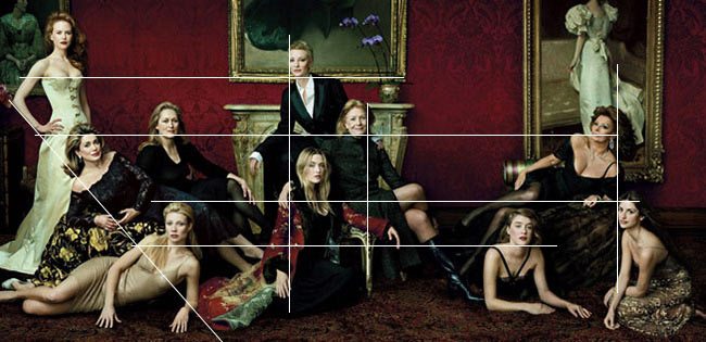
Rule of Thirds – I will always show how the rule of thirds lines up with the image. Do any of the pros use it? If they are, they might be crippling their artistic potential (if this offends you, I’m sorry, but if you please hear me out and give design and composition techniques a chance you will discover an ability to better communicate your art). If you think the pros are using it…look deeper…under the surface. Are you robotically seeing things line up exactly on thirds as we’ve all been brainwashed to see (myself included), or are you seeing things lining up to the verticals, horizontals, diagonals, being united by ellipses, radiating lines, with figure ground relationship, and all of the other design elements?
Some people think Henri Cartier-Bresson used the rule of thirds, but if you look at Day 41, you’ll clearly see he’s designing his images to the 1.5 grid. Sure it may land on a third, but saying you are using the rule of thirds will lead your compositions into a dead end. In result, you’ll be creating an image without thinking about other design elements which are necessary for outstanding compositions.
So sure, you may see the mantle lining up, or a foot or hand here and there, but you can’t get this composition by using the rule of thirds. How do you organize the other women which aren’t on the rule of thirds grid, and still bring rhythm and movement to the image? That’s where design comes into play. The dynamic symmetry and other design elements will help guide you through the trials and tribulations of creating a composition that would make Da Vinci cry.
How would you organize 10 women celebrities, get them in the perfect position so they all relate to one another, keep the eye moving from one to the other, and unite the entire image? The following techniques listed below will supply the answer. And as I said above, this will be overwhelming, but don’t let it scare you. I will definitely cover all of these techniques in detail throughout the 365.
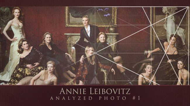
Root 4 Rectangle– The Root 4 rectangle is one of many dynamic rectangles. It consists of two squares. And you see all of those lines within it? That’s it’s internal skeleton…called it’s armature…it’s dynamic symmetry. It’s pretty simple to build and later in the following days I’ll show just how easy it is.
If you follow the lines of the basic armature, can you begin to see their heads and bodies lining up? No rule of thirds here!
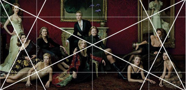
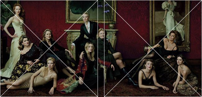
Root Four with Major Area Divisions (MAD) – “More lines” you are thinking. Sure, but it’s pretty easy to get these as well. I just took the first root four and shrunk it down, so that there are now four root fours inside the big one. Confused? Don’t worry…I’ll explain it all…later….
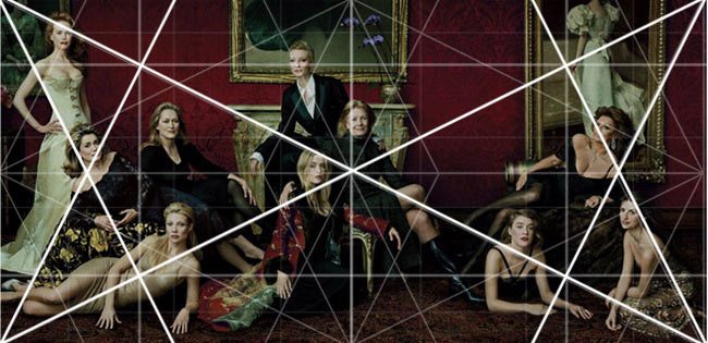
Root 4 with three 1.5 rectangles-Ugh, more lines…yep, get use to it. Laying down these lines allow us to see how they might have planned out there composition. The 1.5 rectangle is a square and a half. The same size as your dslr camera frame. In this image I have three of them side by side. Why?
Because I’m showing that sometimes, if you begin to analyze photos, that you may have a couple of different options to choose from. Since I don’t exactly know how Annie Leibovitz and her team composed this image, I have to do my best to solve the mystery. And in this case, I feel that the 1.5 rectangles line up better.
You can see how the lines begin to line up right? If not, take the time to follow each line with a pencil. Just dumb luck that they are lining up? I was skeptical too. These people are designing their photos, just like the old master painters and guess what? They aren’t telling anybody this secret!
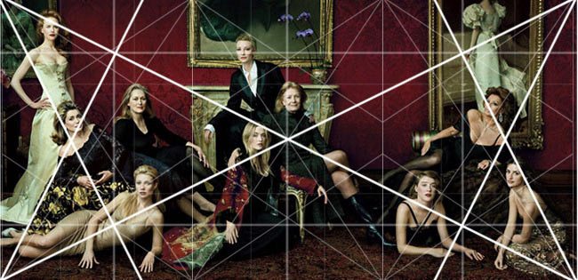
1.5 rectangle – Here’s a single 1.5 rectangle. Heads lined up with the major diagonals, the arms lined up…what’s going on here?
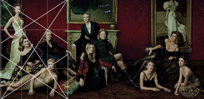
1.5 Rectangle three in row– Can you see things starting to line up to this simple grid? The rule of thirds never taught us about diagonals…what the?? You can use diagonals too??
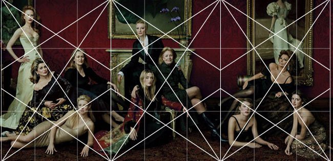
Locked into the Grid– this means that as the grid is layed down, the subjects are locked into it at certain points. If they aren’t locked in, they are paralleling a diagonal.
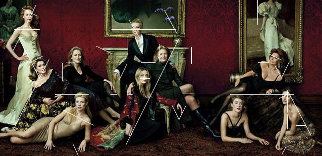
Gamut– this is the limited number of directions used in the image. For pictures and paintings, and other forms of art it’s different. I’ll get into it later, but with photos it’s pretty easy. The human body has two arms and two legs which can be positioned to create repetition and intervals….if you can work in the body and the head into the rhythm even better….echo it in the background and you are on your way!
This gamut not only creates movement, but it creates a rhythm that is speaking to the viewer in a subconscious way. Subconscious meaning that the vast majority of people don’t know how to read an image…they just know that it’s pleasing…they don’t know why. They “feel” it.
Rebated Square– it is said that some artists utilized the rebated square in their art. I haven’t found too many so far. I will always display it just as I do the rule of thirds. The rebated square is better than using the rule of thirds, but using dynamic symmetry in your rectangle is the best way to go. If you’ve already forgotten what dynamic symmetry (with the basic armature from above) is don’t worry, I will cover it extensively.
90 degree-the 90 degree angle is not only part of the basic armature, but it’s also a sign of strength. I will have a separate day dedicated to this subject, but for now just keep your eye out for it. I’m not talking about 90 degrees that are vertical or horizontal. It has to be at an angle to have any worth.
Arabesque-ah yes, the good old arabesque. I love this element! It’s very easy to find in nature within the trees and sky. The human body can form a nice arabesque. This is what truly moves the eye in an image…not plotting it on an off-center-crosshair like the rule of thirds claims. It’s the line of movement, the line of beauty…so sexy.
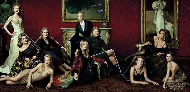
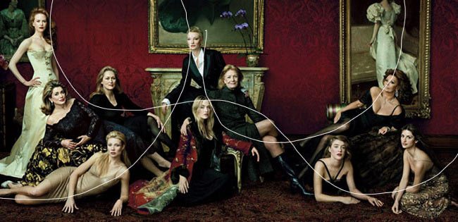
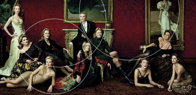
Ellipses-arcs and ellipses can be used to unite subjects or objects in the image. Follow the line of the ellipse from Nicole Kidman…do you see the heads being collected on the arc?
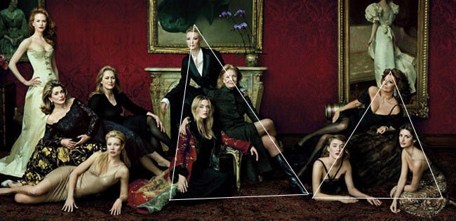
Enclosures-Enclosures are made up of simple geometric objects (triangle, circle, square) used to group objects and unite them. Do you see the two groups forming a triangle?
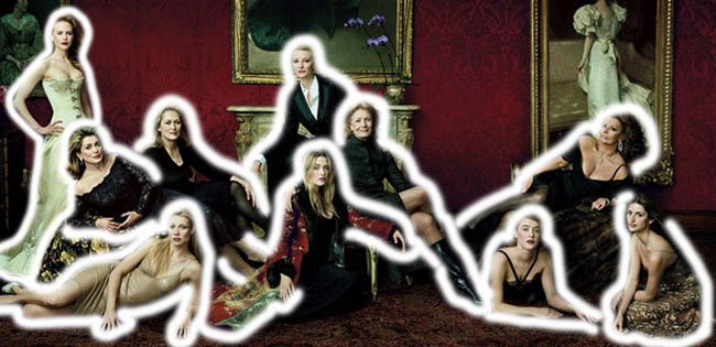
Figure Ground Relationship-one of the most important techniques to learn right off the bat. I draw a line around the subject until the background interferes with the readability of the image. So in this case, when the black meets the black it’s hard for the viewer to determine the true shape of the subject. Drawing a mental line around your subject before you take the picture will ensure there is good separation between figure (subject) and ground (background).
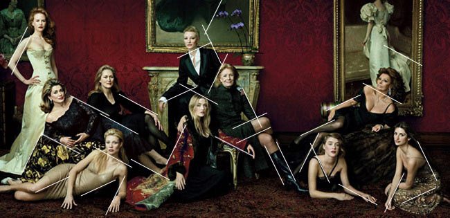
Coincidences-artists use these to create a movement from side to side, top to bottom, and on diagonals. It also helps unite the objects on a line of continuity. Follow the line, you will see forehead on the same level as chin, legs, bust…see how the lines are matching up from side to side?
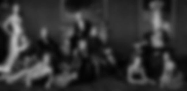
Black and White Blur – (BW BLUR) Value scheme – I do this to get a better look at the value scheme used. Simply convert your image to black and white, then give it a blur as if you are squinting your eyes. I’ll be doing a video tutorial on this later, along with finding the GAC below (see Day 71).
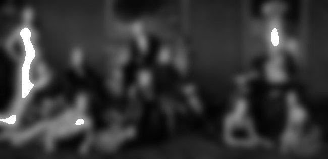
Greatest Area of Contrast (GAC) – it’s proven our eyes will go to the greatest area of contrast. Knowing this will give you the power to control where your viewers eyes look first. This is also another technique you should be learning right off the bat. This has everything to do with light. Know where the brightest area of your scene is. If you can’t place your subject there, be aware that it will pull attention away from your subject…especially when it’s placed up against a darker value.
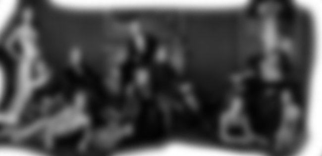
Edge Flicker – (EF)- Learn this technique right off the bat as well. What, that’s only three…FGR (figure ground relationship), GAC (greatest area of contrast), and EF. Ok, learn these three first, but one at a time…baby steps. I don’t want to get you all stressed out. Edge Flicker refers to the areas of high contrast near the edges. Remember that our eyes go to the contrasting areas…well, keep them away from the edges! I will paint white around the edges and show where it is broken by areas of high contrast. As you can see, Annie has quite a few areas of high contrast near the edges.
And that’s about it. There are a few more techniques like aerial perspective, and simultaneous contrast…all of the gestalt principles, gazing direction, but we’ll get to those eventually. But for the most part, whenever I analyze an image, I will be covering these techniques. Please let me know if you have any questions. If you are confused, don’t worry. Stick with it and I will be explaining everything in more detail.




November 1, 2013 @ 7:31 am
This article is amazing. Thank you for making such detailed information and analysis about one image.
It got me thinking about my own photography…about how one would apply these principles to their own image making. would you be able to recommend any books/texts that would be worth reading up on.
This all just reminded me of highschool art and finding triangles in the great painters compositions. I would love to learn more and attempt to bring some more depth in to my own compositions. 🙂
Thanks again. (bookmarking your page to read through the rest on the train)
Andrew
November 1, 2013 @ 10:29 am
Hi Andrew, you’re welcome! It’s nice to finally start to see how these compositions are created. I wish I had studied composition like you when I was in high school! I’ll be releasing an article on how to use the grid…I want to make a video, so it’s easy to understand. I will also release a list of recommended videos/books on the subject. Until then, i would check out all of Myron Barnstone’s free videos on youtube. If you like those, he has them for sale too. “The Painter’s Secret Geometry” gives more examples of how it’s used in art, but it’s tough to find…plus expensive. I really liked “The Practice and Science of Drawing” by Harold Speed…he talks about communicating to the viewer and using rhythm…good even if you don’t read the specific parts on drawing. It all relates to most forms of art.
February 24, 2014 @ 8:03 am
Hi,
Interesting post, thanks for sharing your knowledge. If I may make a suggestion to improve the reader’s experience: you should increase the font size a bit to make it more comfortable to read. I know, I know, we can zoom in! But still, I thought it could be worth mentioning as it is part of the design of your website. The font size used for the Comments section is already a lot easier to read.
Now this being said, it is a subjective opinion and you might prefer it as it is.
February 24, 2014 @ 9:17 am
Hi Camille, thanks for taking the time to view my project. Glad you are finding it helpful 🙂 I added a font size plugin which should help with your great suggestion. You can adjust it at the top of the article and should remain that way until you clear out your internet cookies. Take care! Tavis
December 5, 2016 @ 11:39 am
Im struggling to understand your analysis. I can see to much variation in the image to be honest. where is best to start to look at the image. For instance I look at the squaring and literally imagine squares. I know that from a graphic design point of view if there is one- its different in britain quite anarchic in parts. Im referring to in design here and how it divides canvases into squares and the diagonal is there. All these methods are different ways of looking at this image. shrinking down seems vague as logic. root four where does that come from? what about a time lapse of the figures the photographic session. I use a compass to draw a arc usually???? I find the centres first. Are there four rectangles interlocking which disappear in a overlay as opposed to a tessellating form.
I could go on. The groupings the triangles. you say you don’t know how she did it is this all guess work then? A element of animation or colours would help. A index of where the division started? I think most art is kind of improvised. it is winging it. Id love to understand this its very interesting. i see a above and below to it. the arabesque I don’t get I typed it into goggle and got patterns. Patterns that have grids that this pattern is hiding something underneath its refining a design basically. Its like the details are superfluous that the subject is a misnomer That the real players are the ones in between. the negative space.
December 8, 2016 @ 6:54 pm
Hi Timothy, thanks for the question. I’ll try to answer your questions. Sorry that you’re having a tough time understanding, it’s a lot to take in…like learning a new language. The root 4 is mentioned in the book “Elements of Dynamic Symmetry” by Jay Hambidge. It is a rectangle that is constructed from a square. It’s not as difficult as you might think.
I don’t think it’s all guess work. She’s a professional and needs to be on top of her game. This means planning a shoot thoroughly…not winging it. She has a whole team and I suspect that her set designer helps quite a bit with the production.
I have made videos that cover the techniques thoroughly and provide animations. They are for sale on my site.
It doesn’t matter where the division starts, it’s the final product that matters. The grid (armature) is constructed the same way each time…two diagonals, 4 reciprocals, horizontals and verticals.
You’re right, most art is improvised. This doesn’t mean they are masterpieces. The majority of aren’t will never fall under the category of masterpiece. I share these techniques so that artists can surpass the plateau if they wish. They can stay in the same place too…all up to them if they want to continue winging it and see what they get. I think with knowledge comes the ability to control the outcome instead of guessing.
The arabesque is a term that was frequently used by Myron Barnstone. It’s like Hogarth’s line of beauty, but more complex and versatile. The arabesque incorporates the Law of Continuity, which is a Gestalt psychology principle. Basically we can unite multiple objects with their edge to edge relationships…much like a dotted line creating an image.
I just released an ebook that covers all of these techniques thoroughly…it’s only available on Amazon until February though. It’s called “Photography Composition & Design” and I would recommend it if you are serious about wanting to learn this stuff. I present it in a fun and easy to understand format.
The negative space plays an important role as well. It allows the composition to breathe and can be used to create visual tension, isolation, or loneliness in an image.
I hope this helps. The more you study it, the easier it will be to understand. Baby steps 🙂
December 9, 2016 @ 4:50 am
Hello there thanks for your reply. I have read a painters secret geometry. It was a eye opener. I have done most of the exercises actually like swinging the hyp. of the square. Its this image I find difficult I guess and applying the analysis and getting it right. I used to be able to see the composition in paintings. the geometry behind them in a glance even in photos from the press that I didn’t think were composed but I think some are more considered now. obviously photographers are considering the rules and art is in the newspapers. I was thinking about the dynamic symmetry that simple symmetry is side by side like a rorschach test or butterfly yet dynamic could be non consecutive and work across layers in the depth of field. You can have twins, triplets and quads of symmetries yet spread out through time as subjects so they are less obvious and like you say dual in the same figure, different symmetries a quad can share a twin. I guess I’m looking for a controlled experiment so to speak where its explicit. This is a complex image for sure. Im happy that it more complex. thank you i appreciate the feedback.
December 12, 2016 @ 10:58 am
Thanks for the comment Timothy, it is definitely complex, but gets easier with experience. I think the hardest thing would be getting all of those actresses together 🙂 Take care!
January 20, 2017 @ 1:18 am
wow…great great article !!!
January 20, 2017 @ 9:59 pm
Thanks for the nice comment, glad you enjoyed it!