Email Q & A: Blade Runner Analyzed Cinema

#446
This Email Q & A is thanks to Andre Hines. Thanks for being curious and questioning things you see on the internet. Also huge thanks to everyone for the amazing and continued support! I appreciate you all!
Today we are going to take a look at the Sci-Fi movie “Blade Runner” (1982) and some grids that were used to analyze the composition and design of it’s cinematography. Let’s get right into it!
Remastered Trailer
Check out this trailer of the movie if you haven’t seen it yet…pretty nice visuals for back in the day.
Question: “Hi Tavis, I’m a member of the site and have a question about an analysis that I found on another website (HERE). We see he is analyzing some cinematic shots from Blade Runner. I notice that the grids he is using seem to be dynamic symmetry grids, but they are slightly different than the ones I purchased in your grid pack.
Can you explain to me what these grids are? Are they a slight variation of root 5?”
Screenshots from Flooby Nooby website.

Answer: “Hi Andre, thanks for being a member I appreciate it! Great question too! This is an interesting analysis. The grids he is using look like dynamic symmetry grids, but they aren’t derived from the square. The square is the beginning of all root rectangles in the dynamic symmetry system. Just like all of the grids in the grid pack you bought. That’s great that you noticed the similarity.”
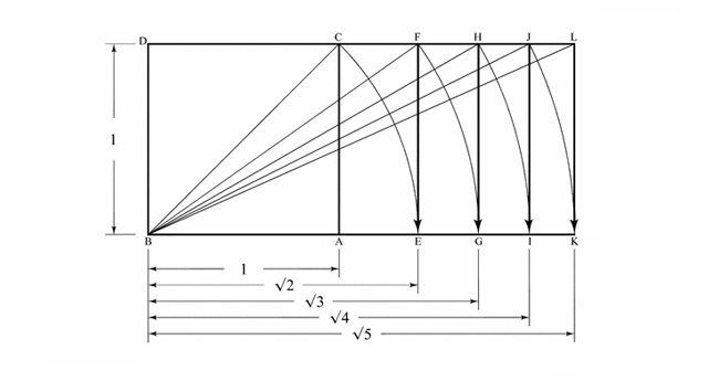
“The cinematic ratio of 21:9 is 2.333, so the root 5 would be the closest at 2.236. The big difference between the root 5 and the grid that he is using is that when using the root 5 we are using a system of design…not just one grid.”
Added Note: Initially, we can use whatever grid we like, but I think once you see the difference below you’ll see that we could use both and get similar results.
“The grid he is using is much better than the rule of thirds though because it brings attention to the importance of diagonals. Interestingly though, check out the root 5 alignment when it’s centered…lines up pretty nicely.”
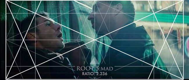
“To construct his grid we can take the 21:9 rectangle, use the rebated square on each side, draw the major diagonals (see Day 63), then make a smaller 21:9 ratio rectangle inside which lines up to the 45 degree diagonals of the rebated square.”
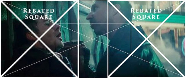
“I know the root 5 doesn’t line up perfectly, but the human eye won’t notice the subtle change in the degree of the major diagonals of each rectangle.”
Added Note: In the diagram below we can see how closely the 21:9 grid (red) lines up next to the root 5 grid. It only starts to noticeably change as it gets closer to the right and left.
It’s important to mention that I built the 21:9 grid the same way the root 5 is constructed…by intersecting the major diagonal at 90 degrees, then building the smaller MAD (major area divisions) inside of it.

“I believe it’s better to adopt a system rather than two grids for one purpose (his second grid just cuts it in half and fourths, then runs diagonals, horizontals, and verticals).”
Added Note: I make the above statement knowing that the 21:9 frame is not fully covered by the root 5 grid. A system of design is much better than the grids in question…but that’s just my opinion 😉 Maybe some day they will make cinematic ratios that fit our dynamic symmetry grids exactly. I won’t hold my breath though.
Example showing how the 21:9 grid was divided into halves and fourths with horizontals, verticals, and diagonals.
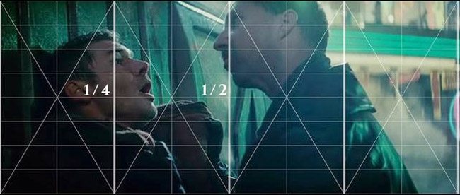
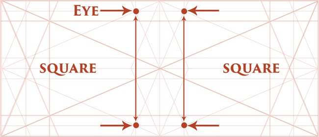
Added Note: When we look at the construction of the 21:9 grid, we can see that when the verticals are run through the eyes we get a square (not exact to the decimal, but very very close). We can use the edge of the square to incorporate basic geometry into the composition.
Example of the 21:9 grid with squares.
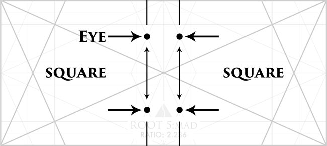
The root 5 can also generate a square by using the eyes as seen below. So as we see, they are both very similar.
“On location during a shoot, only one grid is practical to use. His grid and the root 5 both serve a purpose for composition, but only the root 5 is part of a system of design. Kudos to him for analyzing cinema for more than just thirds.”
Andre: “Awesome! Thx for getting back to me so soon. Yeah, upon further evaluation, when I placed some root 5 grids over the slides, I noticed that things were actually lining up a lot better than the grids he was using. I’m definitely gonna stick with the grids related to dynamic symmetry system. Yeah, this would definitely make a great article.
I’m a filmmaker, and my applications of your teachings is mostly to do with contemporary film, particularly with cinema 2.33 ratios, which I found only a few articles on your site. This lead me to seek out if anyone else was doing something similar, but his site was the only thing I came across that was even remotely similar.
I saw that you’ve done a lot of analysis on older film aspect ratios (see #401), and television 16:9 ratios with Game of Thrones (see Day 26 and #421, also see ), but it would definitely be a welcome to have more cinematic analysis articles dealing with 2.33 ratios (see #418), since that is what most films in the theatres these days deal with.
Actually, I saw the new “Guardians of the Galaxy” last night and it was absolutely stunning and riddled with dynamic symmetry and gestalt principles. You should check it out some time. Thanks much again.”
Tavis: “Hi Andre, that’s great that you started lining up the root 5 to the screen shots. That’s the application part that will help you excel further.
I like your suggestions and will look into more articles dealing with the 21:9 ratio. I will have to check out the “Guardians of the Galaxy” movie. Thanks for the recommendation…I’m always on the lookout for great movies using the design techniques!”
Andre: “Yeah, it’s the Vol. 2 Guardians that just came out this week. I revisited the the first guardians to see if the design is comparable, but unfortunately the art direction in the first one pales in comparison. I didn’t notice any significant applications in the first one. Not to the extreme levels that I saw in this second one. Maybe they upped the production value on the new one. Thx again.”
Conclusion
I think it’s absolutely amazing that Andre is seeking out knowledge to learn more about dynamic symmetry and cinematography. I also think it’s great that he is watching new movies and noticing the design, then comparing it to older movies. Andre is a great example for other artists out there looking to be the best they can be at their art. Don’t be afraid to reach out to me if you have questions about this stuff, I’ll do my best to help you out.
That being said, this has inspired a new and upcoming article (see #448, #449, #450) exclusively for The Master Pass Members. Stay tuned!


