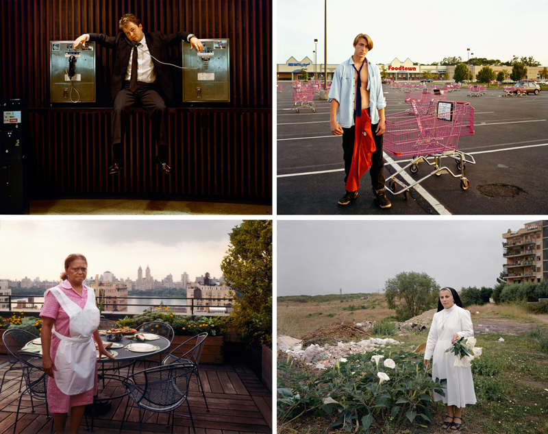
Joel Sternfeld – Top 3 Techniques (ANALYZED PHOTOS)

#707
Thanks so much for joining in today, I appreciate the support!
Today we are going to dig deep into Joel Sternfeld’s photos and discover the top 3 techniques he uses repeatedly. We’ll also learn more about him as a photographer and compare the other artists he’s similar to. This was a recommended photographer, so thanks for the suggestion. Let’s get into it and see what we find!
Joel Sternfeld? Who Is
Joel Sternfeld (1944-present) is an American fine-art color photographer that is known for his large format photos. He prefers color photography to black and white, and started learning about it in 1970. If you get a chance, check out his site where he’s got many photo books and galleries to view.
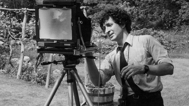
What I find interesting is that he shot with a large format 8×10 camera (see photo below), and he’s got a similar artistic style as many other artists that shoot with a similar camera.
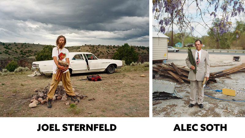
Here we see a comparison of Joel’s photos with Alec Soth (see #546), who also shoots with a large format camera. Can you see the similarities? We will cover Joel’s top three techniques used to achieve his photo aesthetic, but let’s continue to look at other comparisons.
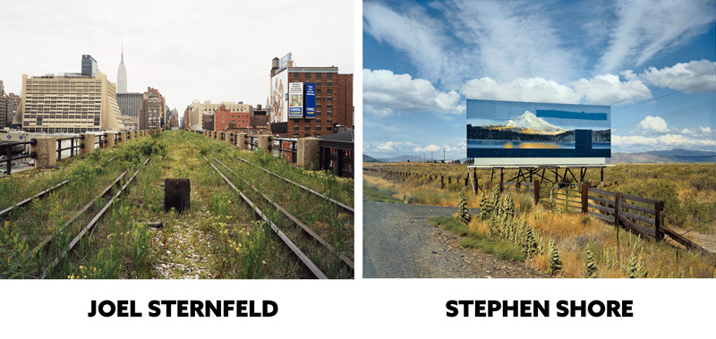
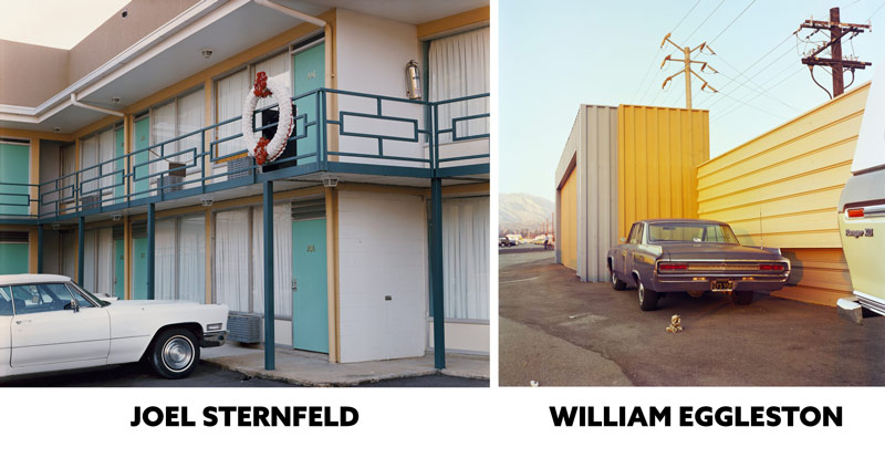
Two other photographers that he’s similar to are Stephen Shore (see #480) and William Eggleston (see #375 or video). They both shoot with film, but Eggleston doesn’t use a large format camera. Their love for mundane scenes is really apparent here.
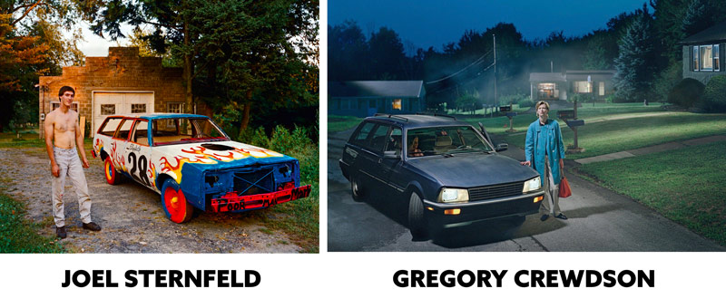
Joel is really similar to Gregory Crewdson as well (see #695), which was a pleasant surprise. Here we can see how the photos by Joel are just slightly different than Crewdson…slightly.
In this next photo, Joel just needs a person aimlessly staring to turn it into a Crewdson photo. Maybe he could use a smoke machine in the background to create aerial perspective, but that’s it. They both have the wet streets, car, and mysterious neighborhood. It’s interesting to see that Crewdson captures more chaos with the telephone wires, while Joel’s is calmer looking.
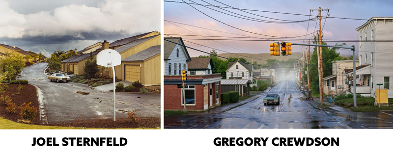
These photos are very similar, and Joel only needs to add some smoke and have the guy stare away from the camera. Some mysterious lighting would also help achieve that signature Crewdson aesthetic…if that’s the goal.
Gregory Crewdson is younger than Joel. Was he inspired by him, in addition to Edward Hopper (see #505)? We may never know, but the similarities are definitely there.
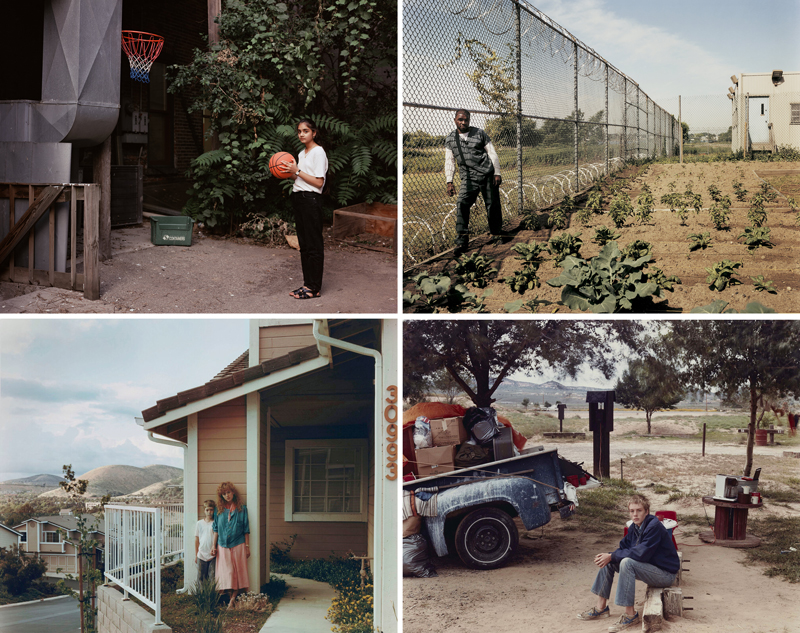
The gazing direction plays a big part in the story of the photo (see #492). Gregory Crewdson has them stare away from the camera, which invites the viewer in to explore the image more. In these portraits by Joel, they are all staring at the camera. Imagine if they were staring elsewhere…we’d get a different story.
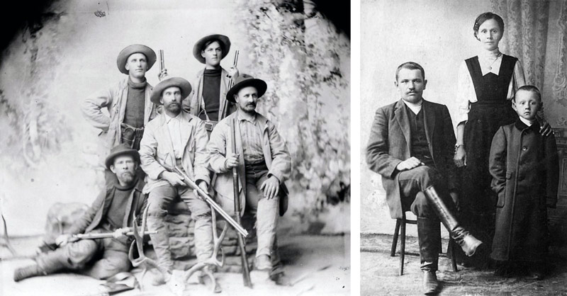
It’s interesting though, because rather than smiling like the usual “say cheeeeese” photos, or IG selfies, they are just staring at the camera like they use to in the old days. Maybe this expressionless portrait originally came from the days of slow shutter speeds, and they didn’t want any blurry expressions on the face. They probably couldn’t blink back then either until the photo was exposed.
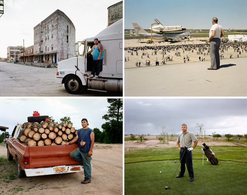
Here are some more portraits for you to enjoy. Now let’s keep digging and begin to learn more about Joel’s techniques!
Top 3 Techniques Analyzed
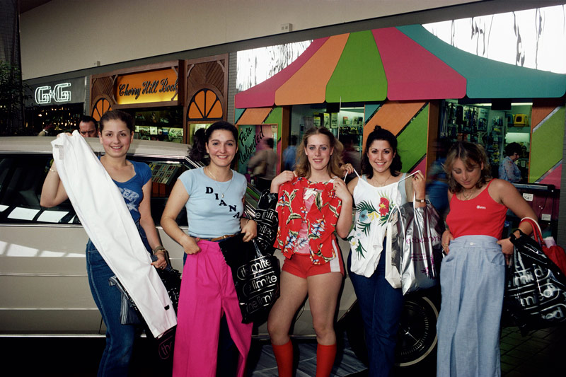
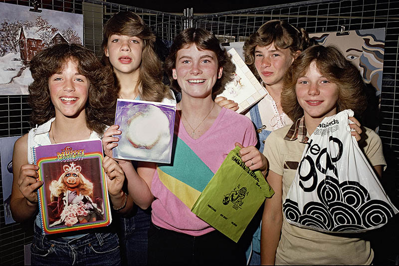
Joel Sternfeld has taken some great portraits, and created some interesting photo projects (see #598). One that stood out to me, from his site, was where he walked around the New Jersey mall in 1980. He cleverly took snapshots of consumers and the things they bought. This project is like a “time seed” that was planted decades ago, which we can enjoy with great pleasure today. I think it would be so interesting to do today, then look back on in 2035. Things would be so different!
Despite his portraits, the most remarkable images are those that include more of the environment. Sure, a small human element can be present, but the image is mostly the surrounding environment. That’s where his artistic style really shines.
Negative Space
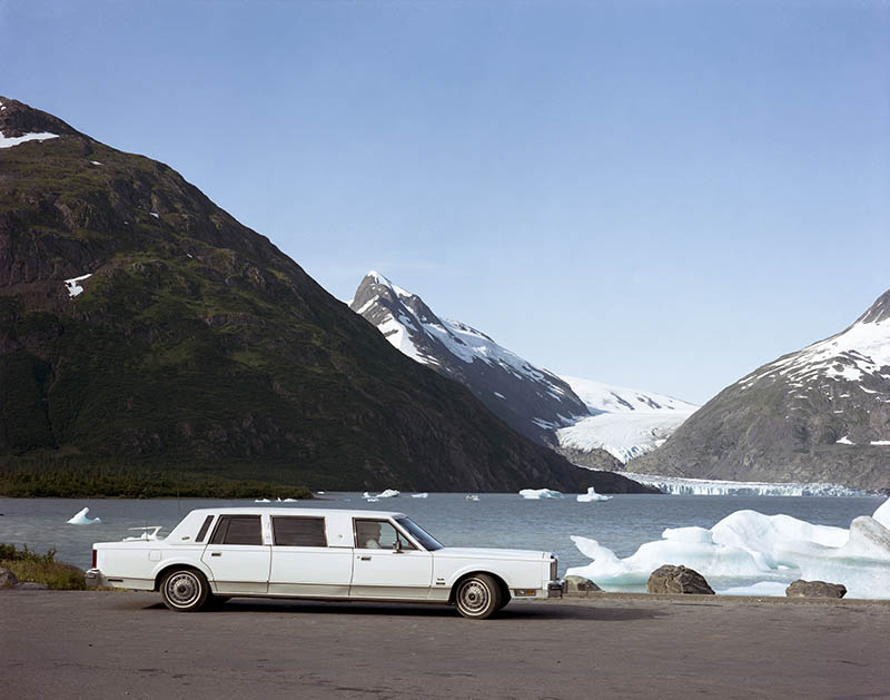
One of the top 3 techniques Joel consistently captures in his photos is negative space (see Day 83). The excessive negative space is really noticeable in a lot of his photos, and since it’s so consistent its become part of his artistic style (see Day 122). This technique is used as a tool to help create feelings of isolation, loneliness, or show the grand scale of an environment.
In this photo, Joel is telling his story perfectly. The clouds in the sky add some interest to the large area of otherwise empty sky.
We can see the difference here with no clouds in the sky. There’s less energy, more negative space, and a quirky story of this retro limo alone in an icy wonderland.
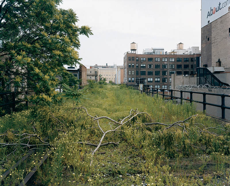
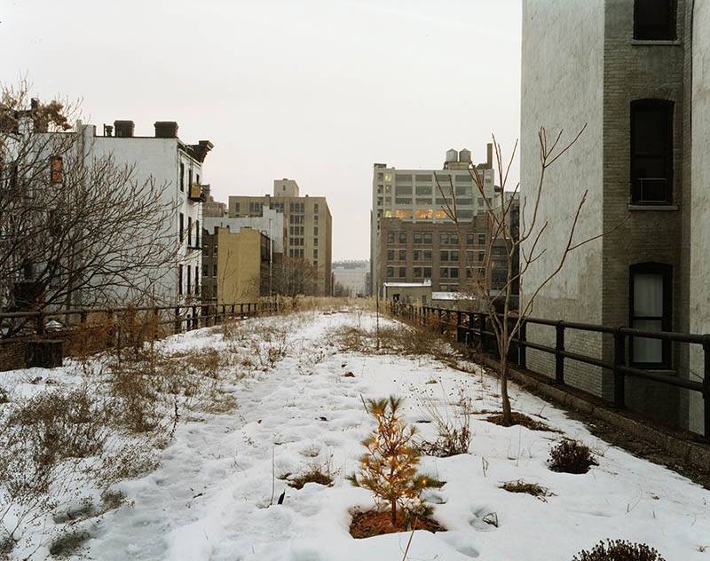
Joel has a short documentary on YouTube where he describes his amazement with the New York High Line, which is an abandoned, overgrown railway. We can see the negative space he captures below, and it looks like a scene out of The Walking Dead. Feeling isolated or lonely yet?
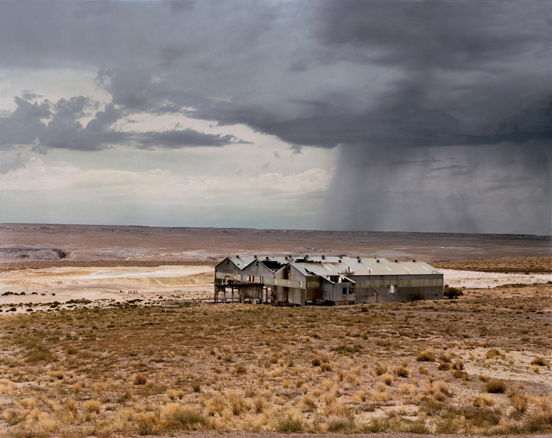
Lots of negative space in this one, and we also have some sinister diagonals in the clouds.
The excessive negative space is doing a great job of telling the exact story Joel is trying to capture; isolation and loneliness. Like the storm clouds “only rain on me” type of scene.
Balance
You may have noticed by now that Joel has a lot of center compositions. Why is this? It’s because the center is the starting point for great balance (see Day 57). Just like a teeter-totter, we start at the center and balance interest points from left to right. The rule of thirds is misleading in this way (see #692) because it tells us to start on a third.
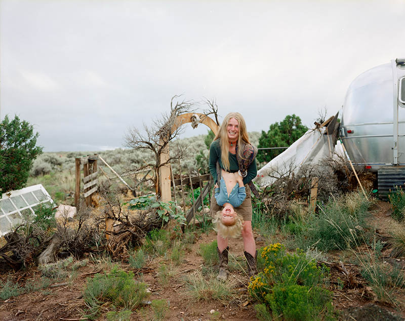
In this fun photo, he’s got the mother and child centered with the distant doorway, then balanced from right to left with the square windows (left) and trailer (right).
It’s not difficult to get great balance if you start from the center.
This centered shot is almost like a Kubrick shot with one-point perspective (see Day 260).
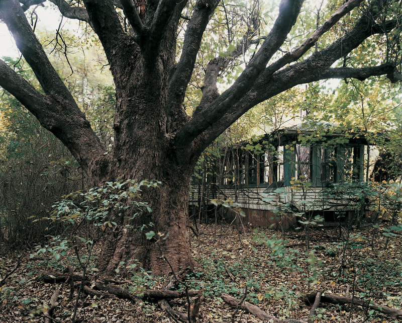
Great balance in this one too. What an excellent post-apocalyptic type of scene! Hmmm, it’s almost like post-apocalyptic scenes are part of his artistic style too!
Repetition
The final technique that we’ll notice in a lot of Joel’s photos is repeating shapes. Whether it’s people or pumpkins, the repeating shapes can create a pattern within the image (see Day 189).
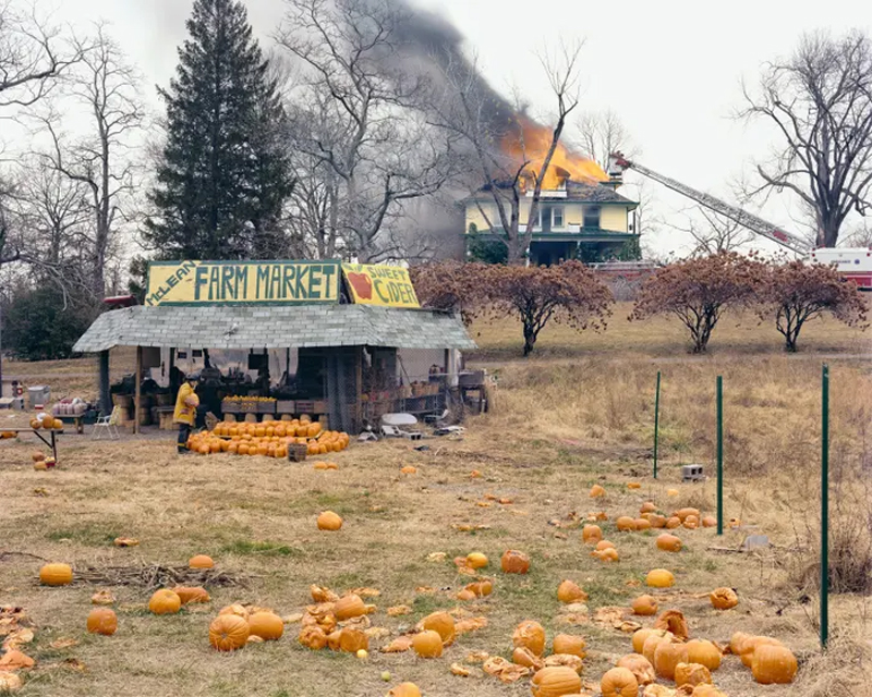
This photo tells an interesting story with the blazing house in the background, and the pumpkin field in the foreground. He also sees the orange color repeating in the flames and pumpkins. Great eye!
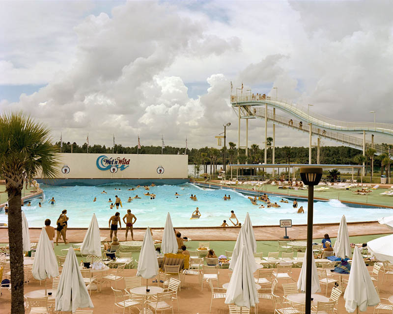
Can you see the repetition in this one? We have the shapes of the people in the pool, but also the pointed umbrellas and square tables too.
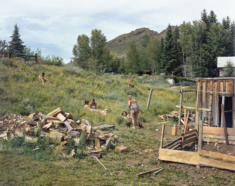
The wood chunks and wood wall both have repetition in this one. Plus, when we look close he’s capturing the repeating colorful orange, yellow and violet flowers. It all adds to the final image!
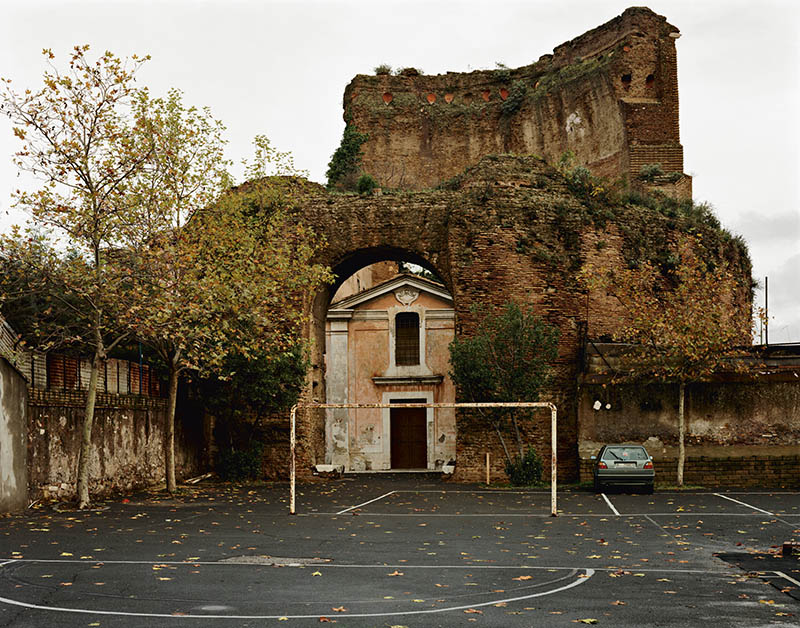
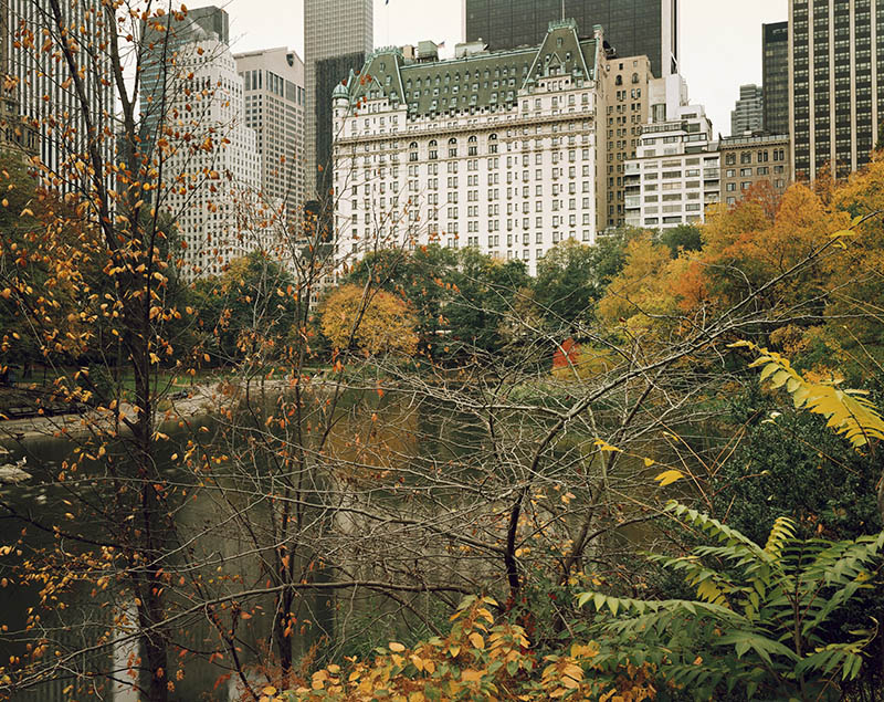
The repeating windows are seen in this one, which might be obvious in any city shot, but he’s enclosing them with the colorful trees. Almost like another post-apocalyptic scene!
Here we have the repeating figures in dark outfits, the rectangular coffins and tombstones.
Ambiguity
Here’s a bonus technique that you may have picked up on. Just like Gregory Crewdson and a few other street photographers, Joel is keen on leaving the story open for interpretation. Ambiguity can strengthen an image or painting if it’s done right (see #440).
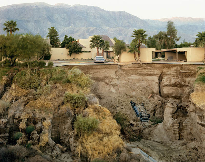
Gotta love this one, with the landscape, the hotel-looking structure, and the large pit with a car buried in it. This could be a book cover for a Stephen King novel!
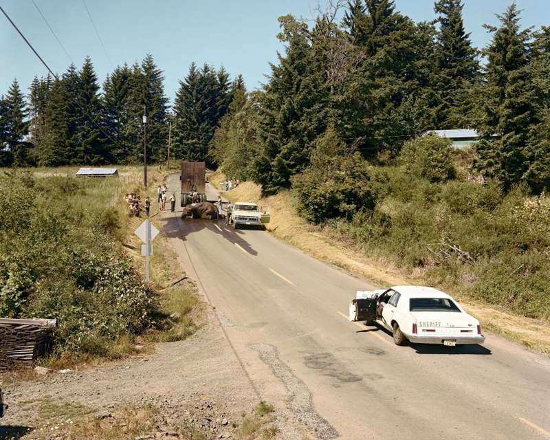
This one too! I always thought this was a Gregory Crewdson photo until I was researching this article. Can you see the elephant? What the heck is going on here?? Did they hose it down?
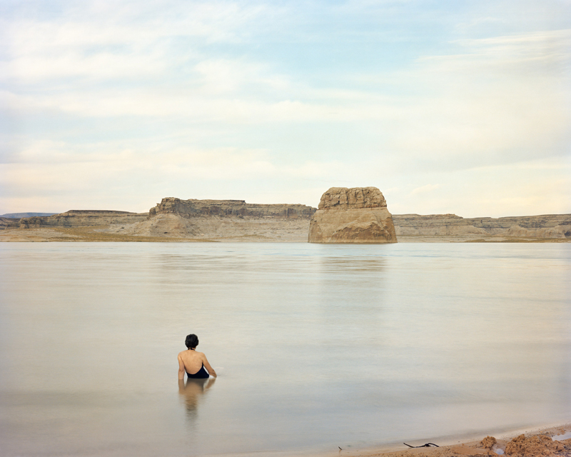
This is a great image and the woman’s hair reminds me of a Rene Magritte painting called “Not to be Reproduced.” Such a calm and mysterious image.
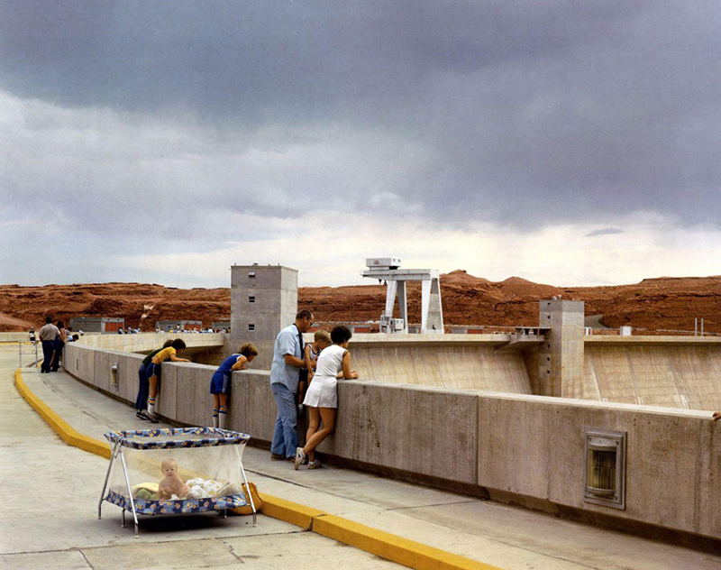
Ok, why would someone bring a baby’s playpen to the Dam? Either way, the baby looks like it’s having a great time!
Artistic Style Consistency
Now, after getting to know Joel’s work and understanding his style, let’s look at some consistency issues. Call it, “an opportunity to learn even more!”
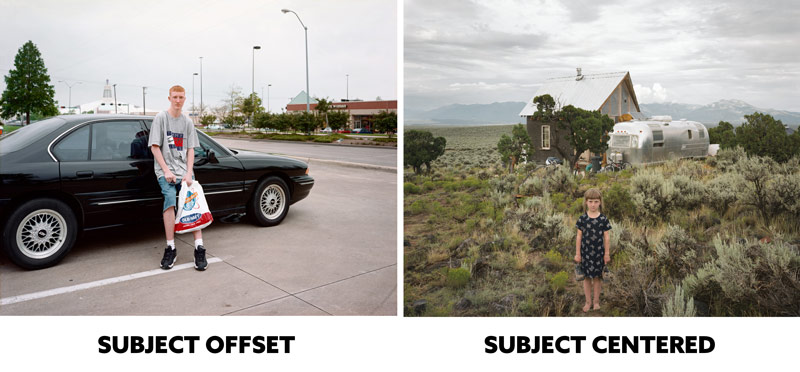
When his subject isn’t centered and not including a large area of the environment, we get a different style that is less impressive or professional than the other. Let’s look below and see for ourselves…
The image on the left has the man almost centered, but his car is a large portion of the main interest and it’s making the image left-heavy. It’s also creating edge flicker with the high contrasting wheel and tree near the edge (see Day 49). In the image on the right, we have way better balance and the image is cleaner looking. Do you see it? One looks like an amateur’s snap shot, and the other looks professional.
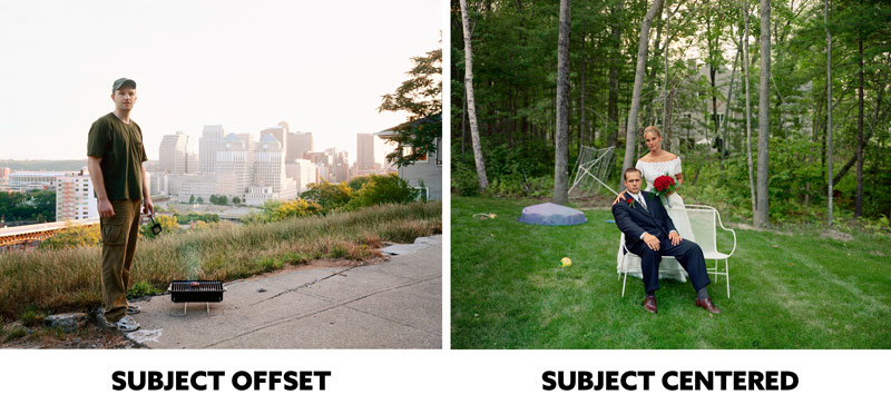
Same with this one. The man is off center, the distant city is centered, then we have high contrast on the edges. The image on the right is centered and nicely balanced from left to right. The center is the fulcrum! Both have excessive negative space, but since the one on the right is centered we get better balance.
Maybe if the man in the left image were sitting down in the center and the city were in the distance it would have better balance??
This is just something to keep in mind when you’re trying to create nice balance in your own art.
Conclusion
Well, are you feeling inspired to pick up your camera and start shooting? What is your artistic style? Do you use any design techniques consistently? Try writing some down and creating a new project of people in the mall, at the gym, or capture quiet mundane scenes of decrepit buildings. Always start balancing from the center and work your way out.
Thanks so much for joining in and for the continued support! See you in the next one!

