The Rule of Thirds Killed Design and Left it for Dead – 1 of 365
INTRODUCTION
“A painting that is well composed is half finished.” ~Pierre Bonnard
Yes, the title is true, the rule of thirds killed design and left it for dead. Sorry to bring it to your attention like this. I should’ve candy coated it, but that’s not going to happen. In fact, the rule of thirds is a cold-hearted lazy b-word. There, I said it. Forgive the language, but someone’s gotta put it like it is! Now, don’t be ashamed for using the rule of thirds. We all have…we had no choice because not much else was available. But what I want to know is why did it kill off one of the best methods of composition?
I’m on a quest, 365 days actually, to try and expose the limits of the so-called “Rule of Thirds” and introduce something that has been around for centuries and is just as easy to use. If Leonardo Da Vinci saw people composing their paintings, photos, videos, or drawings with the rule of thirds he would just snicker and walk out of the room to grab a Starbucks. And he is surely rolling in his grave knowing that every blog, book, magazine, and photog guru is boasting about the powers of the rule of thirds. This 365 project may be a loud shout in a large canyon where I only hear the echo of my voice, but hopefully this will reach at least one poor schmuck (hey, I was there too man!) that is lost when it comes to composition and it will open their eyes to the vast power that can be infused into their art by learning design.
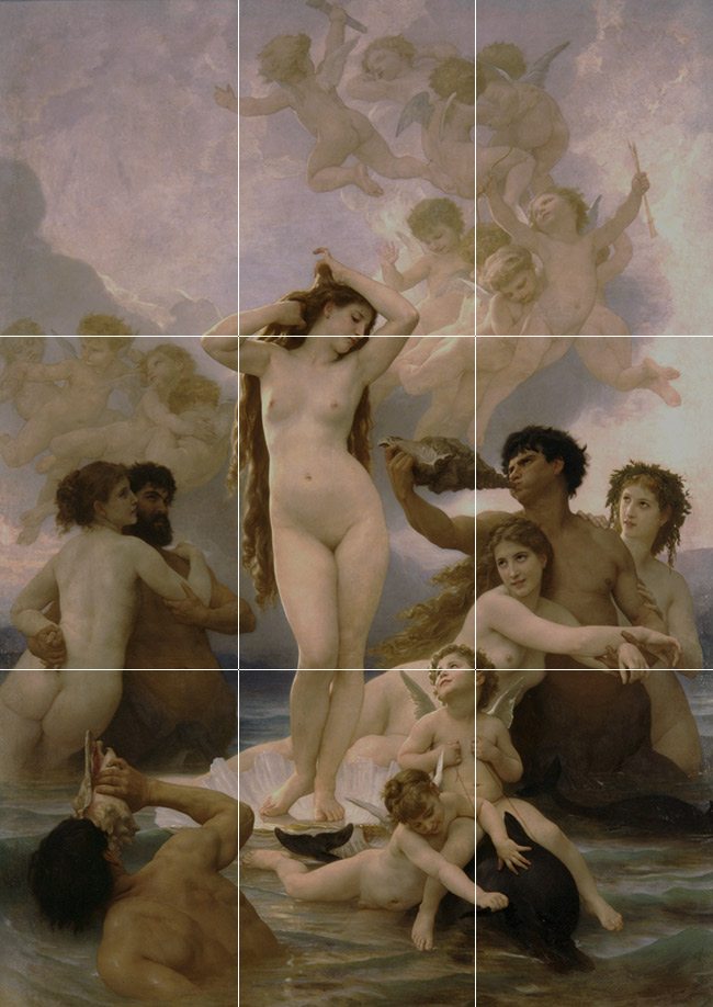
Do you think Bouguereau used the rule of thirds to design this masterpiece? Are you thinking “well, her body and arm line up with the upper left third, and the lower horizontal third lines up with that ladies arm….right?” If you are that’s ok. That’s the blinders being pulled over your eyes. I’ll analyze this painting later (see Day 65) and Bouguereau’s composition skills will blow your mind!
What do I mean by design?
Well, let’s start off by calling it the “Rule of Design” to keep the same theme going. Hmm, on second thought, we don’t want this to be confused with an inferior method. Let’s call it the “Canon of Design.” Ah yes, that has a much better ring to it. Imagine if I called it the rule of design. People would go around using the same old cliche phrase they’ve been using for years…” well, rule’s were meant to be broken” or “I think it’s good to learn the rules, but then know when to break them.” The word “rule” has a meaning that can be looked upon as negative. Some people don’t like to follow the rules. And what I’m striving to demonstrate isn’t a rule that needs to be broken. It’s a canon of knowledge that you can choose to incorporate into your art if you wish. Your choice, simple as that. “Ignorance is bliss,” they say, but I never found it blissful to be frustrated trying to make sense of composition when the rule of thirds was guiding me. I’m not going to call it the Golden Ratio (though this relates to the whole idea and will be explained later), because the canon of design is more than just a ratio, and I don’t want to confuse some of you. And the way that I’ve seen it applied to most photography on the internet is very misleading. People slapping a PHI grid or spiral on a photo like it’s a slice of pepperoni, without having a clue of the concept behind it. If you want a technical description, we can safely say design is Dynamic Symmetry, to start with anyway. Then comes understanding root rectangles, repeating intervals, figure/ground relationship, the greatest area of contrast, aerial perspective, arabesque…the list goes on and on, but don’t let that scare you…it should excite you. And it all starts with the rectangle of your camera (or canvas/paper), which we’ll cover soon enough. But yeh, I’ll be referring to this long lost tradition as the Canon of Design. And with the so-called Rule of Thirds on the tip of every artists and photogs tongue I really have my work cut out for me.
Why on earth would I do a 365 project for composition?
My goal with this 365 is to introduce to some of you a secret knowledge that hasn’t been watered down. Something that can enrich art in the now and in the future. The fate of great art depends on us! Seriously! Let’s match or exceed the standard set before us by the Renaissance, the Impressionists, or Realists. They all designed, so why are we using the rule of thirds? Why can’t we create better art? The only thing that is fundamentally different is our design. I believe if we can learn the canon of design, we will be able to achieve masterful compositions as they did…whether it’s photography, videography, painting, sculpture, drawing, interior design…it can be used for all of these. It is possible to change the future of art, but I won’t be able to do it alone!
As we all progress through this 365 together, we should seek out blogs and sites posting about the rule of thirds and politely ask them to delete it from existence. Too extreme? I don’t think so. With the internet growing like it is, we have to start there and do what we can to get the rule of thirds from circulating to artists that don’t know any better. Just think, If we all started learning design, we would surely see how incompetent the rule of thirds is to provide guidance in our compositions. Four points to line up your subject? Give me a break!
I hope to prove how valuable the canon of design can be for our art. Repost, quote, link, email, comment, reply, tweet, post, favorite, reblog…whatever you can do, but please…for the love of art….help me tackle this rule of thirds beast by giving the canon of design a chance, opening your eyes to change, sharing your thoughts, and incorporating it into your new found art. We can change the future of art for the better! No joke!
If you get lost or confused, please email me and I’ll try to help.
Here are some web clips to show you just how confused the internet is when it comes to composition.
In this clip they say that the rule of thirds is “really essential.” They also have the nerve to say the Greeks discovered it and we’ve been “benefiting” from it ever since.

In this one, they say artist from the Renaissance Period created the rule of thirds. That the “eye wants to roam” so don’t put things in the center. Little do they know that placing it in a third doesn’t help the eye roam around the image. You’ll learn what really does…soon enough!

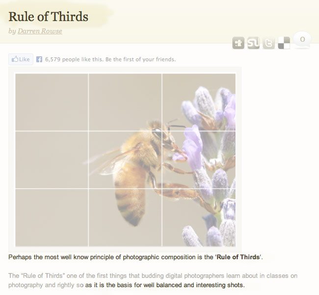
On this well-known site, they claim that using the rule of thirds is “the basis for balance and interest shots.” The image provided is a cool macro shot of a bee…something you may find on a Walmart coupon for honey. You wouldn’t see this hanging in a serious gallery. It’s a stock image, it’s not what most would consider art. I’m wondering… since the rule of thirds is “the basis for balance and interest shots”, then if I take a picture of a nice fresh road apple, place it in the upper right third, then I will have an interesting/balanced shot?? Hmmm…..
(no offense to the creator of this site because he is doing a great deed by taking his time and teaching more about photography. The rule of thirds is what I’m after here…it has infected everything, and we haven’t known of anything better…until now.)
The title “Master the art of Photographic Composition” followed by…yep…the rule of thirds.

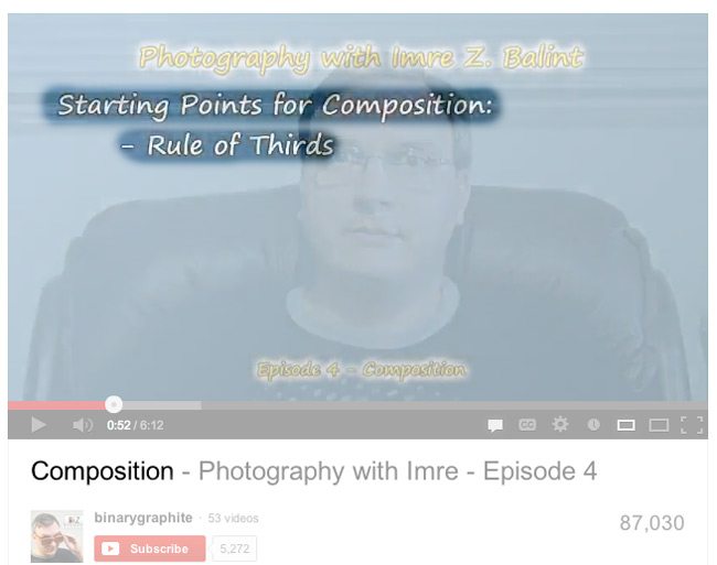
This….63,000 plays…more by now. Poison, seeping into the minds of artists around the world! haha! I may seem drastic, but seriously, once you learn design you will be laughing with me.

So many people regurgitating the same myth “the human eye naturally gravitates to intersection points” of thirds. Really? Think about it…does it really?? I would say the thing we notice first in most art is the greatest area of contrast…we’ll learn more about that later though.

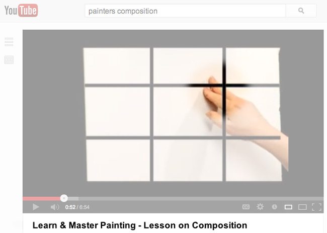
Here you go…”Learn and Master Painting” with a nice rule of thirds grid for ya! I know that’s not Da Vinci’s hand!
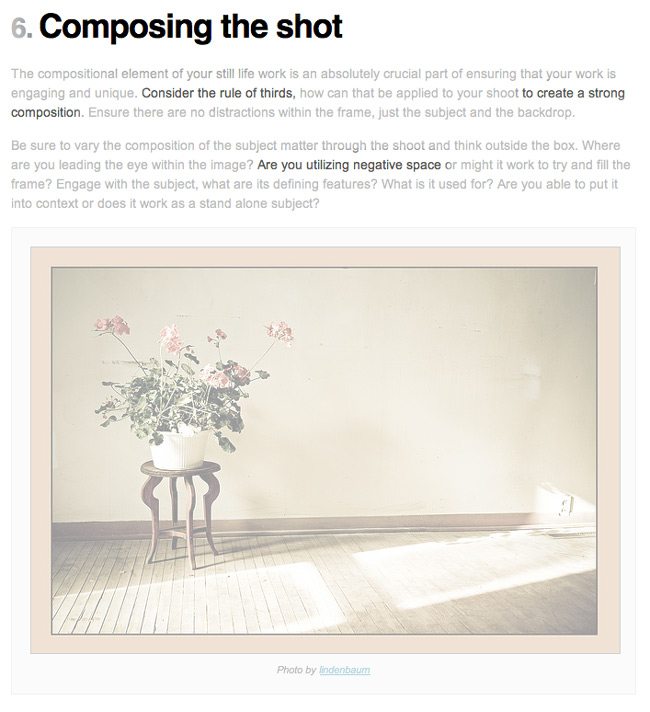
Ugh! More….”consider the rule of thirds…to create a strong composition.” It also asks if we are “utilizing negative space” …another concept that is a symptom of the rule of thirds…which I will get into later.
Wow, look…the bee is perfectly on the lower right third….can you see how generic this is starting to look? If not, you will soon enough…
How about this one? Generic enough for you??
This one…I think it’s a decent picture, but it’s not because they were “of course following the rule of thirds” as they claim. This follows the law of symmetry…even though the Eiffel tower could be more centered, and it has excellent figure-ground relationship…I’ll cover that later, but the point is…if they were only following the rule of thirds for this, then they got lucky with the rest…and they could’ve been aware of the law of symmetry to get the Eiffel tower in the center….you can’t win them all, but you can surely get closer to the end goal and know why you lost…right?
And then there’s this…I had to capture the comments because they show that some people are aware that the rule of thirds is a crap way to compose, and cropping down your image to thirds is even worse.
Wow, that was fun!
By now you may see the confusion out there…all caused by the rule of thirds. As I said before, nothing against the people I made as an example. At least they are trying to do their best to spend their free time helping. It’s the rule of thirds fault. It’s a dead end, watered down way of composition that has infected us all. Let’s not be zombies anymore….let’s start thinking outside of the box. The Canon of Design will lead you out of the fiery pits!

