The Simplified Concept Behind the Rule of Thirds
4/365
I hate to keep bringing up the rule of thirds, but in order to conquer the enemy, we have to understand it thoroughly. The rule of thirds has some ideas (ok, only one idea) wrapped up in it’s theory that I would like to point out….I summarized the definition from everything I found on the internet.
If you divide your screen into equal thirds vertically and horizontally then these will create “power points” or “golden points.” These power points will somehow create tension in the scene (from what I hear) and allow the eye to magically move around the scene instead of being placed in the center where it is “static”.
Meh, I can only agree that it helps get things out of the center, but not much else. And there’s no magic involved I assure you. Placing your subject in a certain spot doesn’t move the eye around the image. The arabesque, ellipses, arcs, radiating lines and coincidences are elements that help guide the eye through the image, but we’ll get into all of that later.
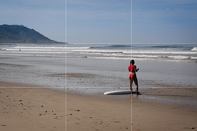
I don’t know about you, but when I look at the image above, I’d rather see what is in front of her…not behind her. Plotting her on the lower right third, and the ocean line on the top third horizontal does not help the image or move the eye around. Sure, we look at the mountain on the left, but there’s not much interest, no unity, and horrible gazing direction….we need to see where she is looking. What do you think? Wouldn’t you rather see more of the ocean since she is a surfer? It would tell a clearer story, or at least help create one. Here we just have confusion and boredom. Is she going to surf…is she waiting for her friend to come in from surfing…is it too cold for her to surf? So yes, a better composition would help clearly define the story behind this image. There’s definitely more to consider than just plotting your subject on a point.
Suppose you do line up your subject on this crosshair…now what do you do with the rest of the image? Do I line up other subjects on the remaining crosshairs? You mean I don’t have to worry about rhythm, flow, variety, unity, movement, or anything else??? This is soooo easy!! Wrong.
You don’t have to disregard these intersections, because they are going to prove very similar in location to our basic grid. Just don’t go assuming that these points create tension and move the eye around the image like some people claim.
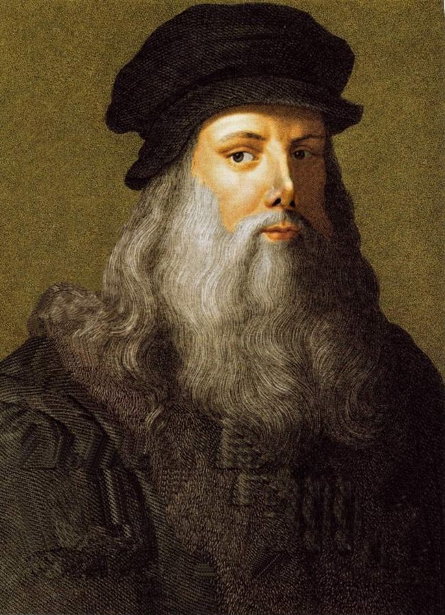
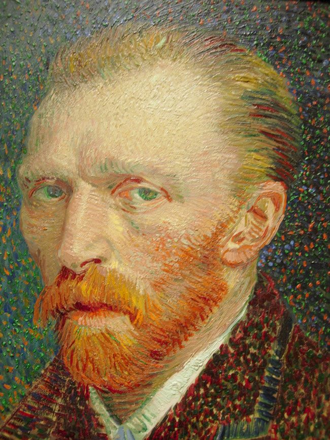
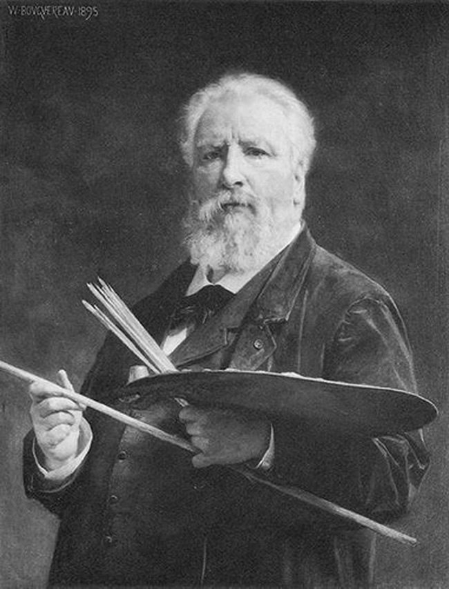
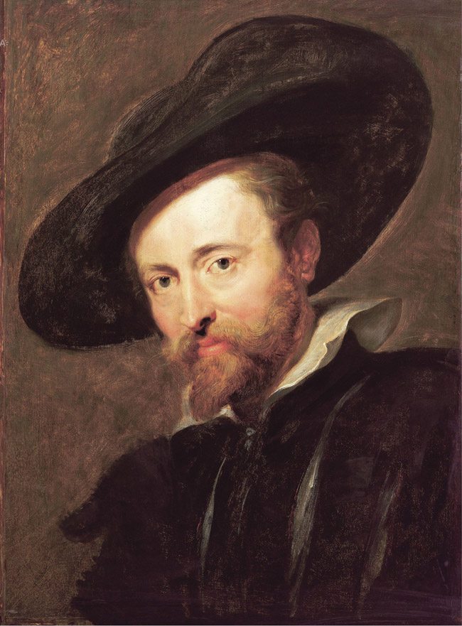
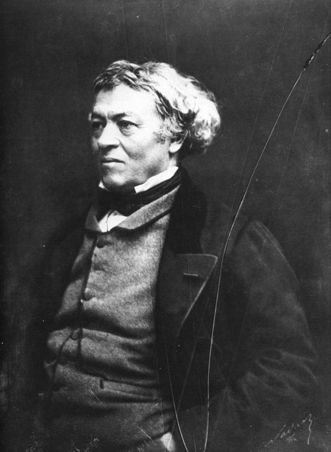
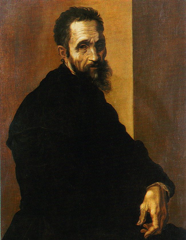
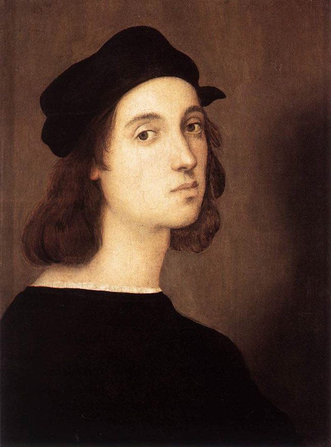
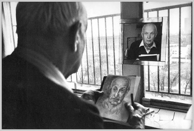
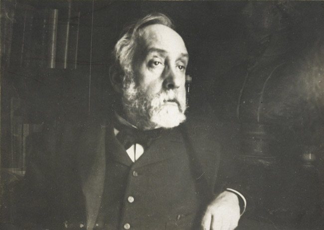
Before we go further, now is an appropriate time to name drop. Ever heard of Leonardo Da Vinci, Picasso, Van Gogh, Bouguereau, Rubens, Corot, Michealangelo, Raphael, Henri-Cartier Bresson, Degas? All of these grand master painters, sculpters, photographers, artists, didn’t limit themselves to the rule of thirds. They designed their masterpieces, all before the rule of thirds even existed…well, not HCB or Degas, they weren’t even a twinkle in their dad’s eye, but the rest did. Even the Greeks used dynamic symmetry to design the Parthenon in 447BC (way before Fibonacci discovered his famous sequence). No, the majority of us will not even begin to approach the talent of these masters, nor do many of us want to. But if we want to learn how they mastered their compositions, we have a great tradition of art to look back on, study, and guide us. The Canon of Design is the result of studying, researching, implementing, demonstrating all of these techniques. I’ve done all of the heavy lifting for you and the techniques of the masters will be found all in one place. No more trying to solve a mystery of the past!
Note: The dates and history aren’t more important than the fact that great minds have used methods of design to create masterpieces, not the rule of thirds.
Here’s a glimpse of these masters

